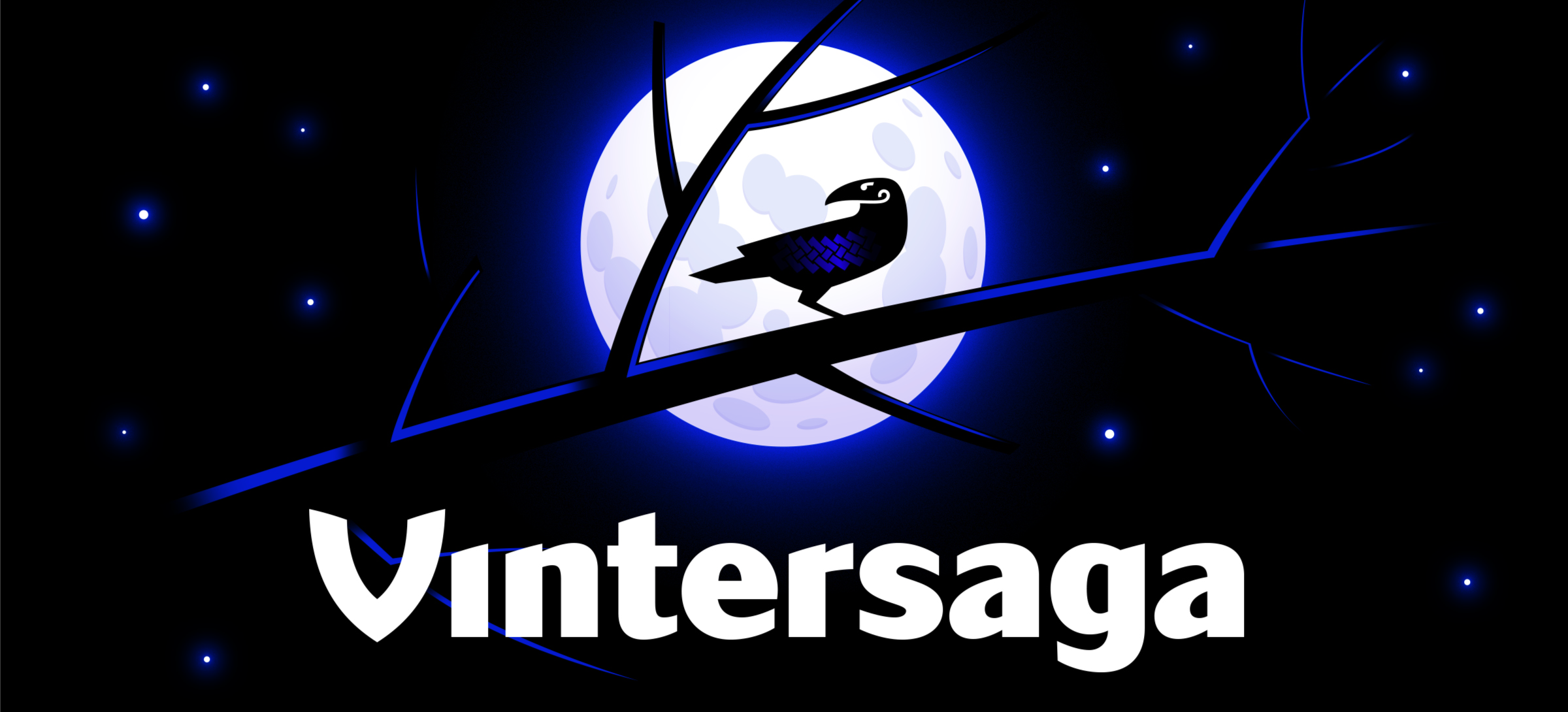
Vintersaga Scandinavian style
LOGO • SUB LOGO • FONT WORK • PATTERNS • GUIDES • MERCHANDISE • SMM TEMPLATES
Vintersaga mobile game developer studio is just entering the market, so the corporate identity should not just be an addition to the brand, but also to help present themselves as much as possible. The northern shades in the name (Vintersaga in Swedish — Winter Saga) led us to Scandinavian mythology, where, as in the new games, brave heroes meet with an enchanting and mysterious world. All that was left was to combine these centuries-old myths with modern requirements, so that the identity looked fresh and could be read even in the smallest Internet frame.


V dominance in all forms
The word ‘Vinter’ is unusual within the Russian-speaking world. The initial letter V seems wrong and instantly attracts attention, that’s why we have strengthened this organic emphasis by making V the main letter.
An emblem is built around the V: the stylized letter is complemented by a blue-black pigtail pattern and a mythological mascot. Black ravens in Scandinavian culture symbolize wisdom: a pair of ravens, Hugin and Munin, who fly around the world as messengers for the supreme god Odin. Now the ravens are hovering around the world of mobile games.
The letter V should be immediately associated with Vintersaga, so it couldn’t be done with a standard strict font. Its shape is based on the lines of a drakkar, a legendary wooden Viking ship with its bow raised high. This Scandinavian character V resonates throughout lettering.
It’s especially important for a mobile game developer to have a logo that is used as successfully in mini-formats without loss of recognition. We have prepared several varieties of the corporate block (the layout depends on the tasks and the carrier) and an elementary logo: the letter V is easily recognizable on a small scale like a favicon.


The Mascot raven and its elusive pattern
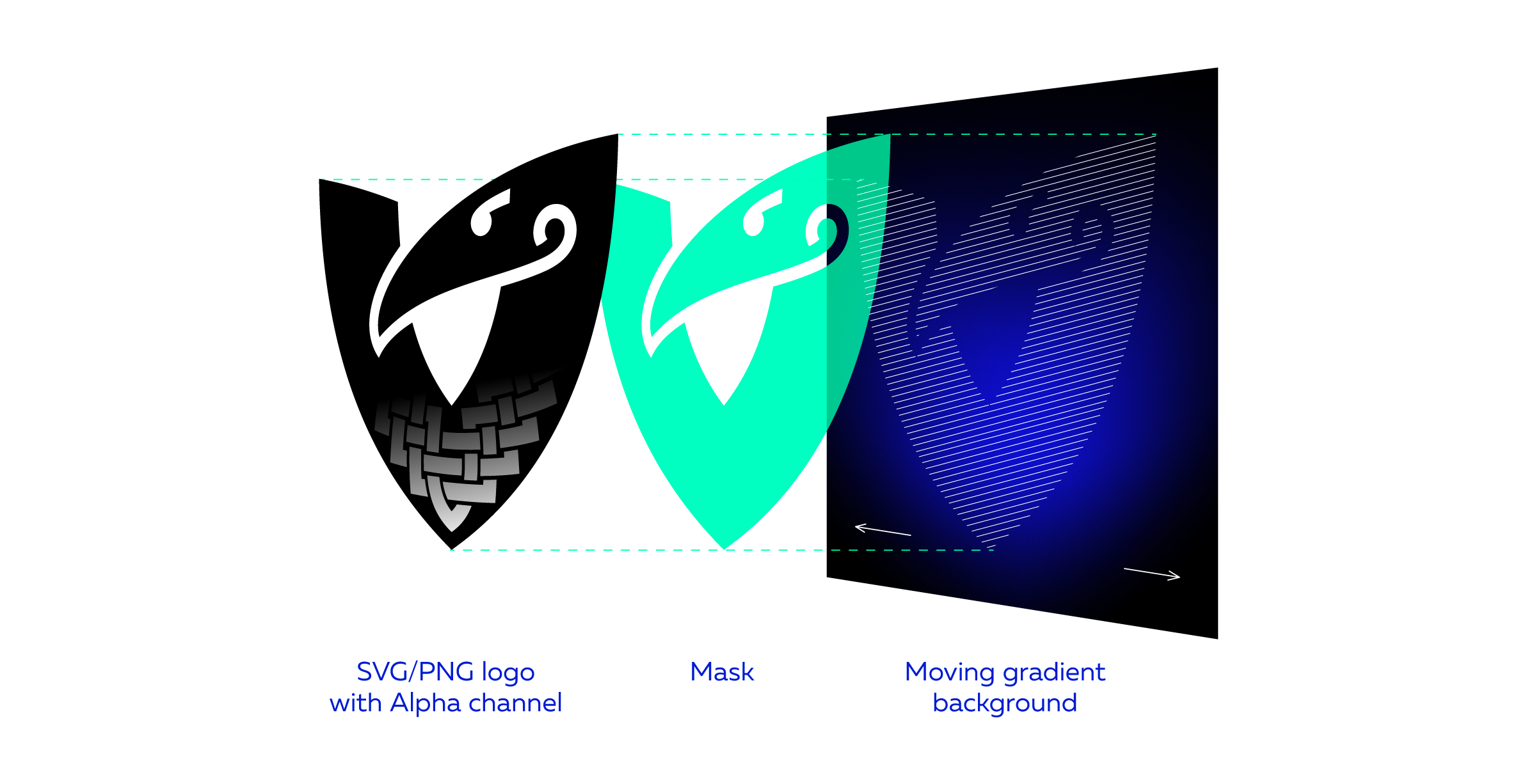
The appearance of a mascot strengthens the corporate identity, making it flexible and more interesting. The Vintersaga raven occurs in three positions: he sits on the lettering, takes off, watching the world below, and flies with his wings spread wide.
The raven always stays black. On a black background, the chipping is done either with a gradient corporate background, or through a white stroke.
Vintersaga has acquired an elusive ghostly pattern that changes according to a given algorithm thanks to the mascot: for example, when the cursor moves, the gradient background can seem to fly from place to place.


Winged Pattern
The basic elements of the Vintersaga identity rhyme not only with the lettering, but also in a series of background and active patterns. The letter V can transform into the open wings of a raven — such patterns look light and airy, despite the depth of black and blue colors. The patterns can be used everywhere: from the merchandise line and motion graphics (with animation of wings) to SMM-templates and packaging.


Медиа: