Restyle and uniform of HC Jokerit
LOGO • SUBLOGO • TYPEFACE WORK • UNIFORM • PATTERNS • GUIDES
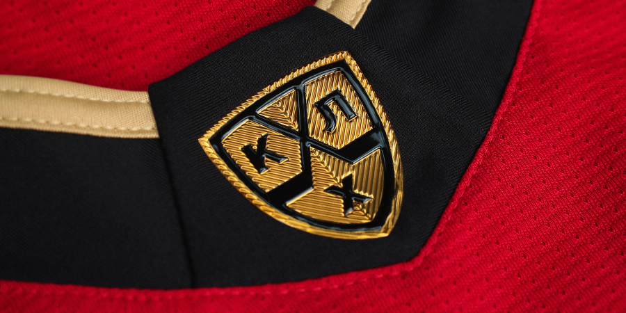
Jokerit is one of the most recognizable hockey teams in Europe, with only the CSKA star standing out next to the Finnish joker. Working with the logo and kit of such a strong brand should be based on more than 50 years of history, and Quberten studio approached the updates carefully.


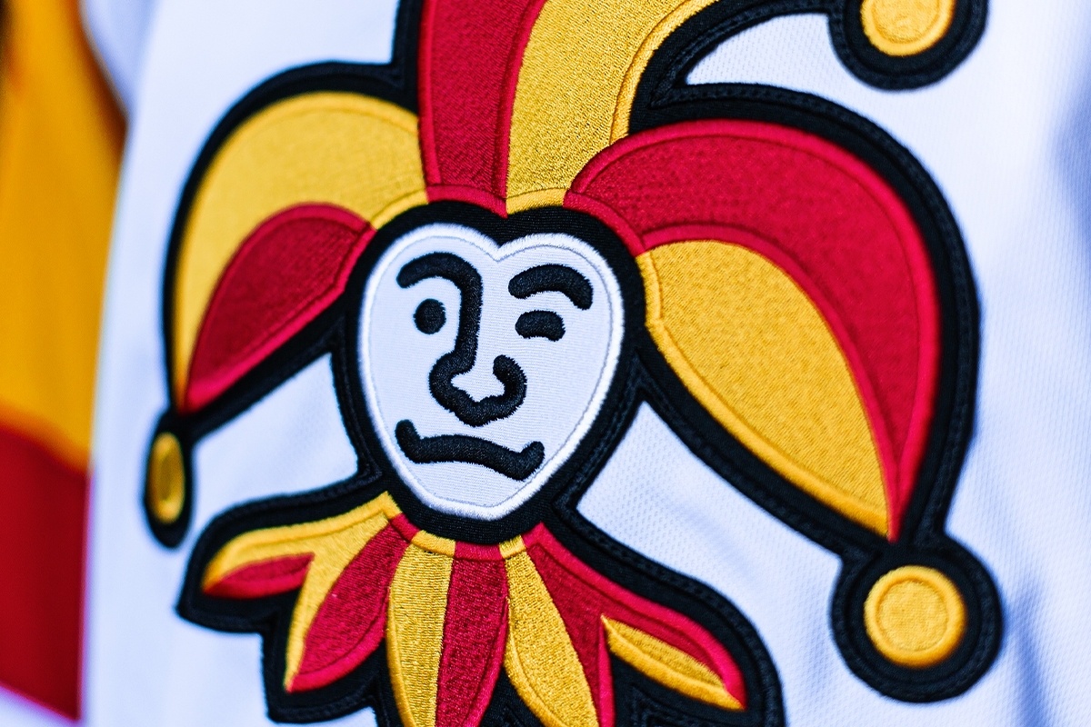
The Joker has been cleaned up
The Jokerit emblem needed only minor adjustments: we made the outline thinner and cleaner, and the shape of the logo tighter.
Such cosmetic changes benefit the logo (as they make it easier) and do not change the joker’s overall image in the eyes of fans. Updates will be noticed only by the most attentive, which is exactly what you need for an interesting and legendary emblem.


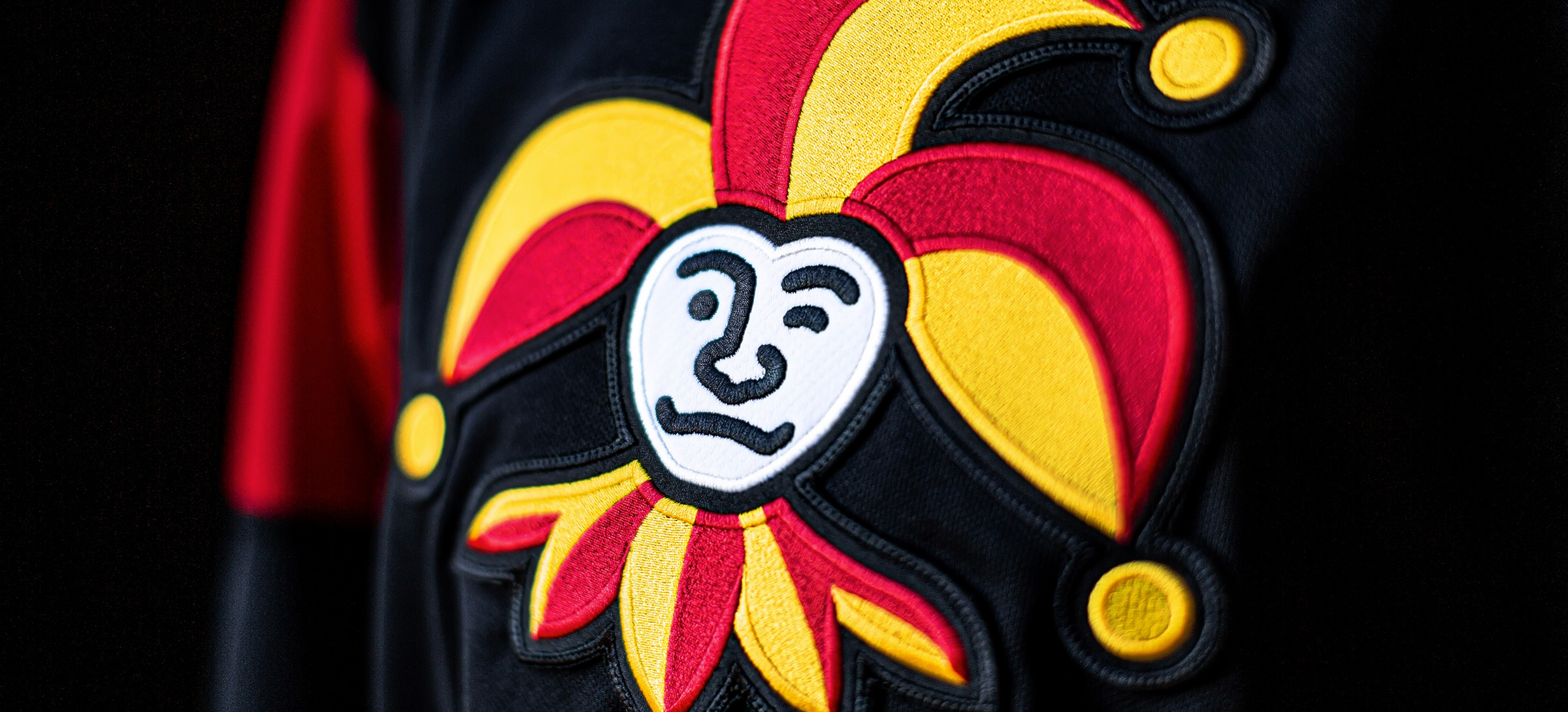
New style of the kits: contrast on black, brutal font, sublogo and event sets
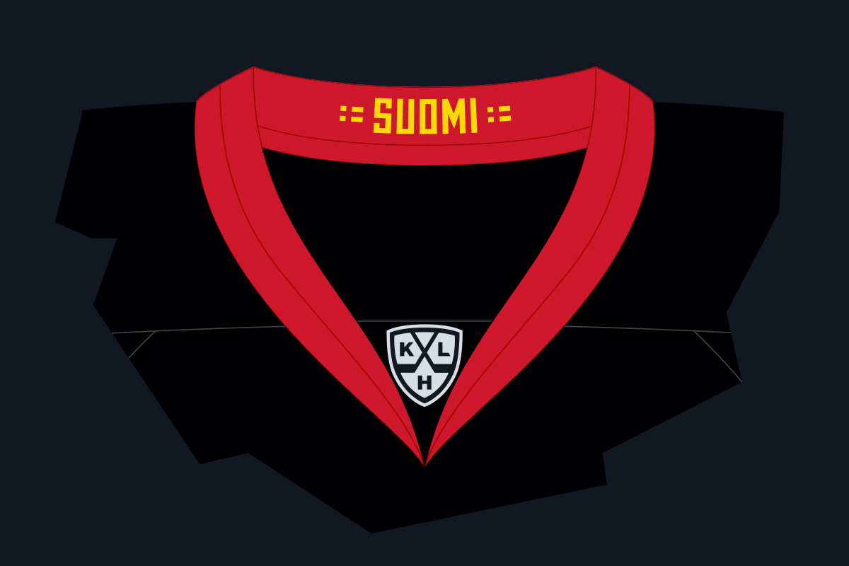
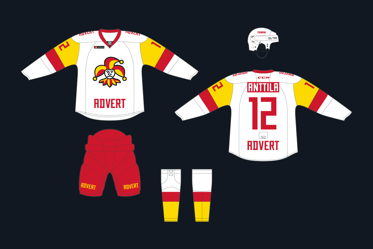
Another change catches the eye. The main colour of the home kit is now black combined with the branded yellow and red, which will give it a unique palette and distinguish Jokerit from other KHL clubs.
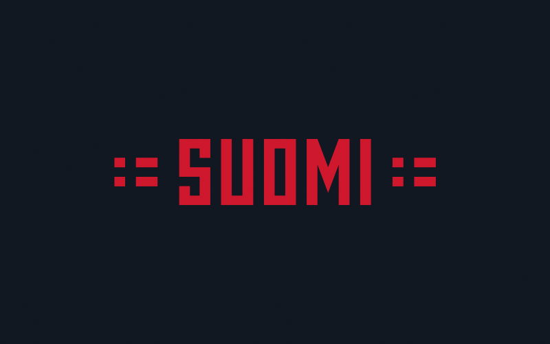
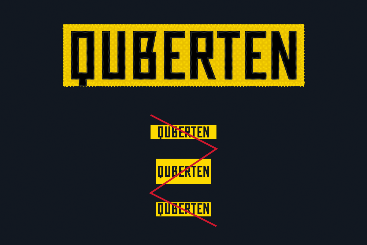
To ensure that the kit is perceived as a whole, we rethought the spelling of the names on the Jokerit's jersey: the club received its own brutal font with ligatures and special signs such as the Finnish flag. A new set of numbers is also made in its plasticity.
A new sub-logo of Jokerit is also concisely embedded in the numbers: using the monogram ‘J’, rhymed with the main emblem. This look of such bold elements strengthens it and makes the club’s overall identity more flexible. After all, the sub logotype is not only integrated into the numbers but also makes the line of club merchandise more attractive.


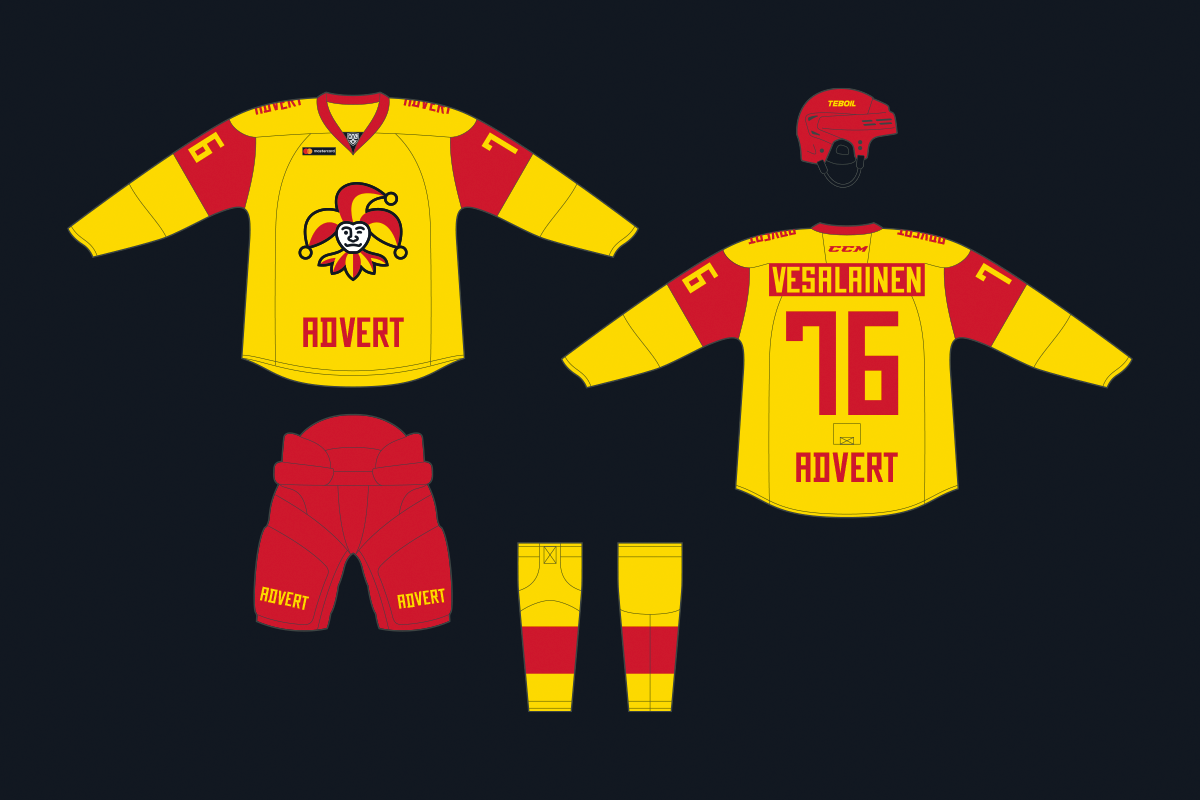
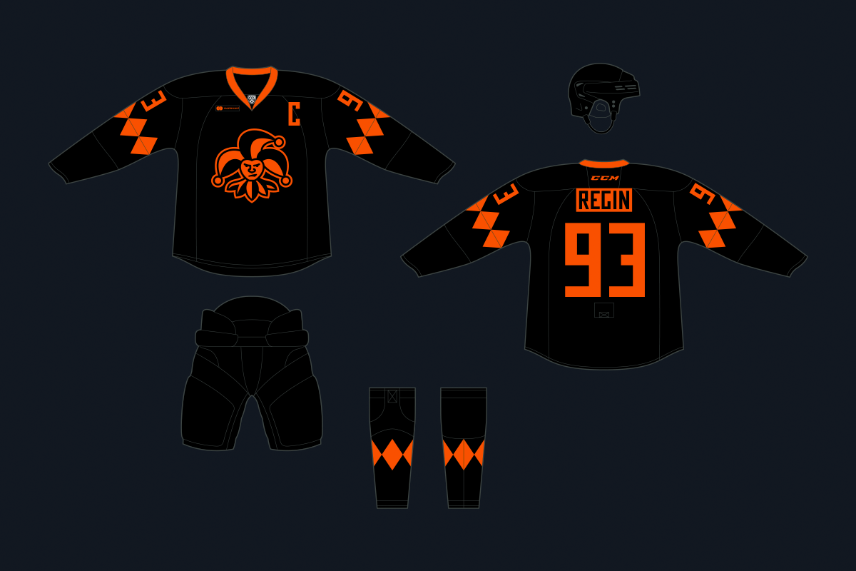
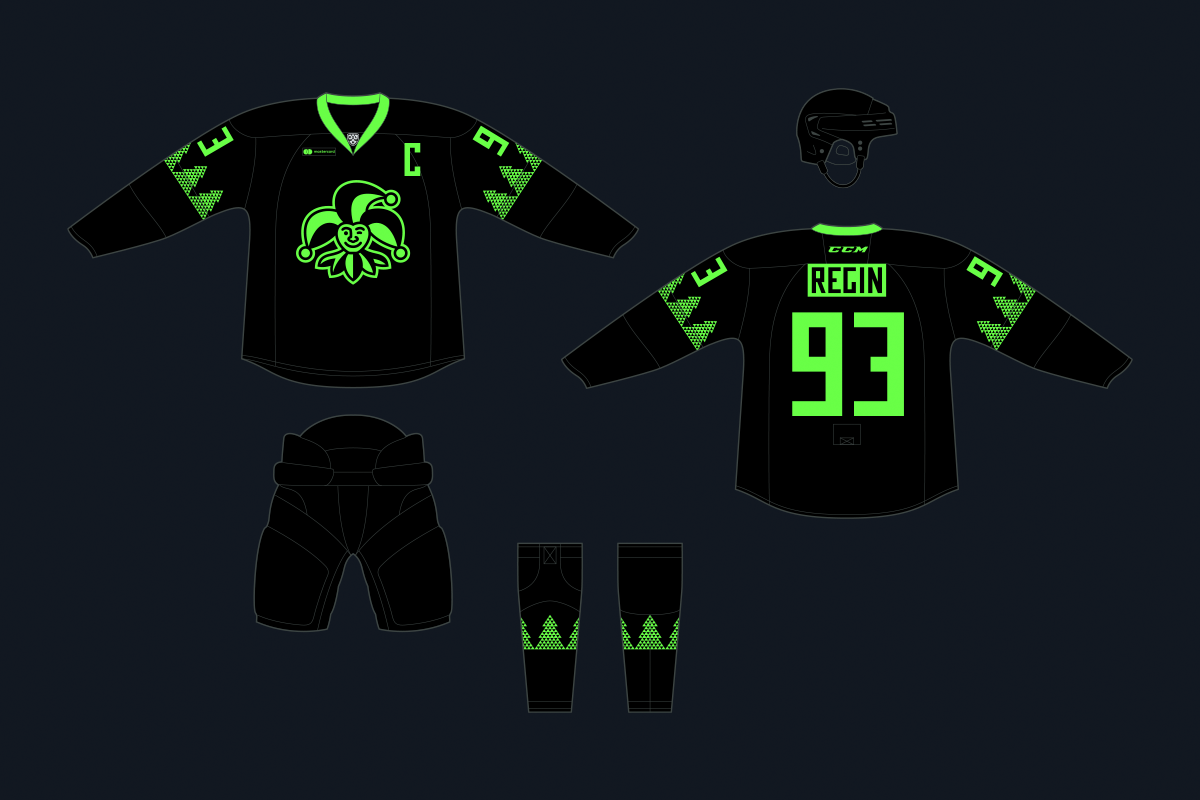
In addition to the main game sets, holiday sets are provided. Halloween is dedicated to the black and orange uniform, referring to the burning pumpkin and intimidating the disgruntled look of the joker. For Christmas, a cheerful light green set with a smiling club symbol and Christmas trees on the sleeves and socks has been prepared.