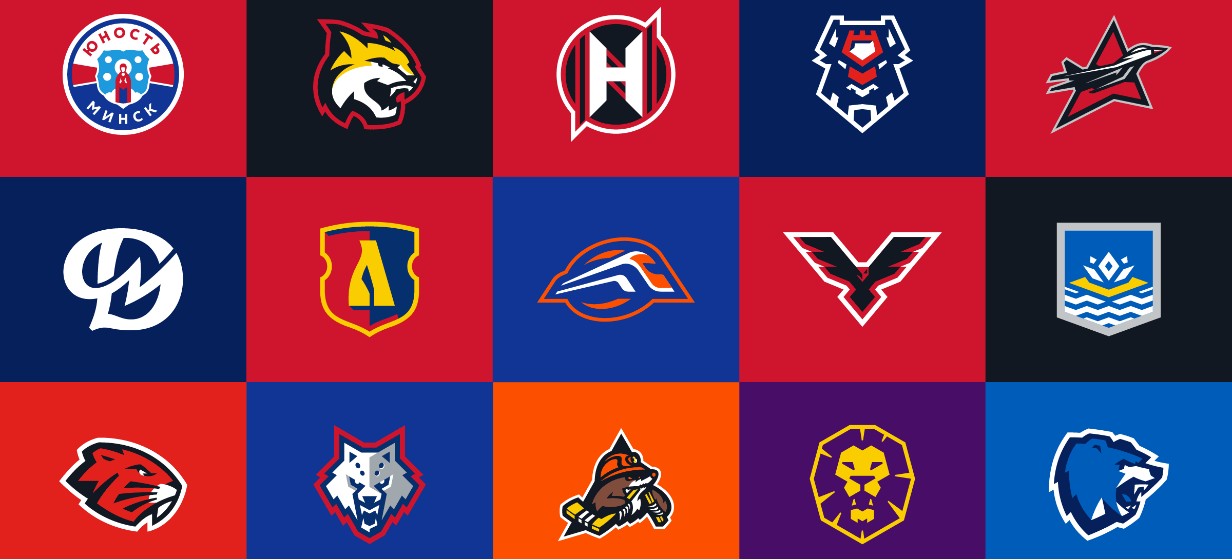
15 logos for Belarusian Extraleague
Making a logo for the sports team is Quberten Studio's day-to-day job. But rethinking the whole League of teams – such a large-scale task – was set and, what pleases, solved for the first time. 15 team logos and one for Extraleague — is a serious work not only in scale but also in content. A single ecosystem of logos can only be afforded by the largest hockey tournaments of national teams like the Olympics, but now such a precedent is created by the Belarusian Extraleague and maybe others will follow it.
The League clubs had a whole bunch of problems with logos: they are obsolete and do not meet modern standards and requirements; spontaneous graphics, a complete lack of culture curves, thickness is not in dimensional logic; illustrations abound in small details, because of them speckle is formed, clarity and purity of images is lost; logos are not adapted for use in small sizes – and standings and mobile applications suffer; the number of colors can be painlessly reduced; there is a combination of logo and lettering.
Several trends have emerged in modern sports design, but if we talk only about identity, the main vector is directed towards simplification. Flat graphics, plates of simple shapes and total simplification are in fashion. Guided by these principles, we have redesigned all the Extraleague clubs.
Now animals, transport, cities and even the faces of saints quietly coexist in one paradigm. The clubs' logos contain a lot of Easter eggs, they are filled with a true sense, and sight directions are fixed — no one looks down or back.
BREST
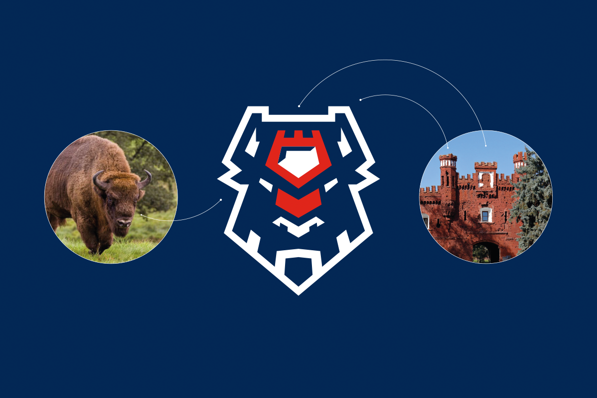
Two important images are encoded in the logo at once: the bison and the fortress. The head of the bison consists of elements of the Kholm Gate - the most famous symbol of the Brest Fortress: the forehead is the central tower, the horns are towers along the edges, and the arch below is in the mane. The brutal style of the logo is characteristic of a modern sports identity.

VITEBSK
The bear got rid of numerous symbols arguing with each other - a shield, a ribbon with an inscription, hockey sticks. In addition, at the request of the club, the polar bear turned into a brown one.

GOMEL
We turned the head of the lynx, and also removed the visual noise. Characteristic recognizable flames are sewn into the lynx contour.

LIDA
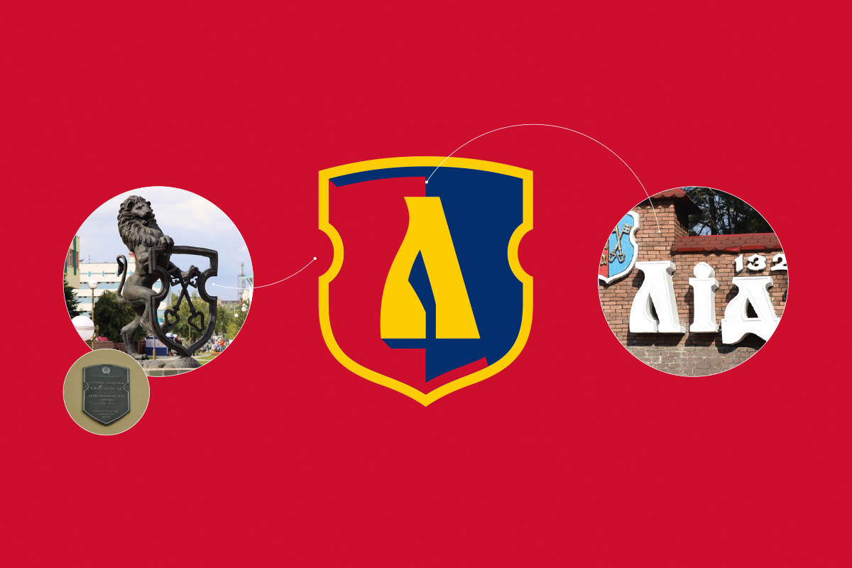
The shape of the shield has changed in the logo. It is borrowed from the city emblem. This form is often found in the city, for example, is used in tablets. In addition, it is quite rare and is an additional identifier for the command. In the logo, the letter L. was rethought. The reference for it was the city sign. A hockey stick fit well with the letter.

METALLURG
Graphically, the wolf has become much more formidable - no fussy lines, only a tough sports style.

MOGILEV
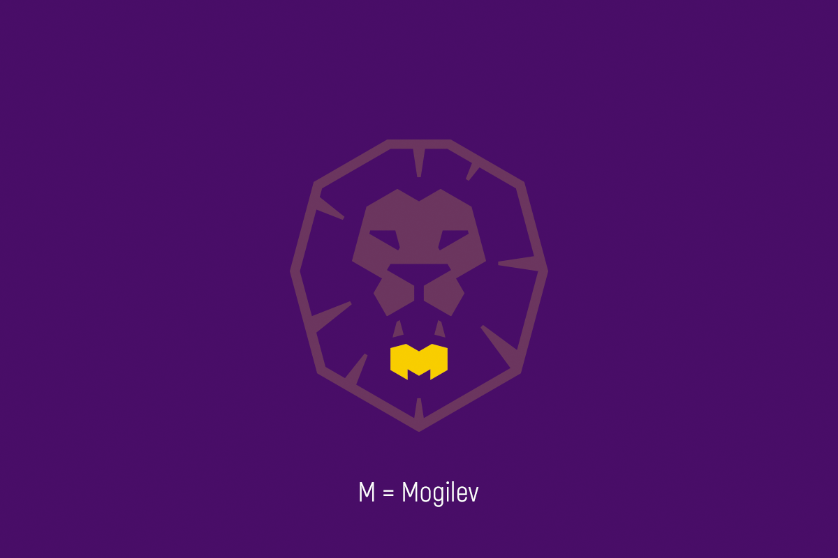
The city emblem, the inscription, the castle, the second figure gave way to a more convincing image of a lion. The logo retained the color palette of the old emblem. In the lower jaw of the lion is hidden a secret - the letter "M".

NEMAN
The logo of “Neman” has become cleaner, fresher and more geometric. It meets the modern standards and requirements of digitalization - the logo is adapted for work on a small scale.

KHIMIK
The simplification principle requires removing the extra stroke. The emblem of the city has undergone a geometric rethinking.

SHAKHTER
The logo has undergone the minor simplifications for easier use in a digital environment.

JUNOST-MINSK
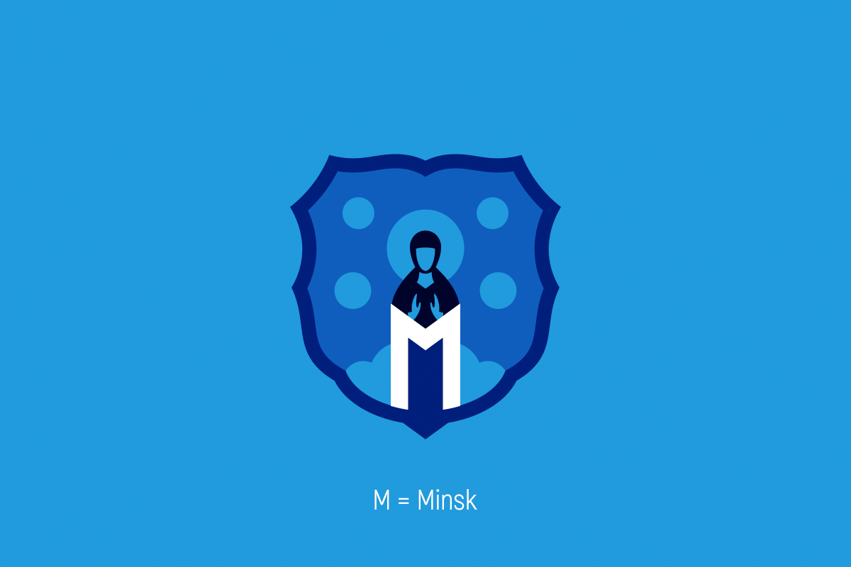
The logo of “Junost” is a special case; we worked in it with the faces of the saints. It was important to maintain the mood and meaning of the logo. As a result, it has become cleaner, fresher and more geometric. The logo meets modern standards and requirements. Now it is adapted to work on a small scale.

DINAMO-MOLODECHNO
Thelogo of “Dinamo-Molodechno” is a monogram from the letters “D” and “M”. The logo contains explicit references to the classic letter “D”, but at the same time it is a completely new sign that is not the property of the Dinamo society.

LOKOMOTIV
The logo dynamics vector is directed to the right - forward. The outgoing locomotivehas a triangular shape and implies the abstract letter “L” - “Lokomotiv”. A curly die on the background forms the letter “O” - Orsha. In the locomotiveillustration, a secret - a hockey stick is sewn up.

BOBRUISK
The logo has become cleaner and clearer. It meets the modern standards and requirements. Now the logo is adapted for work on a small scale. The logo dynamics vector is directed to the right - forward.

PINSK HAWKS
A recognizable form has been preserved in the logo, but graphically it is a completely different sign.

AVIATOR
The aircraft in the new logo has become more graphic, concrete and rapid. The logo dynamics vector is directed to the upper right corner - forward to the tops. The curly die indicates the abstract letter “A” - “Aviator”. Also, the plate causes associations with aircraft devices. In the lower part of the fighter there is a secret - a hockey stick.

Many logos hide references and secrets:
