Cool breeze. The new logo of OFF Northwest
LOGO • SUBLOGO • PATTERNS • TV GRAPHICS
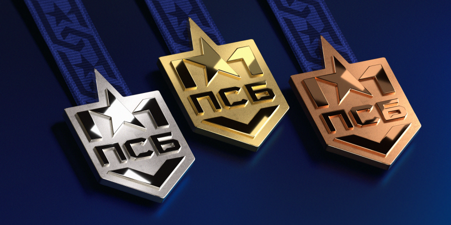
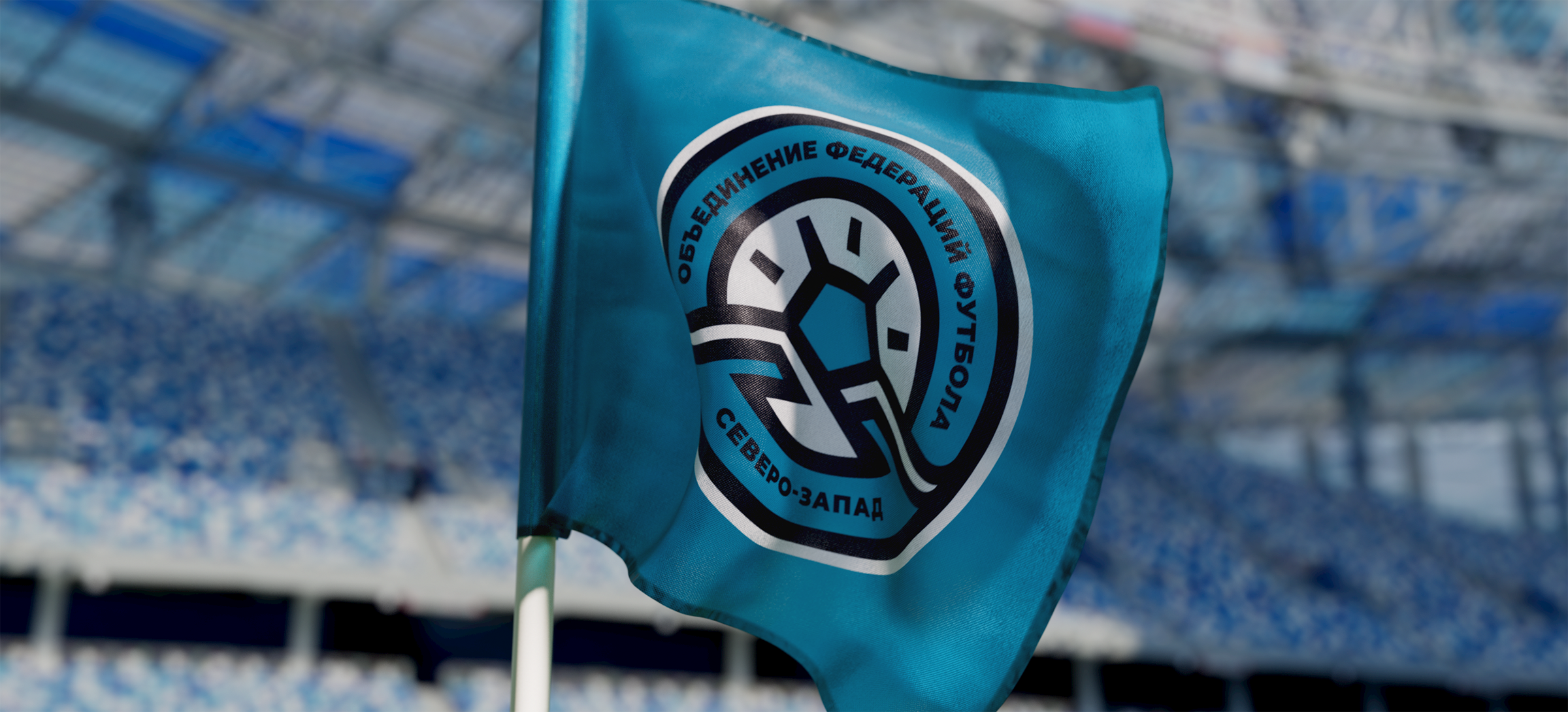
Russian football union brings together a huge number of local and independent organisations which develop and popularise sport in different regions. Among them stands out OFF Northwest whose area of responsibility covers the territory from Kaliningrad region to Komi Republic. Our studio helped to modernise its brand identity and connect it stronger with the region’s geography.
Медиа:
Медиа:
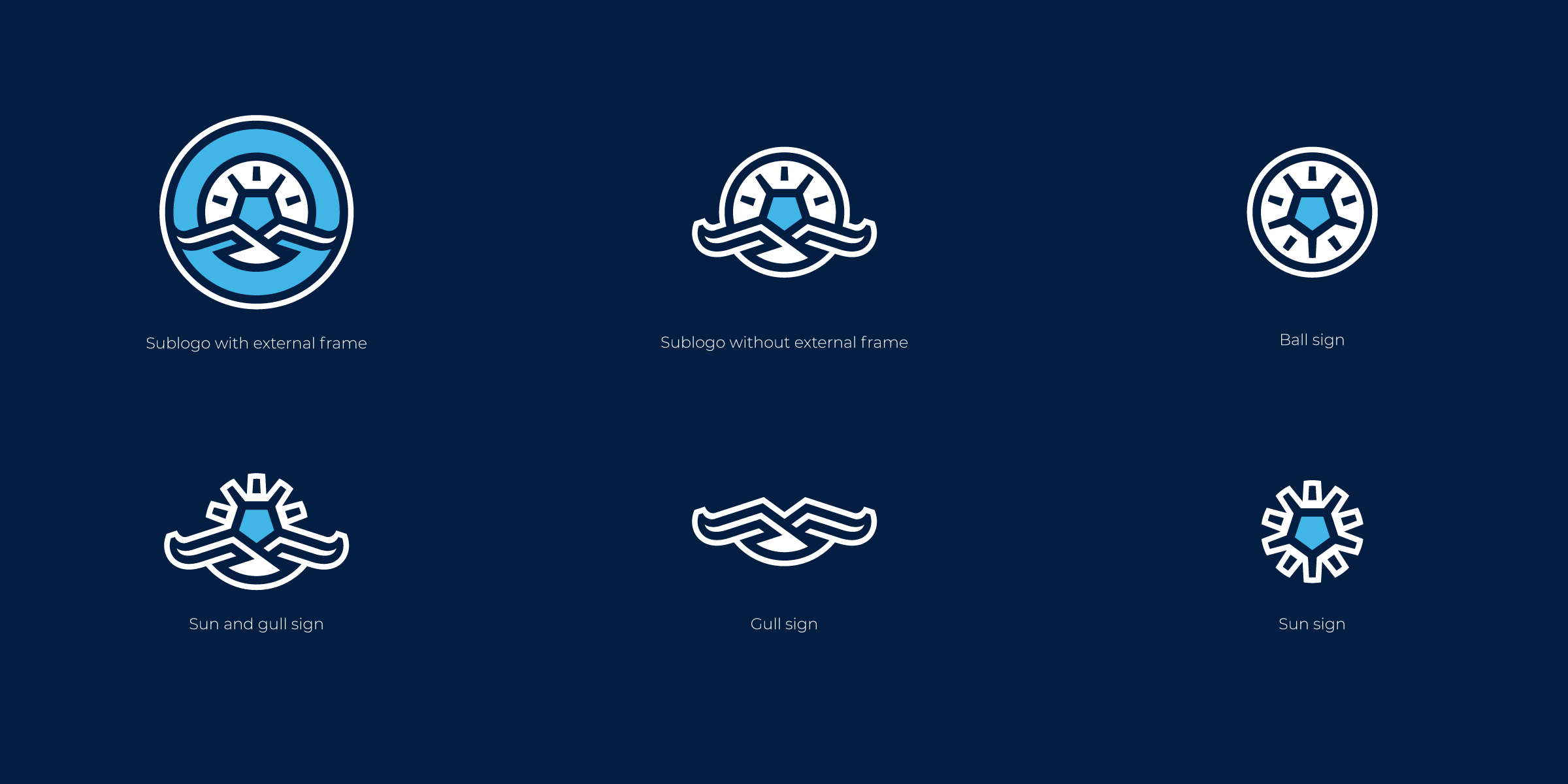
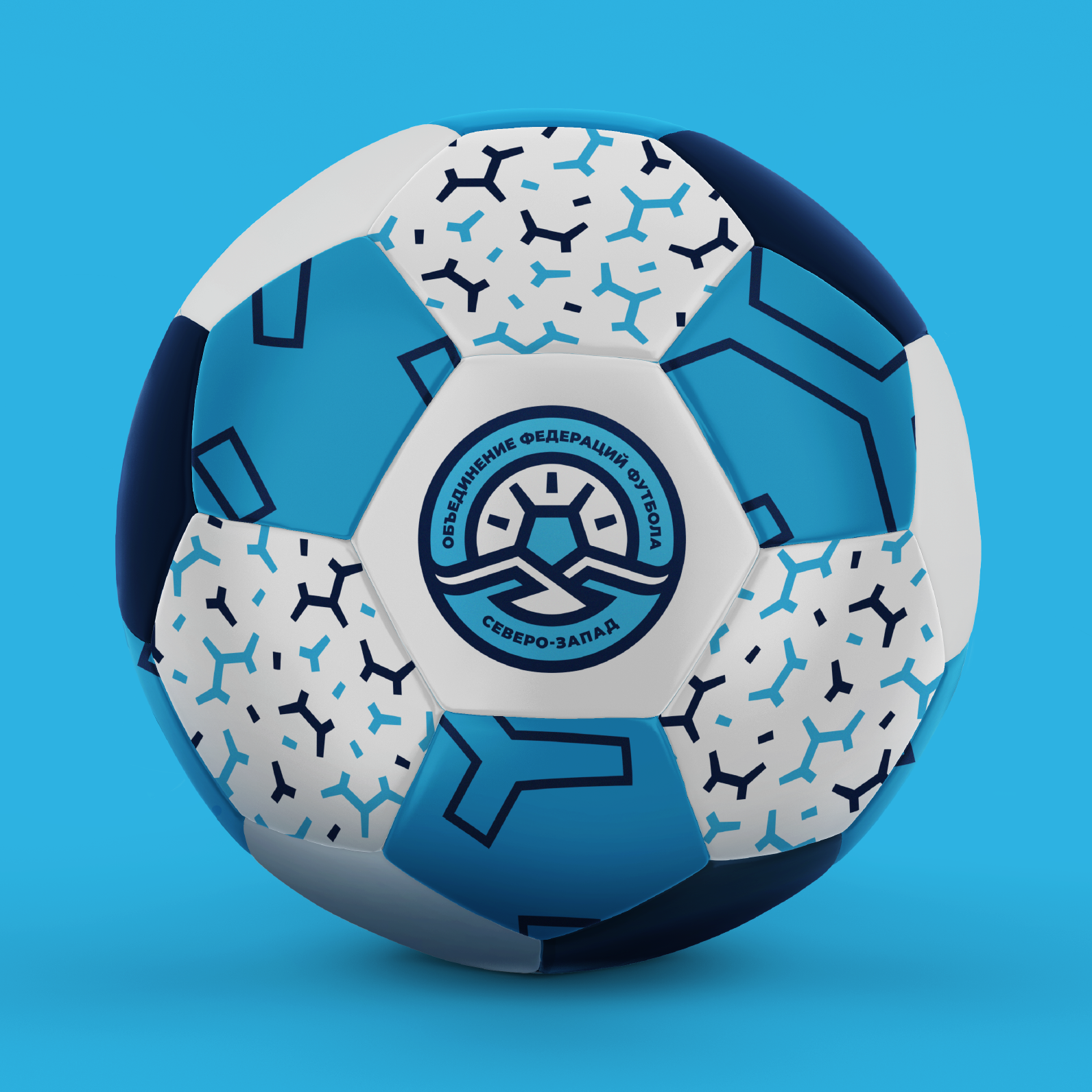
Complex logo composition
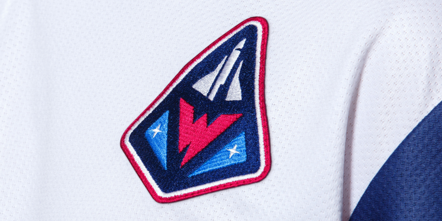
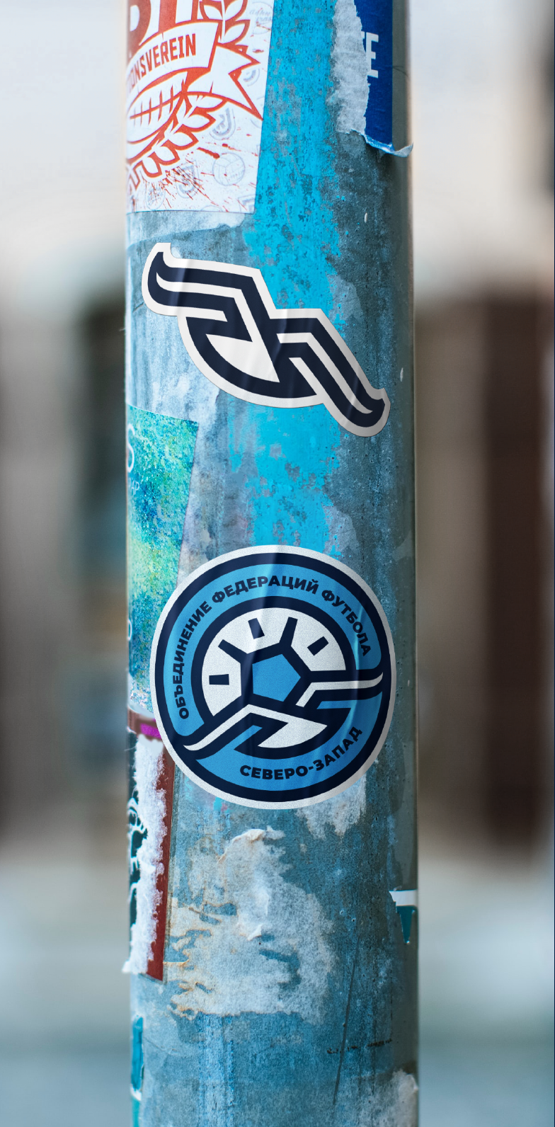
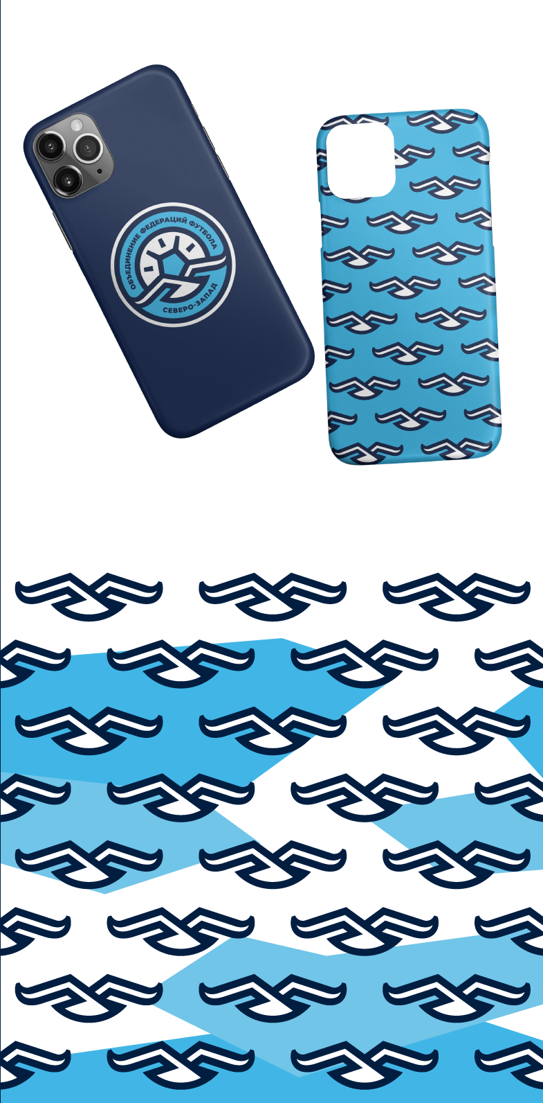
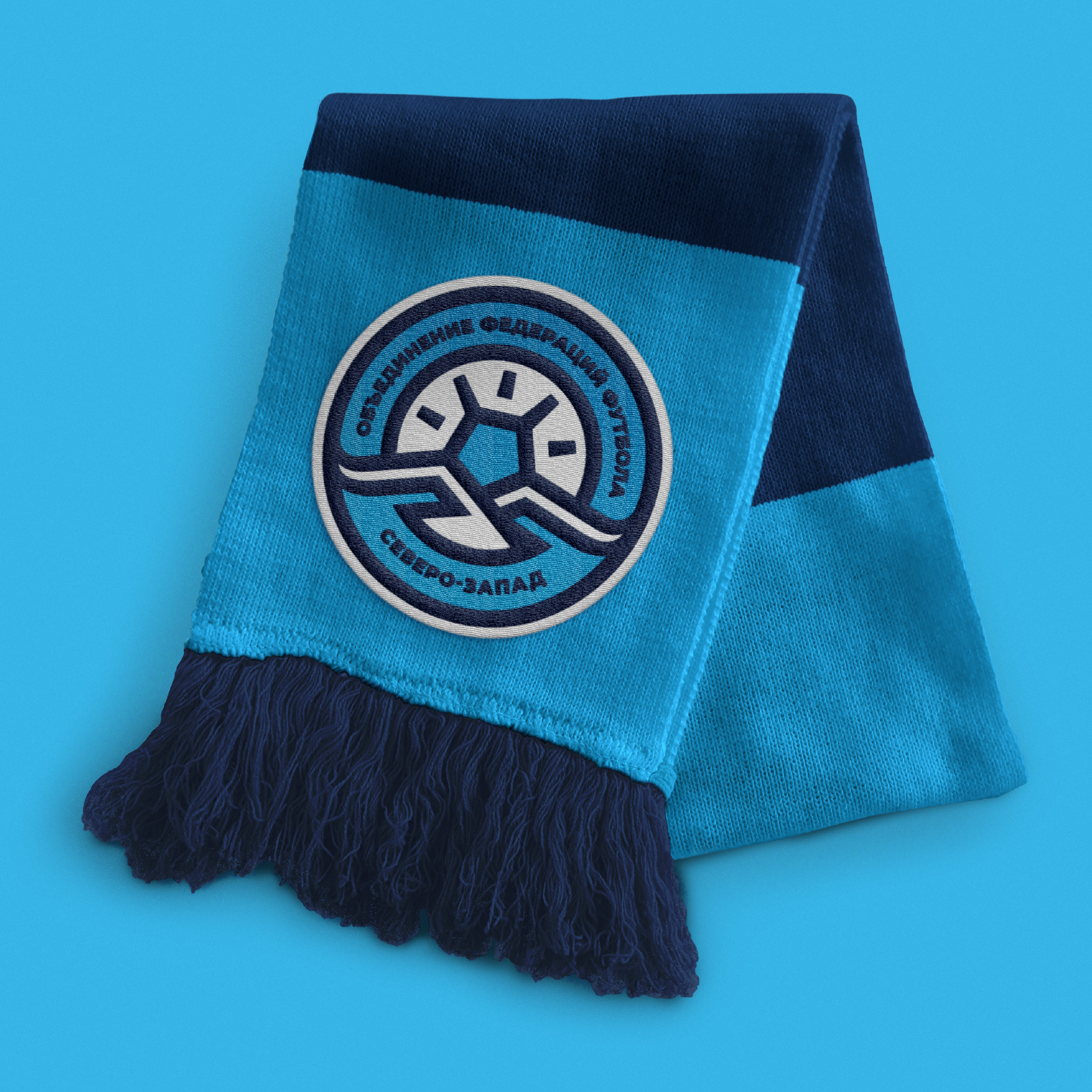
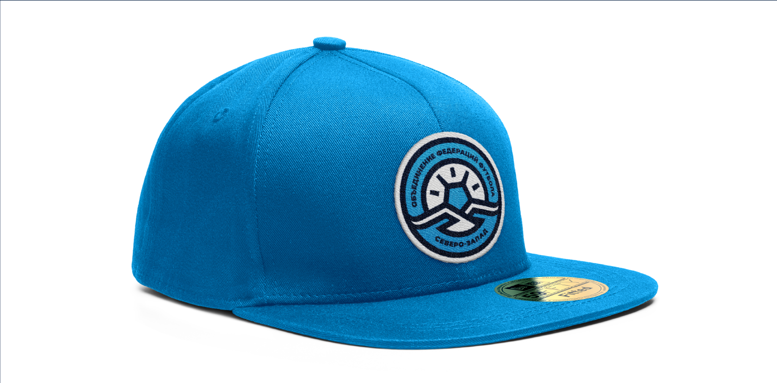
The new logo is designed with the succession to the old mascot. The gull comes into focus as the all known symbol of the northwest. Unlike its predecessor the bird became more graphic and looks like a pictogram. In the new style the gull does not overload the logo with many excessive details and appears more readable. The frame of the geographic map was replaced with the new element — the rising sun. Such positive connotation refers to the development of football in the region. One more Easter egg is a pentagon frame of the sun considered as traditional in football. As a result, the diverging rays of the sun resemble football panels. The up-to-date sport identity must be flexible and adaptive to any style media, that’s why, all the elements in the logo can be used stand-alone. The main sign can be disassembled into the independent sublogos that remain recognisable brand attributes.
Медиа:
Медиа:
Медиа:

Медиа:
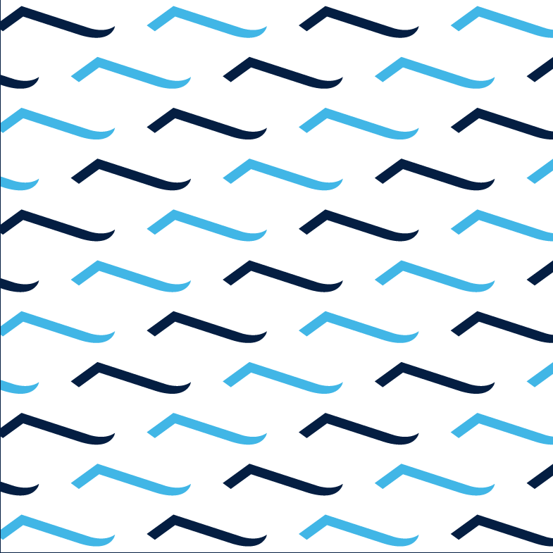
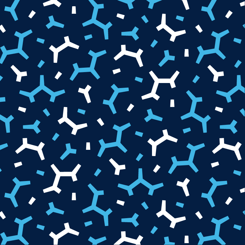
Northern style: patterns and graphics
The style is built around the angles’ system of 54° and 18°. This idea formed the basis for several options of corporate pattern. Its main function is to be unified with the logo and widen brand communication. There were many patterns generated — from the simple alternation of the mascot to the elements decomposition that brings new images and meanings (e.g. patterns «hoarfrost» or «net»). Some versions can be outlined without filling.

Медиа:
Медиа:

Медиа:
Медиа:
Examples of style in SMM or TV broadcasts