JetRush Corporate Identity
LOGO • SUBLOGO • CORPORATE IDENTITY • PATTERNS • FONTS • MERCHANDISE • SMM TEMPLATES • KITS • GUIDES
Water sport-based competitions have their own atmosphere. Everyone can feel a special sense of ease and summer vibes. Our studio has touched on this aesthetic by collecting an identity for JetRush: Russia’s main water sports media.
The style for this had to be flexible and adaptive regarding how water sports presents itself. It therefore had to revolve on the most conventional features relating to these sports e.g. aquabikes, scooters, speed boats etc. As these vehicles tend to go flying past at high speeds, the design needed to be bold and easily readable.

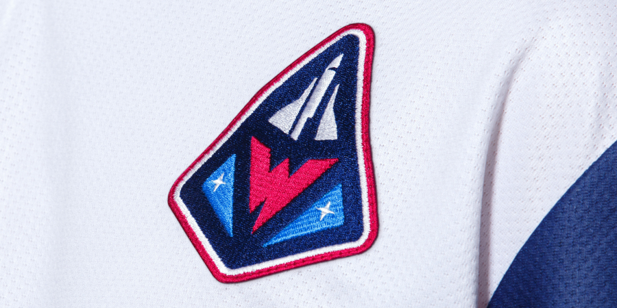
A recognizable symbol at the heart of the style
The concept of the logo is built around the image of a jet ski, a significant figure within water sports. The sign looks dynamic: it can be easily recognisable even in the moment as the athlete takes off into the air on the jet ski to perform a spectacular trick.
The monogram embedded in the emblem consists of the letters J and R. This sense of freedom within water sports needs to be represented with a flexible identity. Therefore, the ligature has several sub-versions and even handwriting, resembling graffiti and personal tags.


Special lettering expands the application area
The branded lettering and numbers repeat this energetic shape of the ligature, maintaining a rigid geometry and an angle of inclination of 65°. Despite this characteristic accident, the numbers are easily read from any distance.
JetRush also has an alternative lettering, which is conceptually identical to the aesthetics of graffiti bombing, but is made in a more freestyle form. It focuses on the fan segment of the brand: merchandise, various variants of informal media, elements of the festival infrastructure.


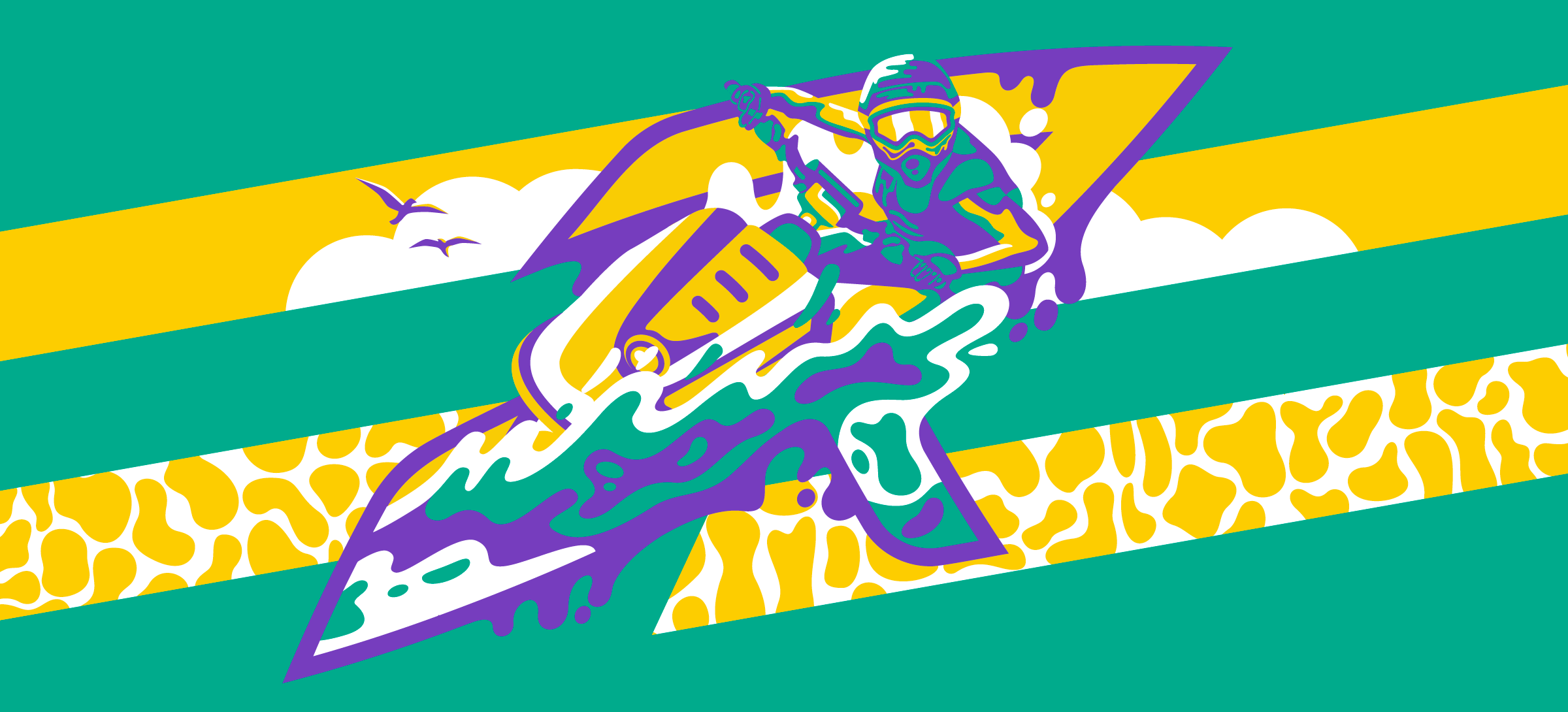
Summer vibes through the color palette
Coming up with a visual component of a brand from scratch is both an interesting and difficult task, because there’s a lot of room for choosing new and unusual combinations.
We have created an energetic and contrasting palette that develops the «summer mood» of the identity. The bright color code will not only allow JetRush to attract attention, but also to mimic various festivals and events.


Patterns in the spirit of the West Coast
The nature of the graphics is based on the basic details of the identity. Conceptually, it continues this water sports theme, and the variety of geometric solutions is borrowed from the physical properties of water: caustics, ripples, wave interference.
Various variations of background patterns can also be obtained by large-scale framing of elements of alternative lettering, visually similar to dynamic waves and splashes.