FC Chelyabinsk: a new direction for historic symbols
The club was founded in 1977. In its first decade, the team played under the name Strela (“Arrow”), and during the 1990s and 2000s — as Zenit. Under the Zenit name, the team made it to the professional level and competed in the First League. The name Zenit became iconic for the fans, which made it difficult for them to accept the club’s new name — Chelyabinsk — adopted in 2009.
Медиа:
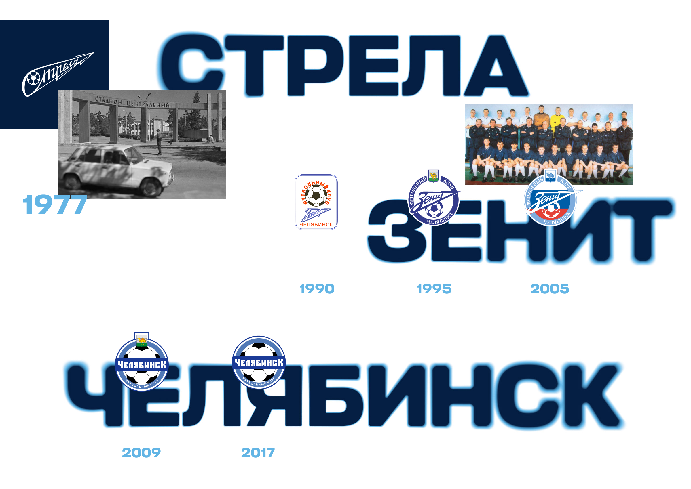
A new identity, developed by Quberten Studio, helped bridge this gap and reconnect the club with its traditions. The new branding carefully preserves historical symbols, giving them a modern interpretation. The refreshed style reflects Chelyabinsk’s drive to move forward — like an arrow — while its true strength remains in the unity of its people, and their love for the team and the city.
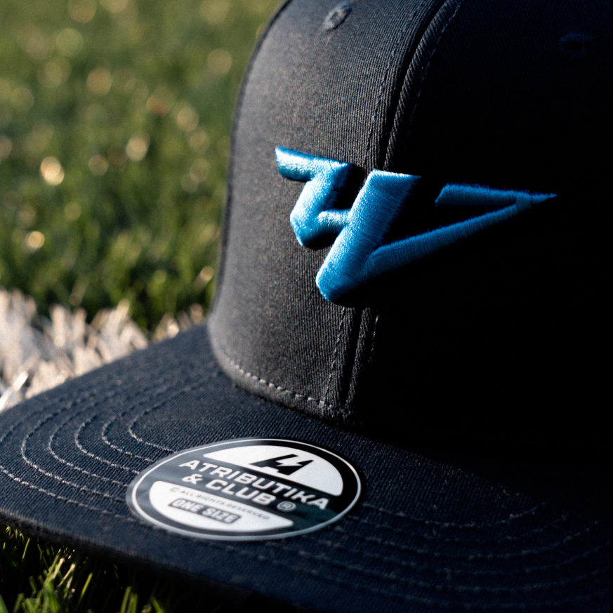
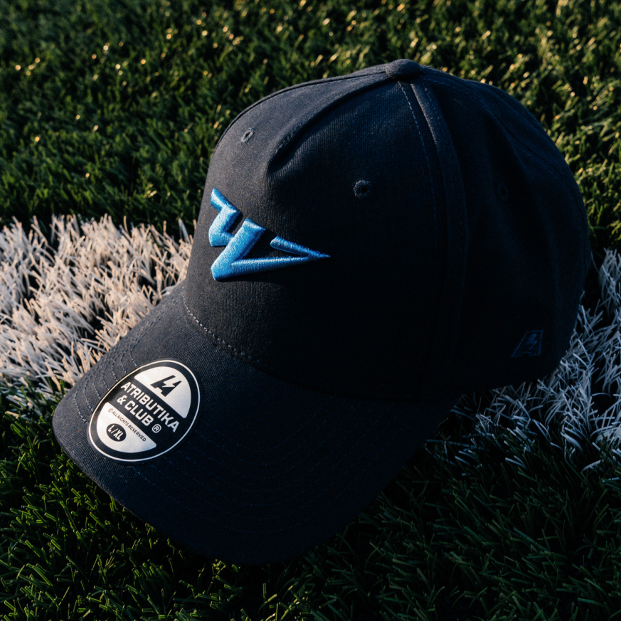
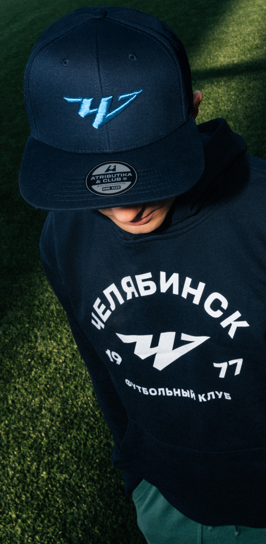
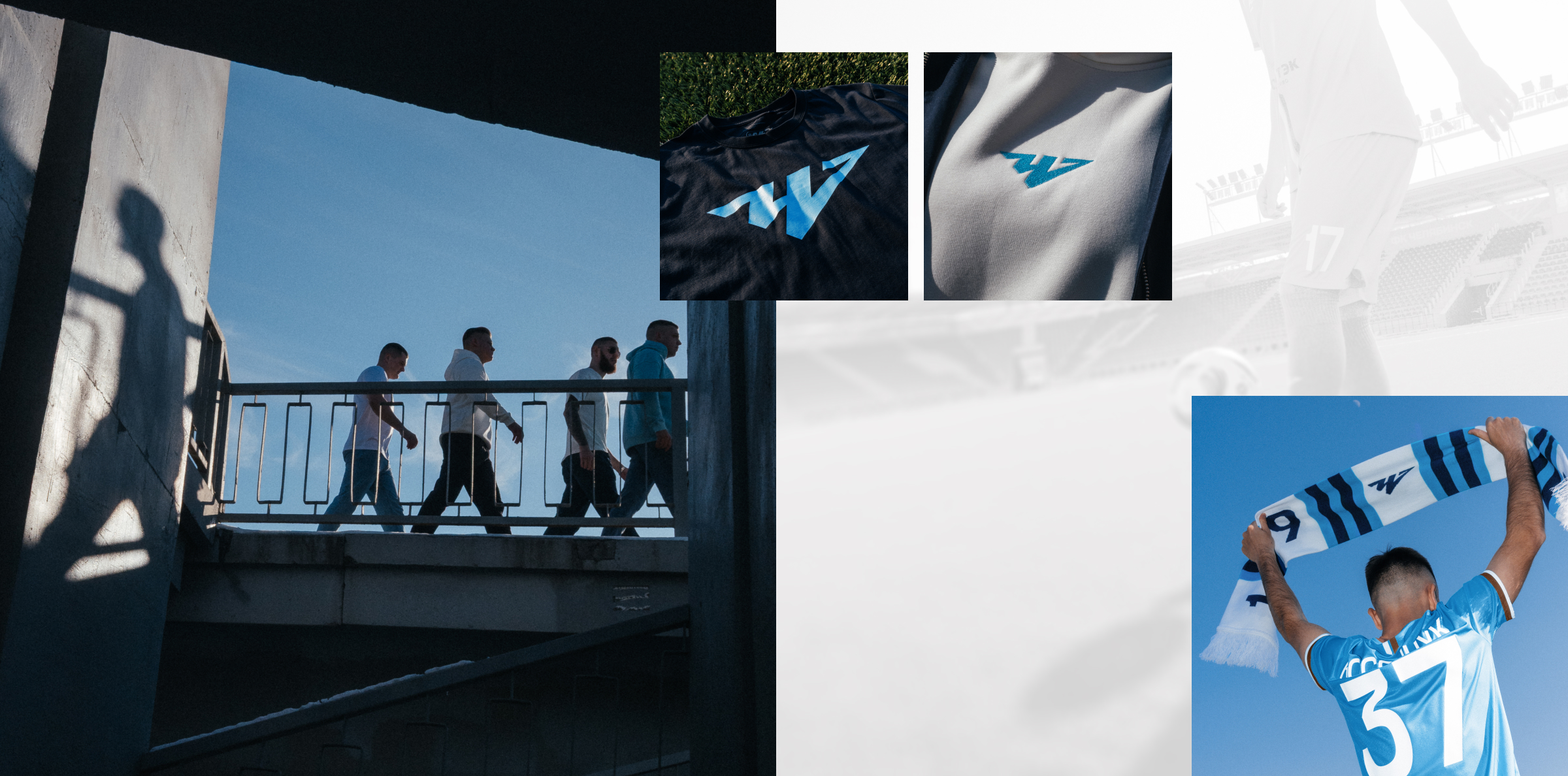
Logo
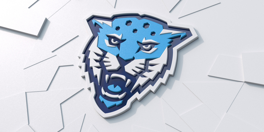
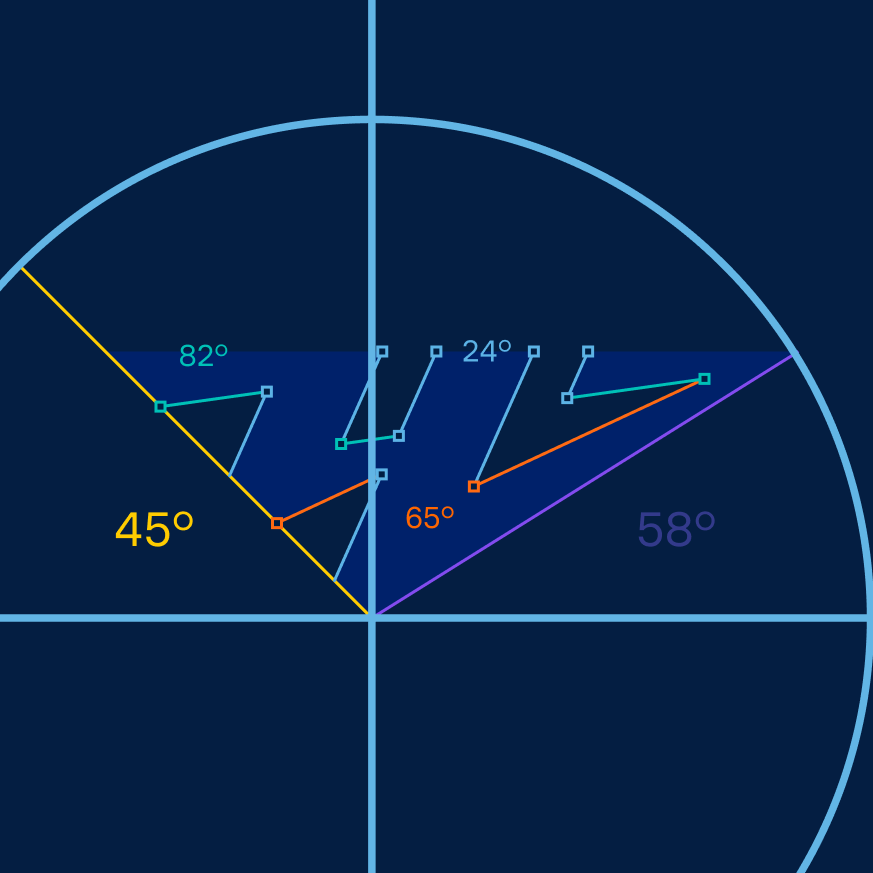
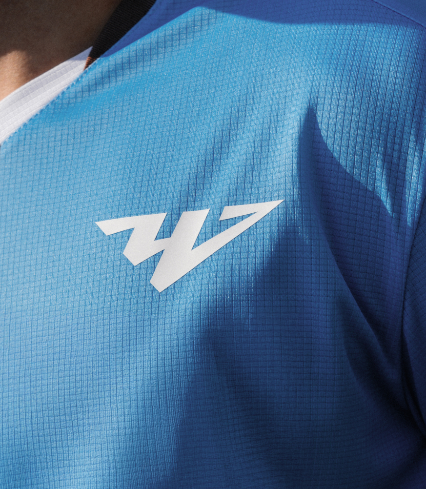
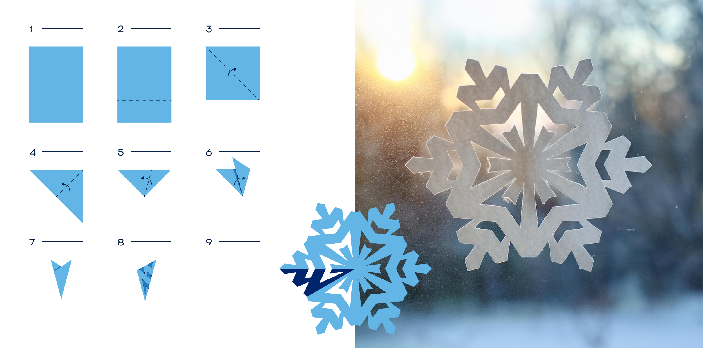
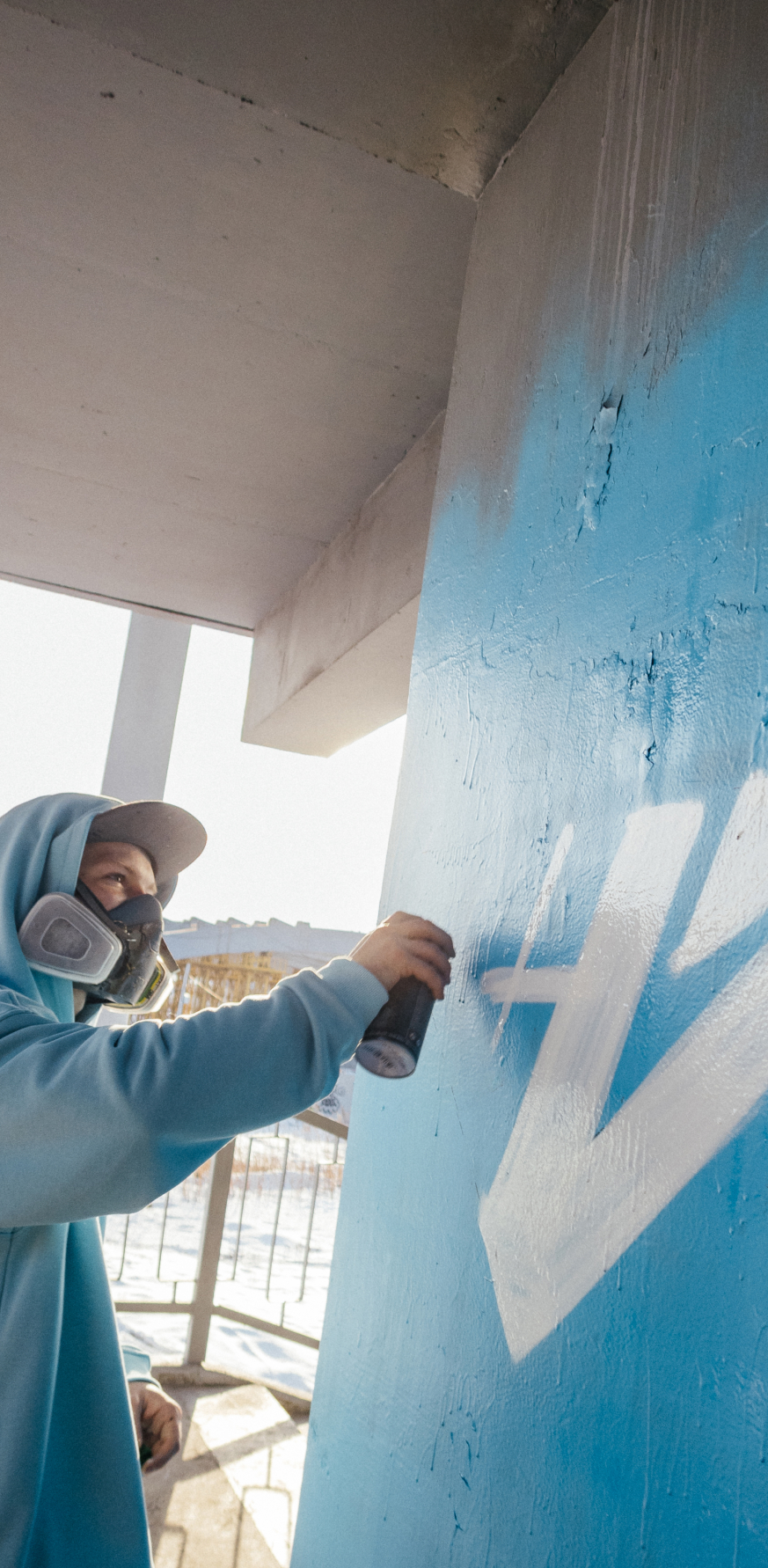
The logo design reimagines historical and cultural references. The form is based on the arrow symbol seen in earlier emblems. The triangular shape nods to the monument at Chelyabinsk’s city entrance, while the stylized letter “Ч” (Cyrillic) evokes a simplified silhouette of the camel from the city’s coat of arms.

Медиа:
Медиа:

Медиа:

Typography
The custom typeface is a modern variable grotesque with a strong character. It ensures excellent legibility across both print and digital environments.

Медиа:

Медиа:
Медиа:
Заголовок:
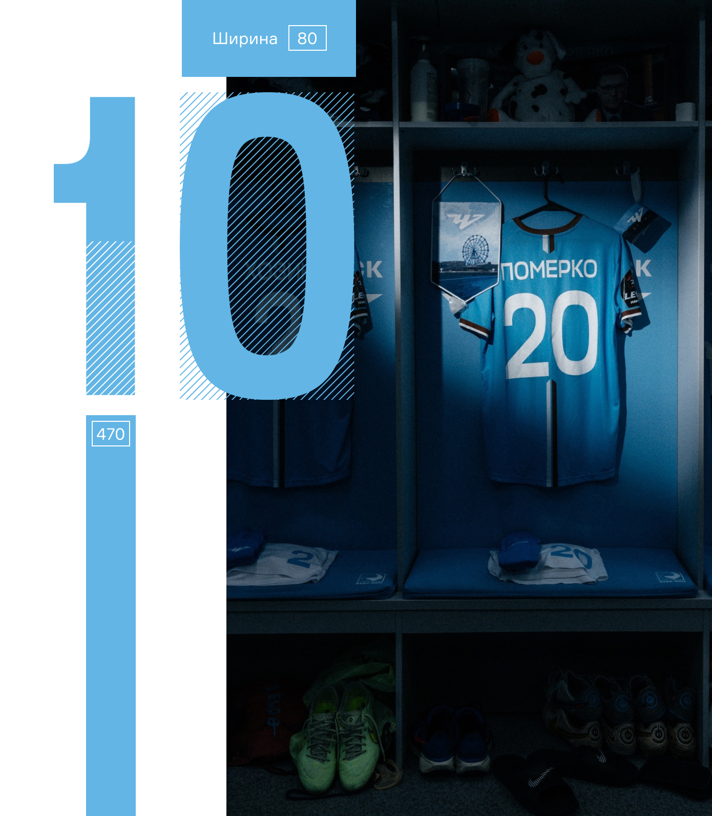
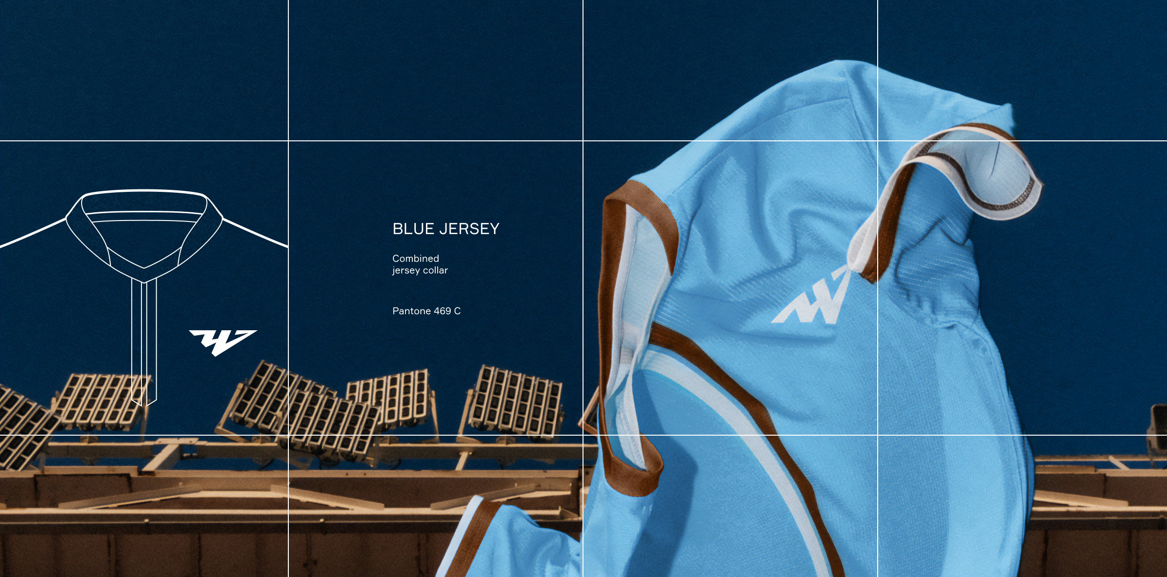
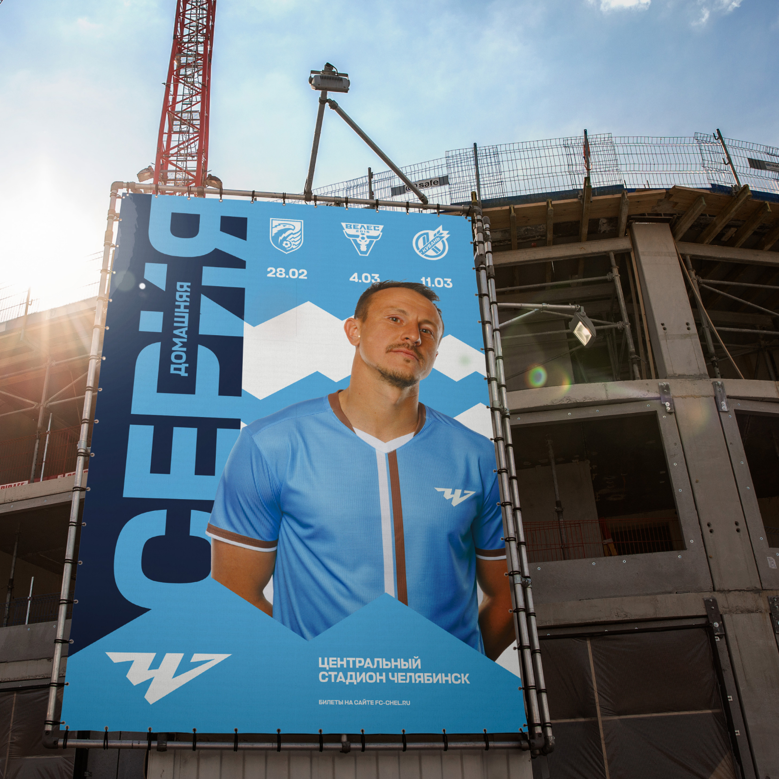
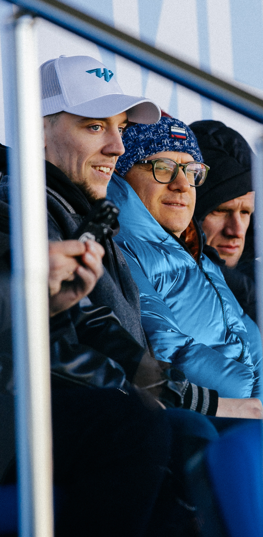
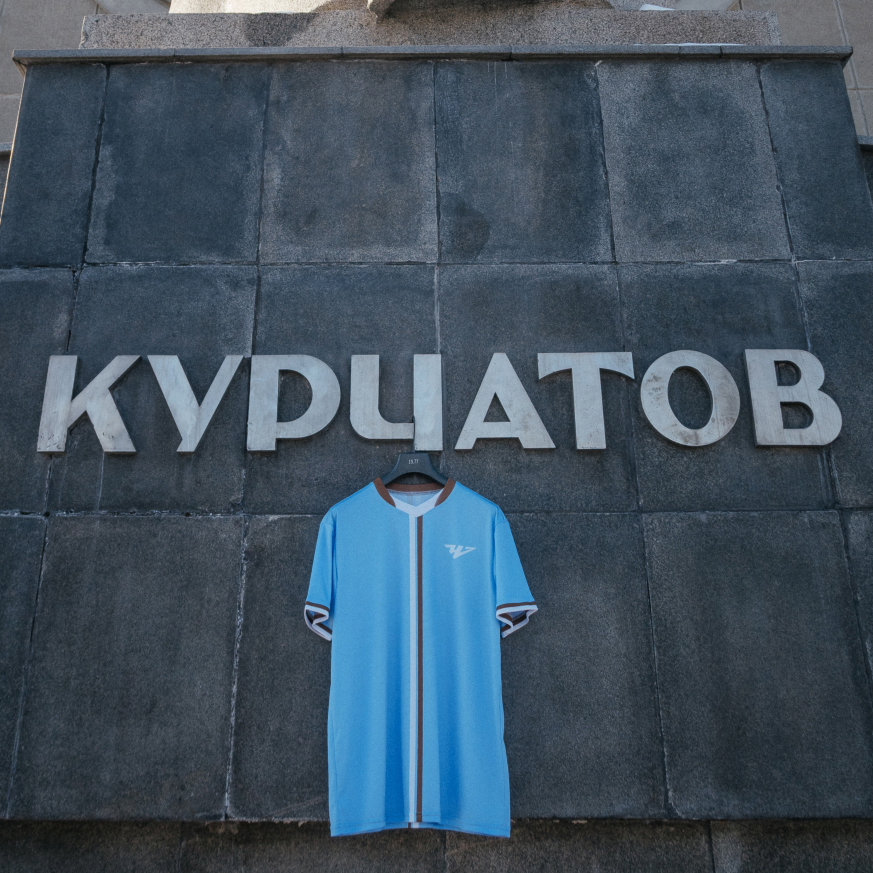
Kits
Текст:
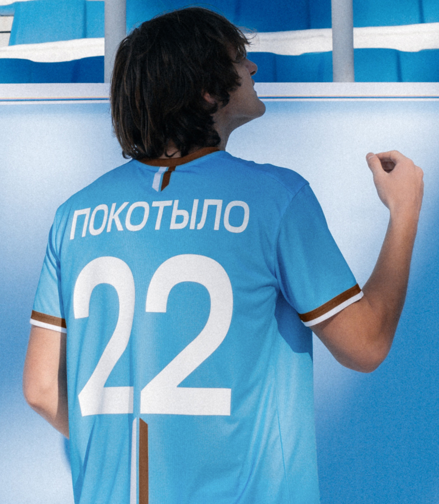
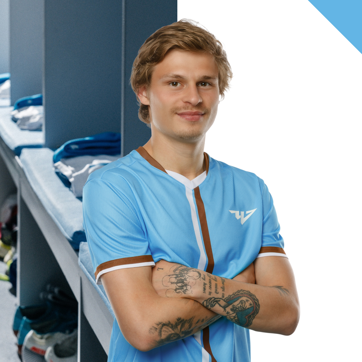
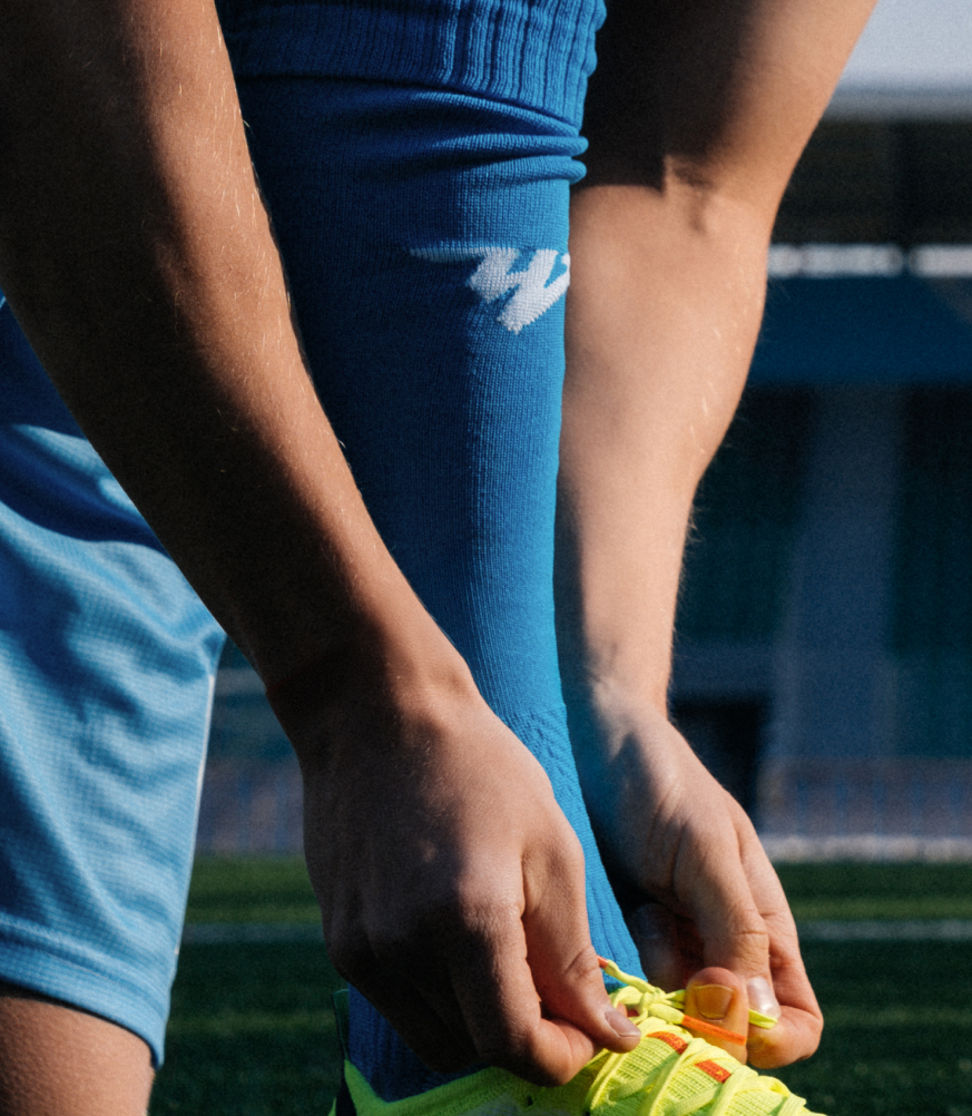
The kit design stands out for its minimalism and thoughtful detailing. The V-shaped collar is stylized as an arrow and echoes elements of the logo. White and brown stripes against an azure background create strong visual accents.
Медиа:
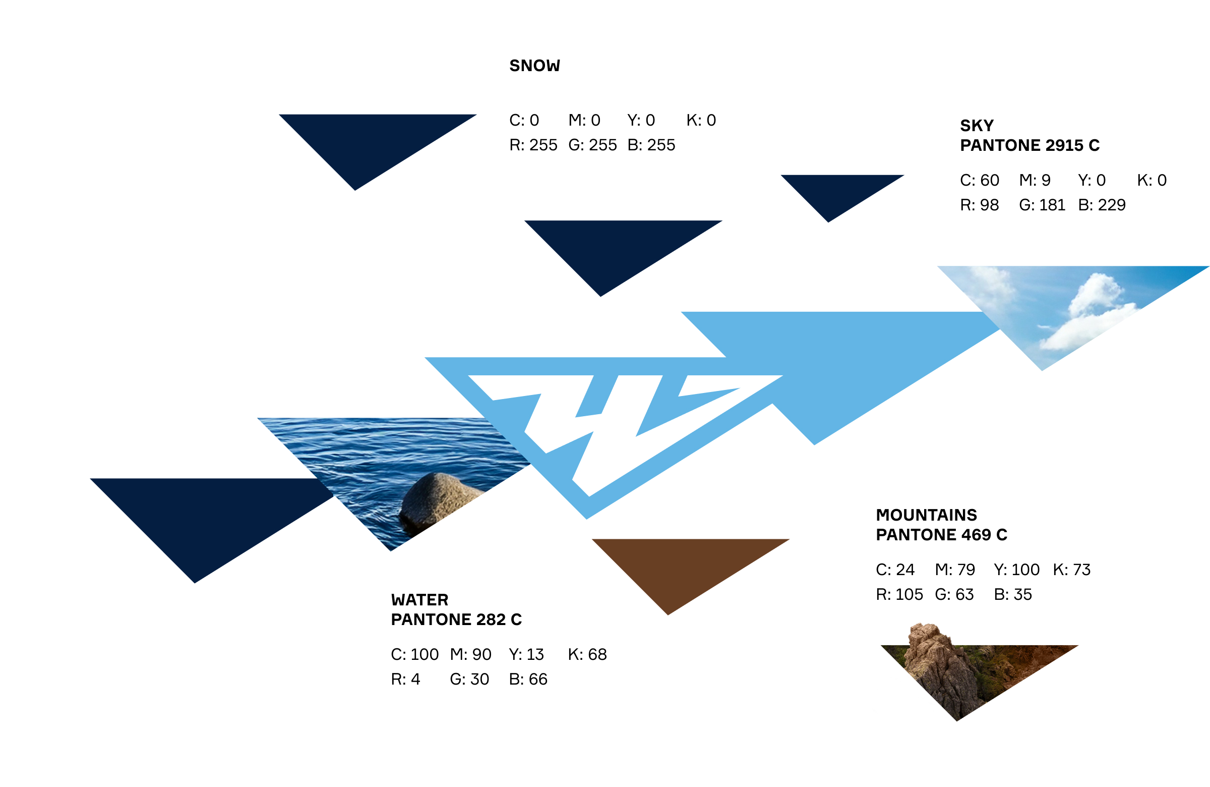
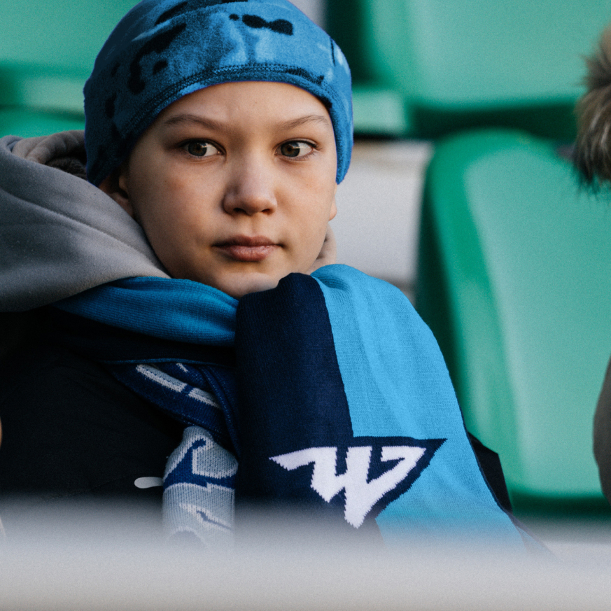
Colors
The club’s palette draws inspiration from the nature of the Urals. The white-and-blue tones are reminiscent of rivers, lakes, and the clear sky, while the accent brown color references the mountain ranges, cliffs, and the rugged landscapes of Taganay and Zyuratkul national parks.
Медиа:
Медиа:

Медиа:
Медиа:
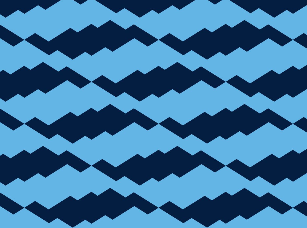
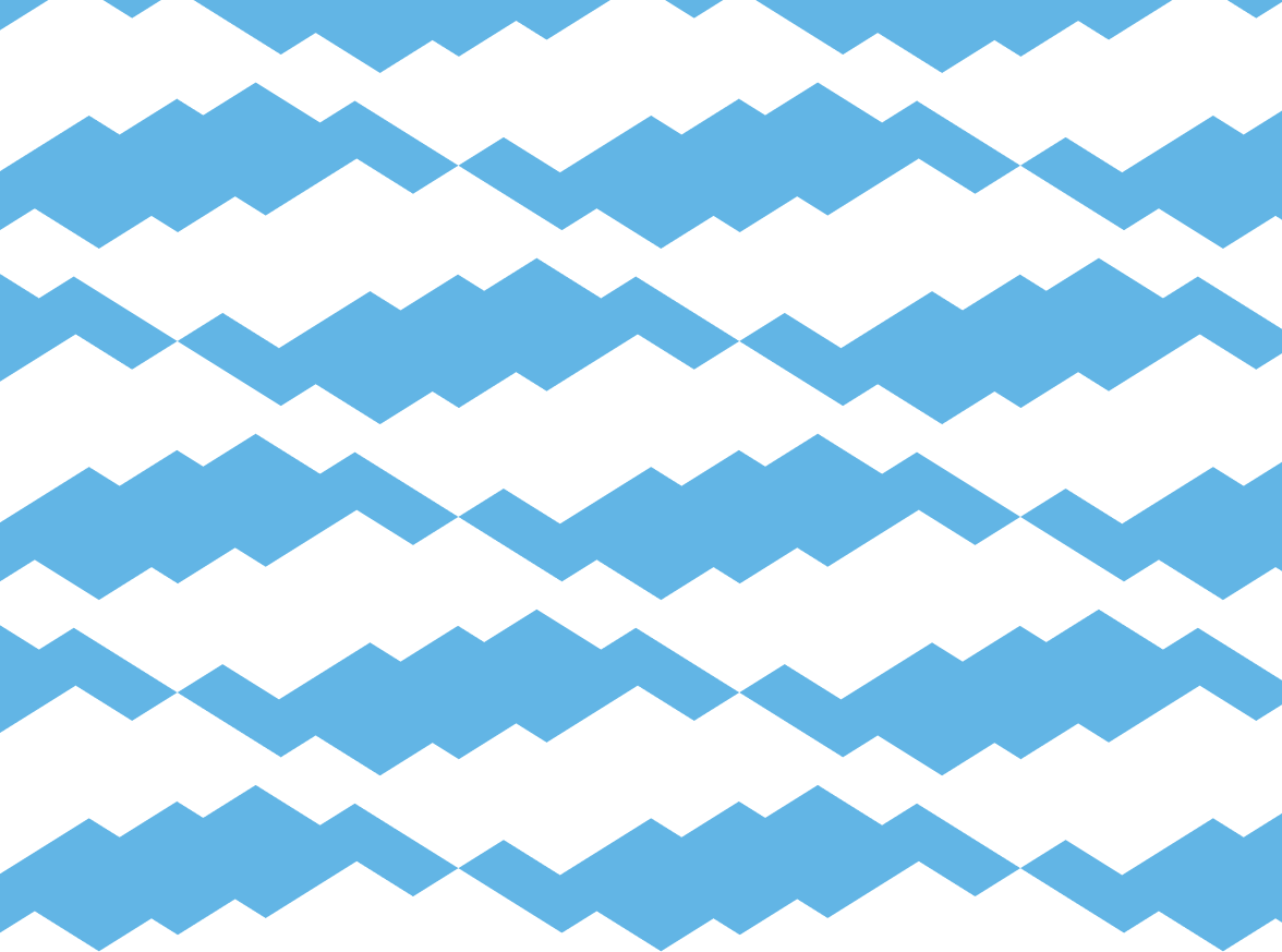
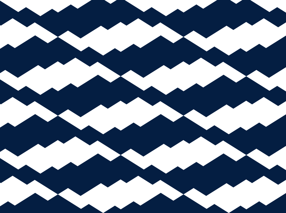
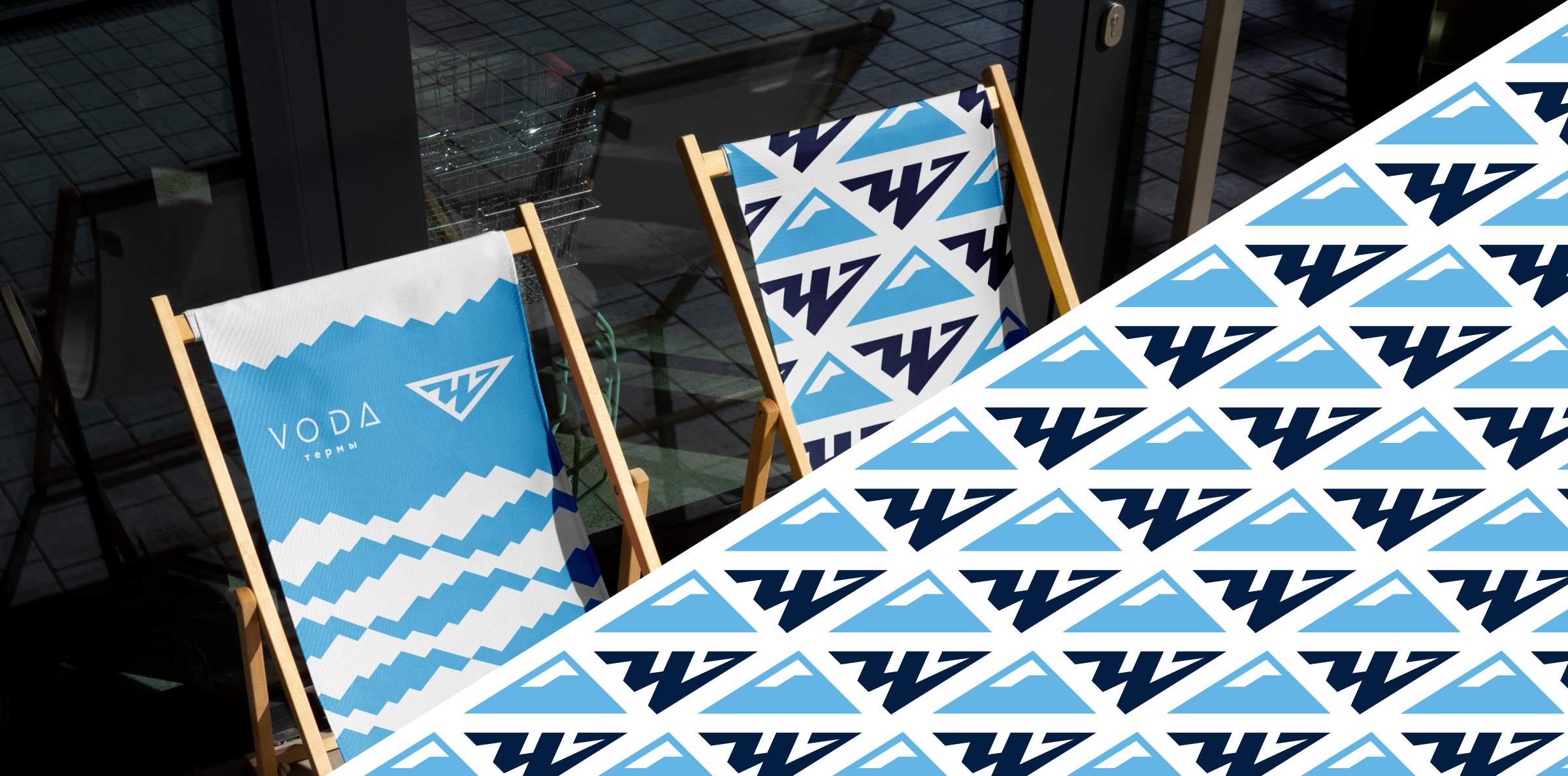
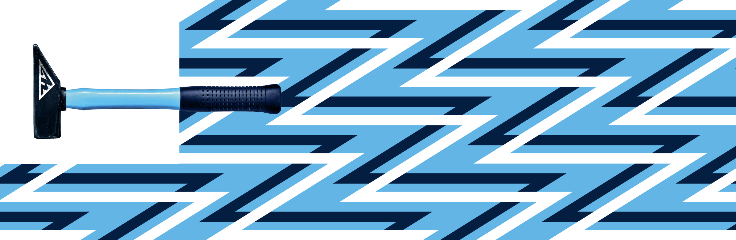
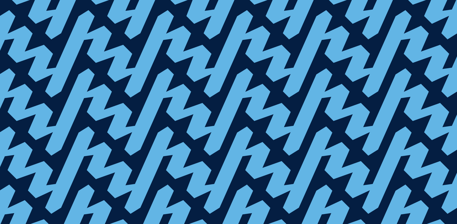
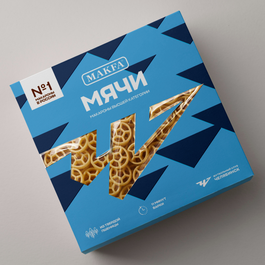
Patterns
The patterns continue the identity’s core themes: nature, sports, the club’s history, and its bond with the city.
The “Waves” pattern, built from signature angles, imitates ripples on water and evokes the Miass River and lakes like Turgoyak and Zyuratkul. The “Mountains” pattern combines the logo’s central element with stylized mountain scenery.
A pattern of small, evenly spaced arrows reinterprets the club’s traditional symbolism, while a zigzagging dynamic pattern “rhymes” visually with the shape of the “Ч” (Cyrillic) in the logo. Both patterns are constructed using the same signature angles, reinforcing a sense of visual unity.
Медиа:
Медиа:
Медиа:
Медиа:
Медиа:
Медиа:
Медиа:
Медиа:
Медиа: