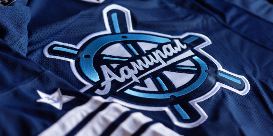
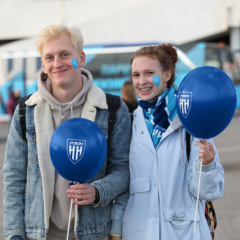
Raise shields. FC Pari NN identity
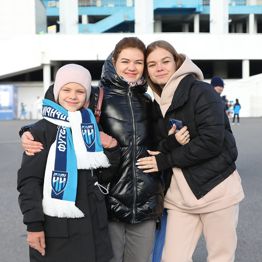
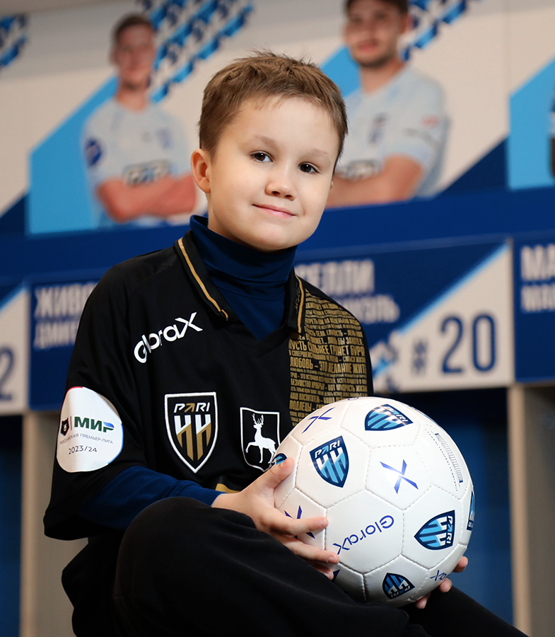
Founded in 2015, the football club from Nizhny Novgorod is relatively young in the russian football. The team has recently started its second season in the Premier League with a new sponsor and a new name: PARI Nizhny Novgorod. The club has quickly become a noticeable player on the Russian football stage, making headlines with the signing of new players and posing a formidable challenge on the pitch to its more established rivals. Ahead of the third season, the club underwent a subtle rebranding, including the creation of graphic style guides to maintain a consistent image.
Медиа:
Медиа:
Медиа:
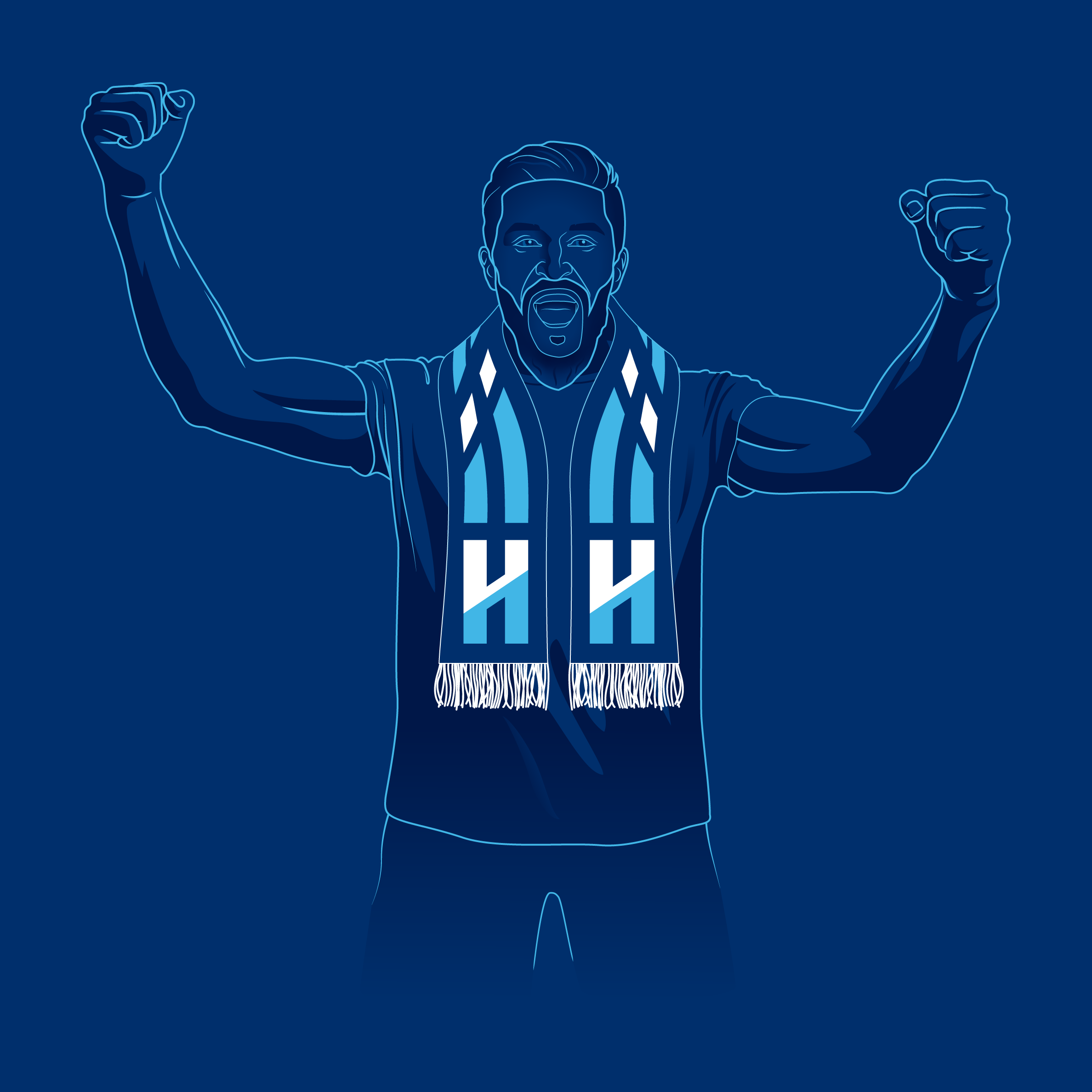
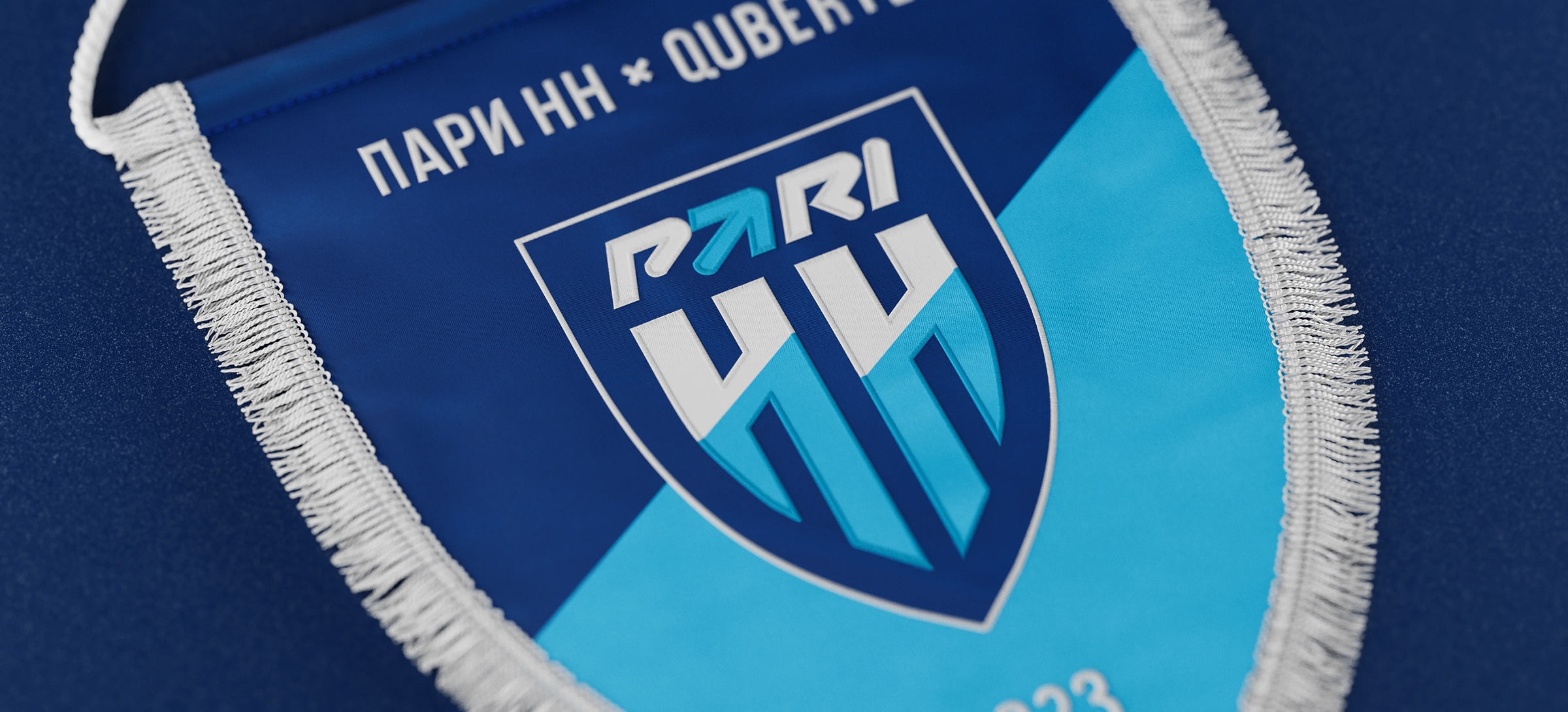
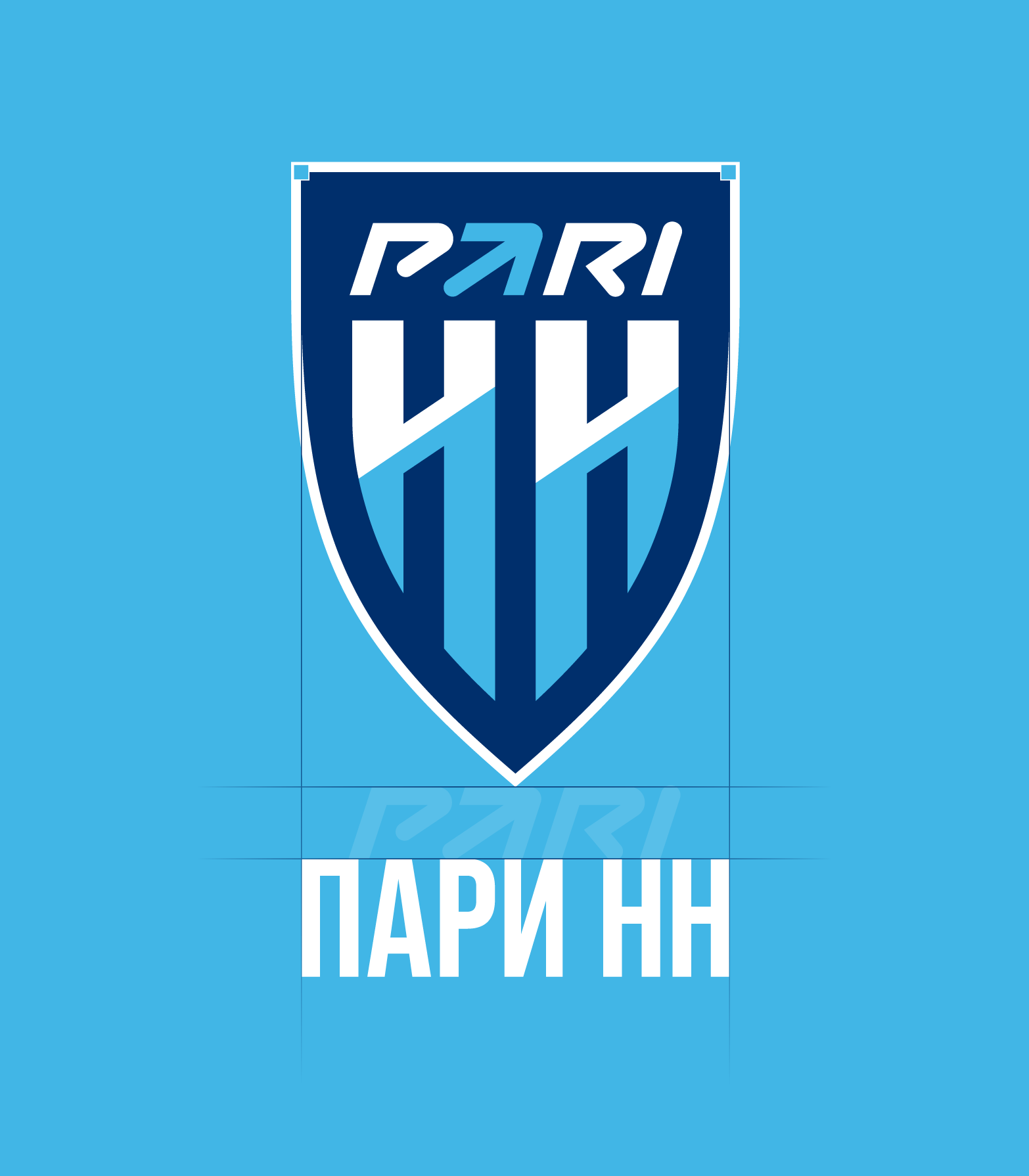
Logo
The new construction is characterized by clear angles and a geometric rhythm of vertical elements. The logo has been visually simplified, with the letters «НН» more seamlessly integrated into the shield, which now repeats the shape of the frame. In the updated version of the mark, the PARI partner logo has been given a prominent position. For digital environments, a simpler logo is preferred — a shield divided diagonally — which remains recognizable without any lettering.
Медиа:

Медиа:
Заголовок:
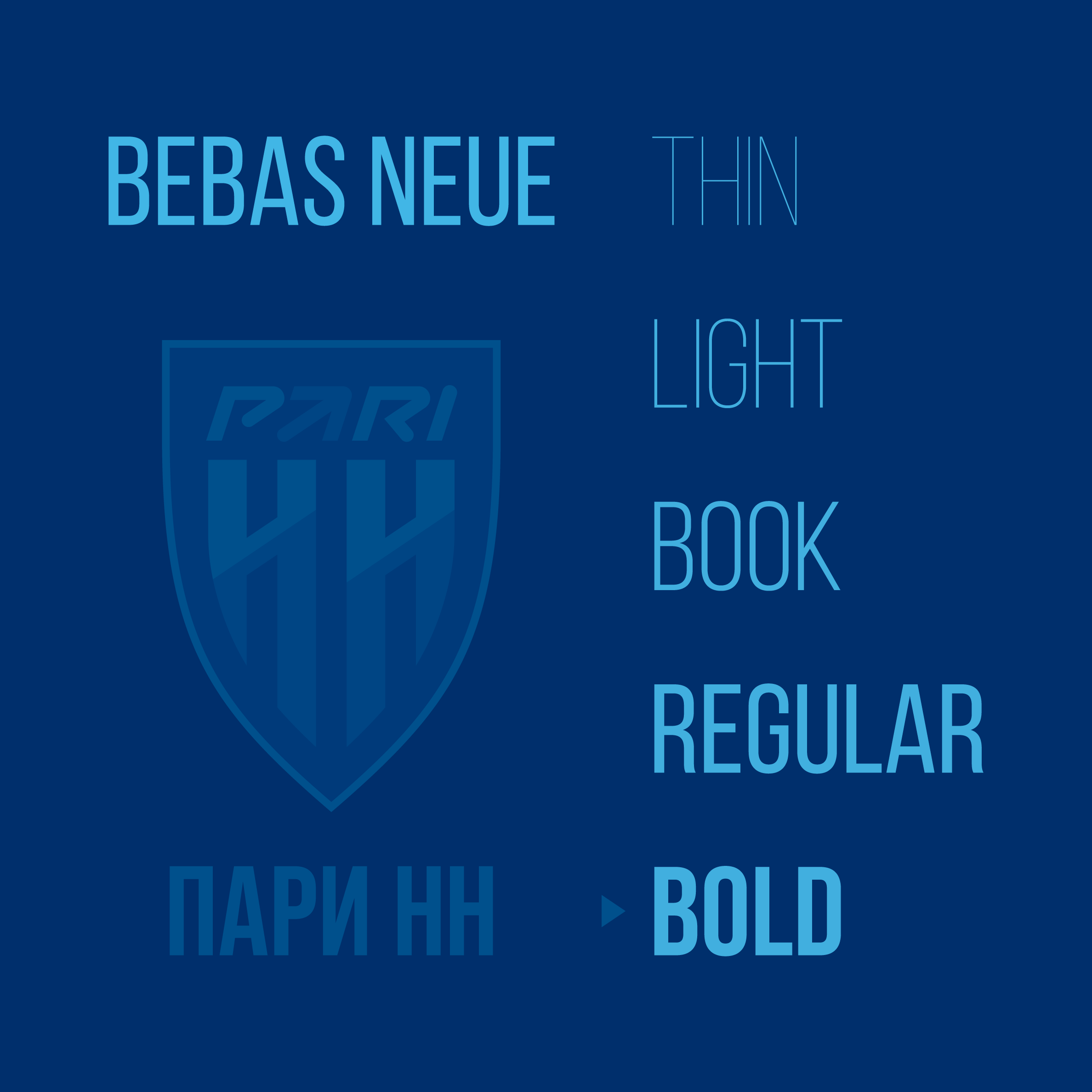
Signature font
Текст:
Bebas Neue was suggested as the primary font for website design, headers, and social media marketing. The elongated proportions of the typefaces characters in Bebas Neue are identical to the letters «H» in the logo. If there is a need to design a large amount of text, other styles of the same font family can be used, such as Bebas Neue Pro Regular and Bebas Neue Pro Exp Book.
Медиа:
Заголовок:
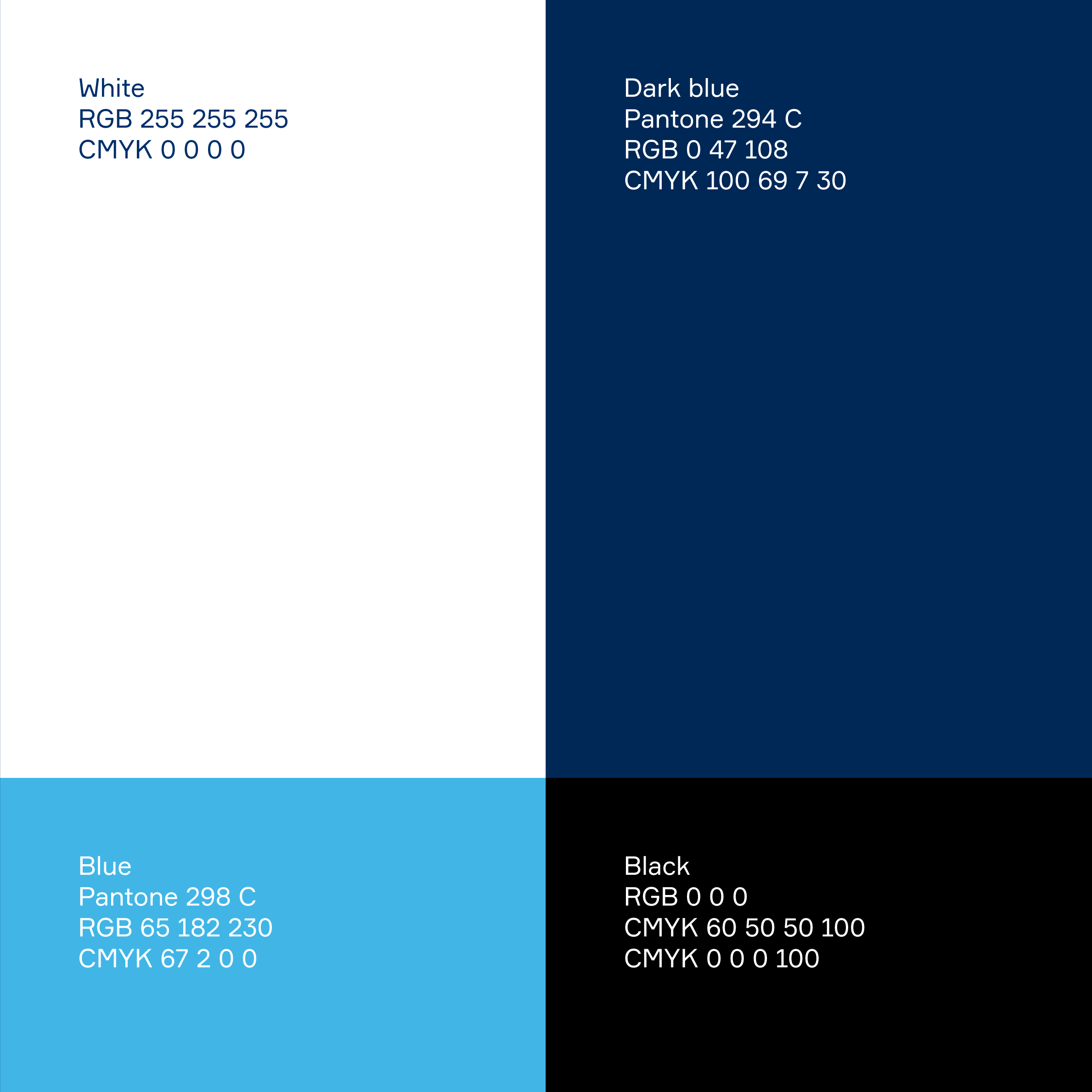
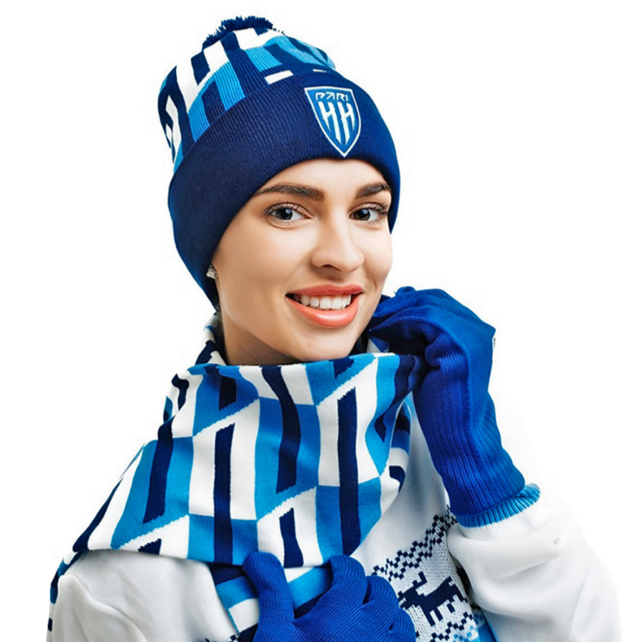
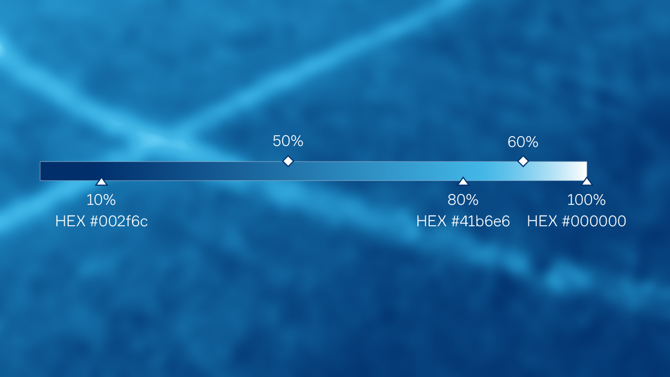
Color palette
Текст:
The club’s signature colors have been updated to a rich deep blue (294C) and a lighter shade of blue (298C), replacing outdated Pantone color models. The updated palette is accompanied by the use of black for extra kits and club activations.
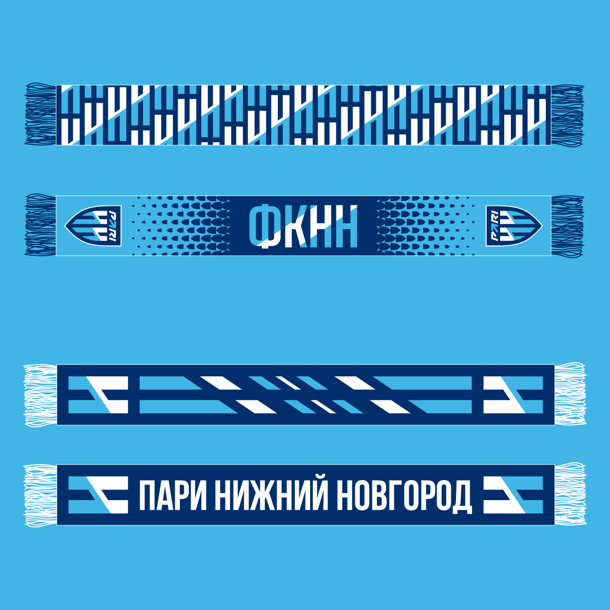
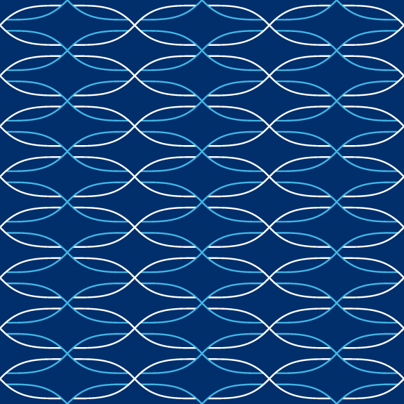
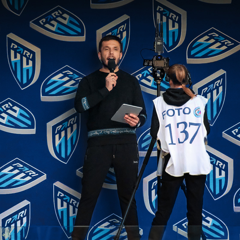
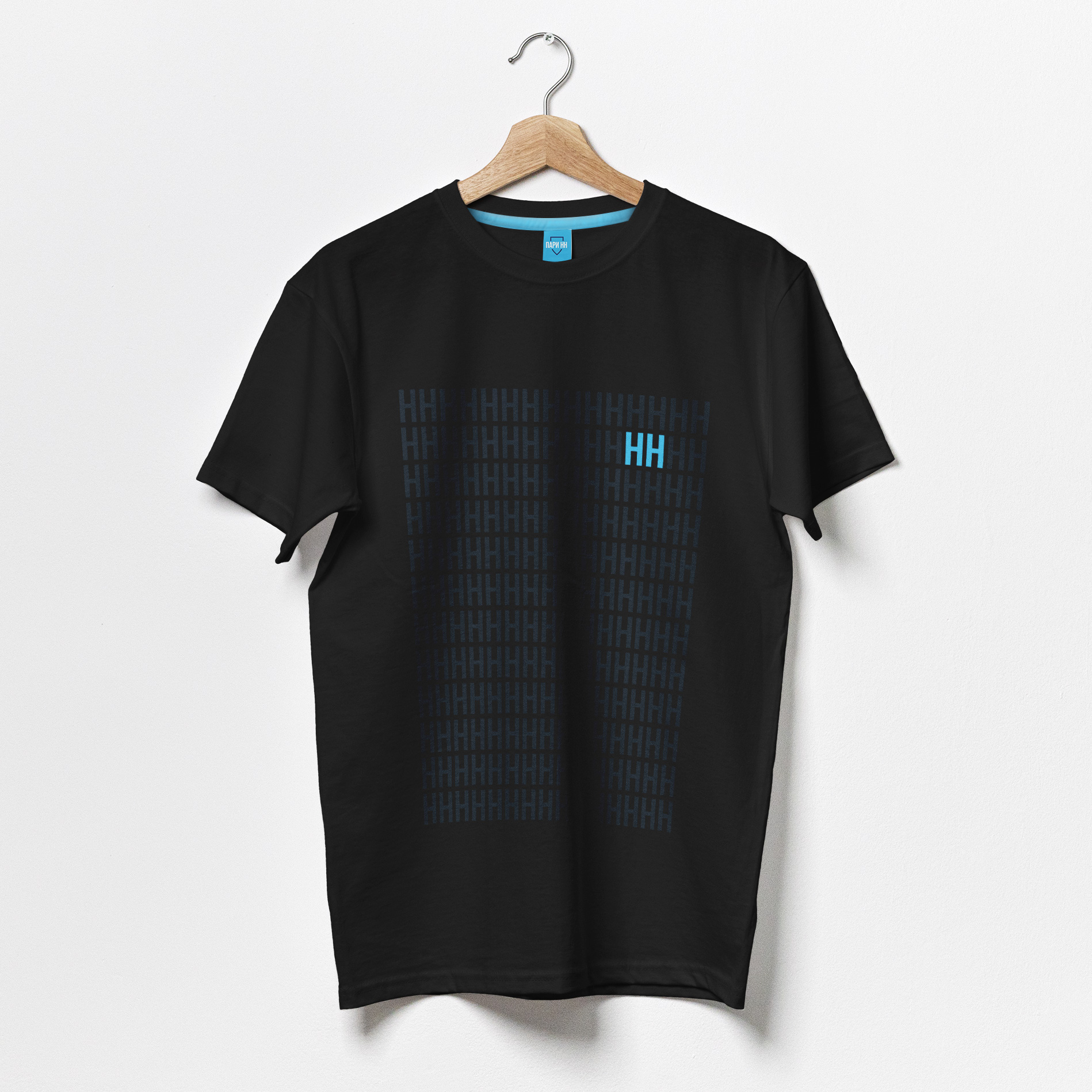
Patterns
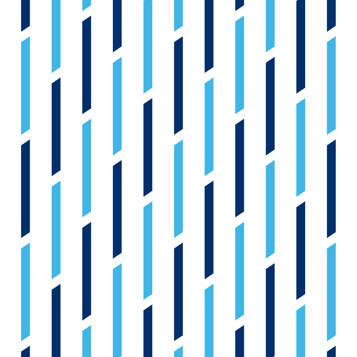
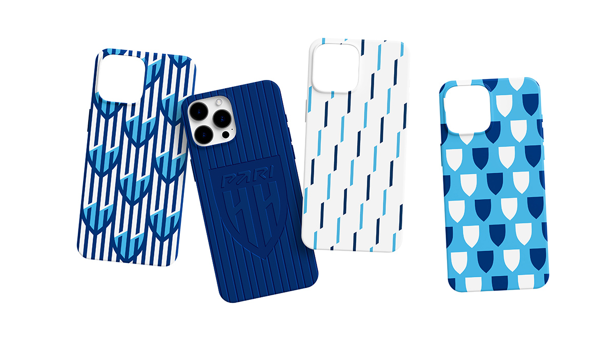
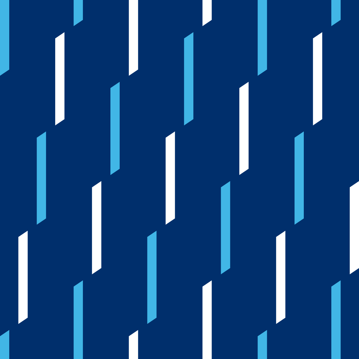
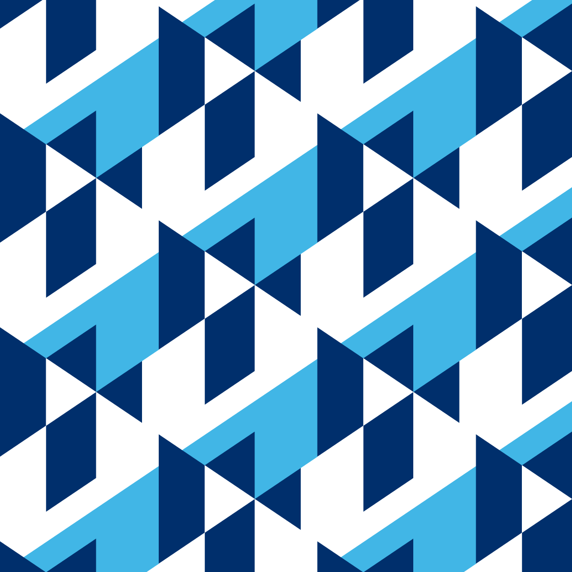
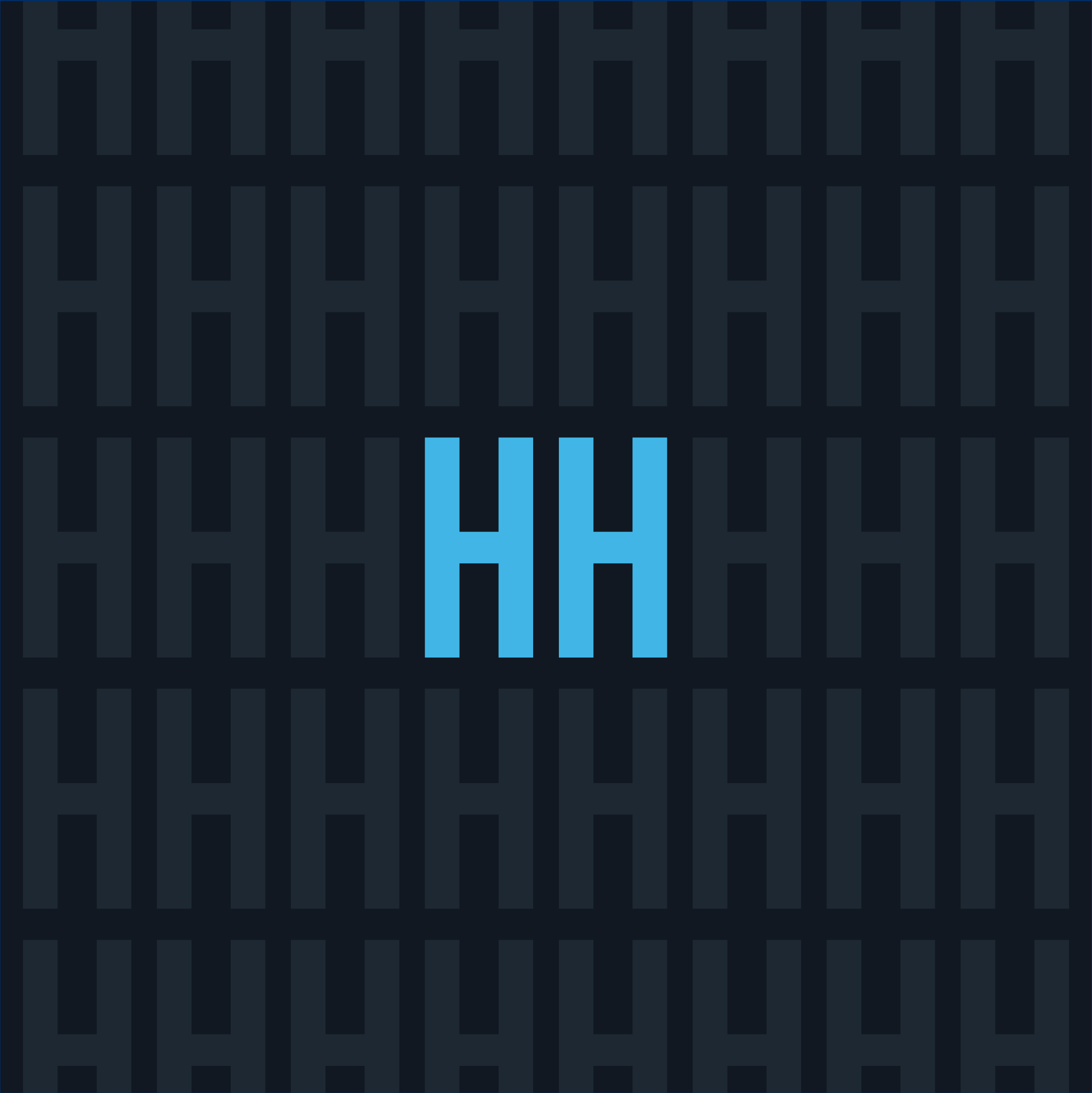
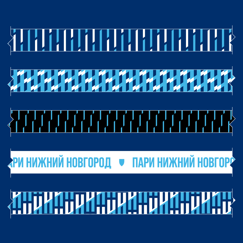
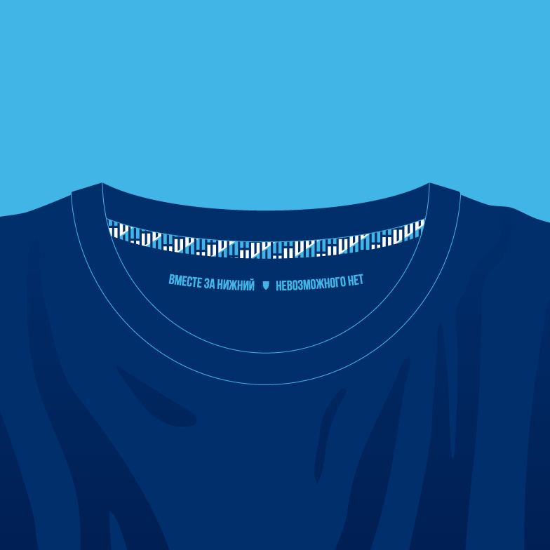
The signature patterns have a unique style that incorporates variations of patterns. The primary design elements of ornaments are the letters «HH» and a shield that creates a chainmail weave. Additionally, the design includes geometric references to urban areas and ’digital glitches’. The four-stripe system used to construct the HH letters can be a special feature in designing club merchandise, souvenirs, and apparel. One of the patterns repeats the fan wave seen in the stands of the 45,000-seat Nizhny Novgorod stadium. The other designs pay tribute to local painting schools and folk crafts of the region.
Медиа:
Медиа:
Медиа:
Медиа:
Медиа:

Медиа:
Медиа:
Медиа:
Заголовок:
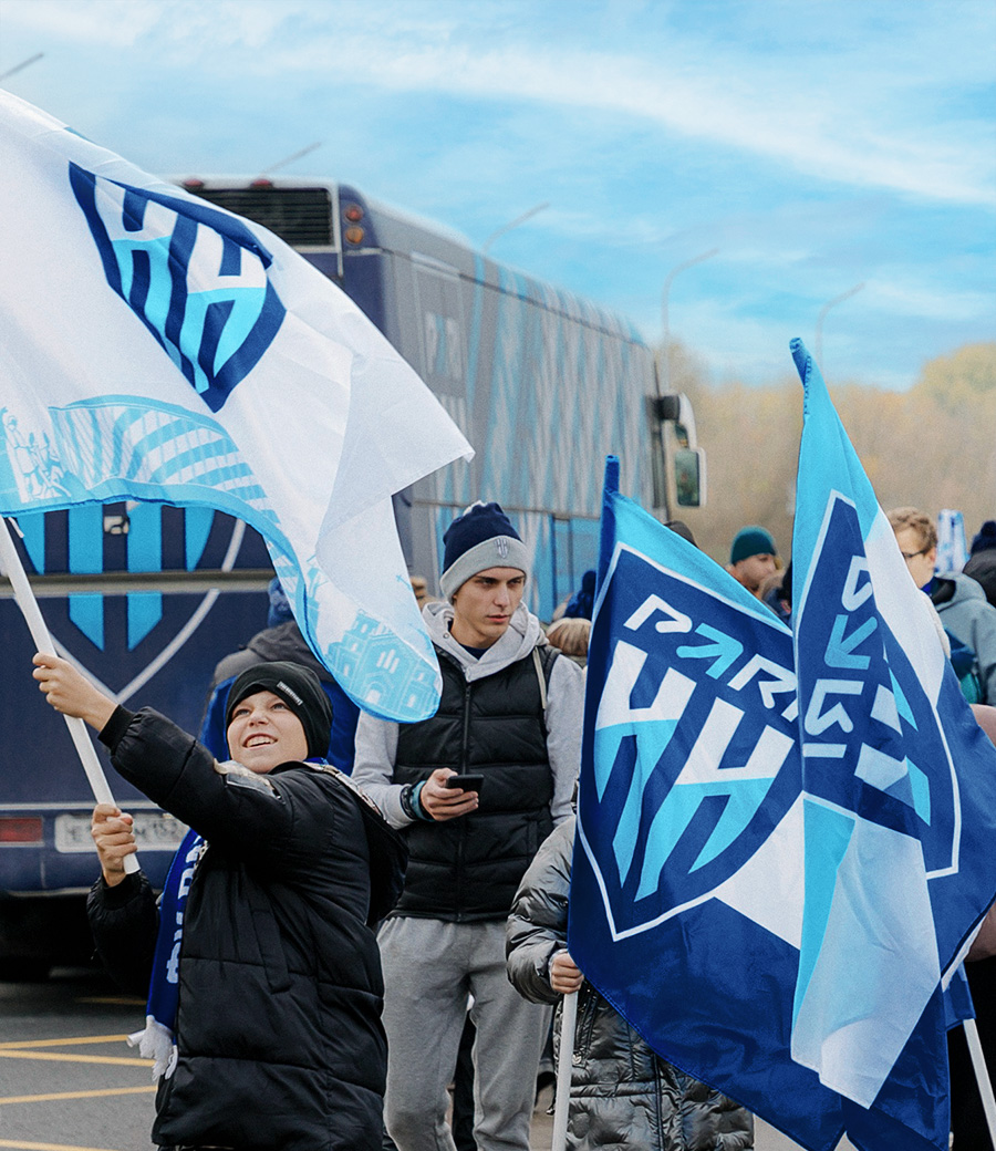
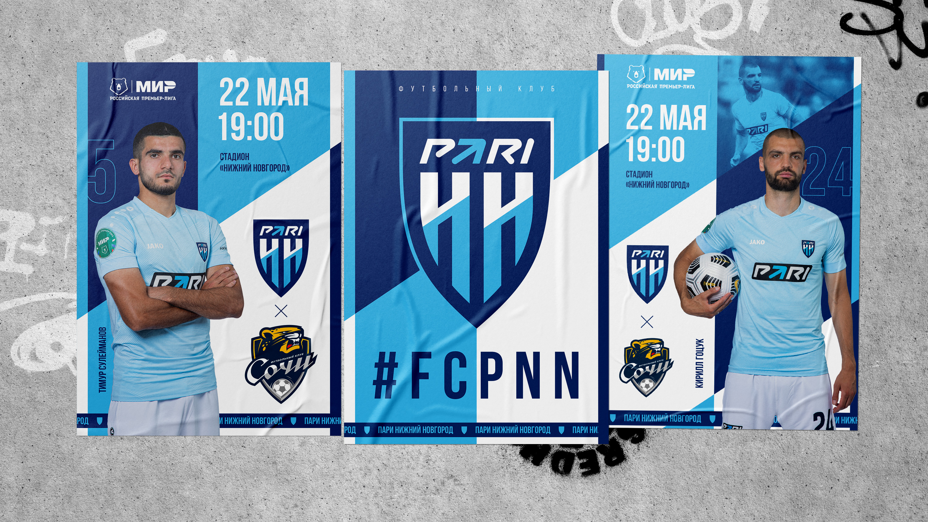
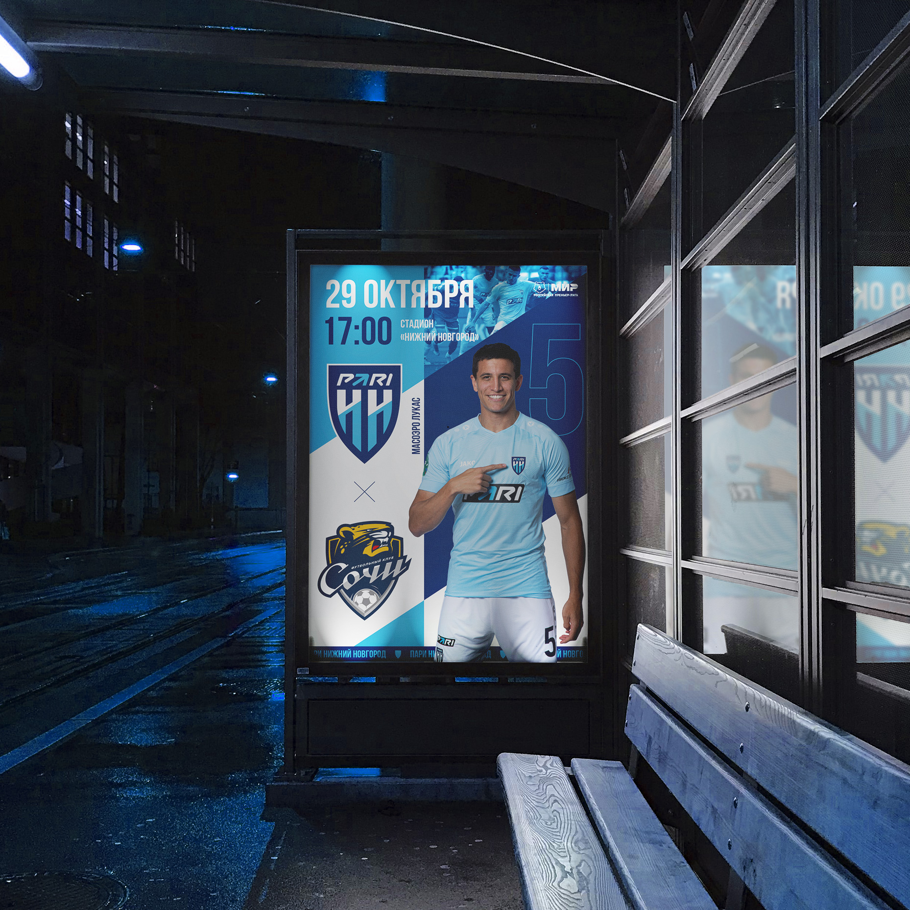
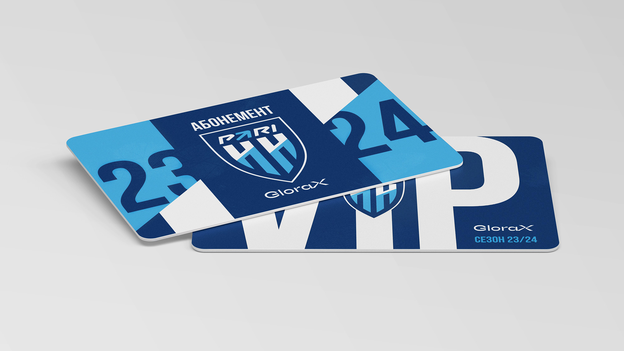
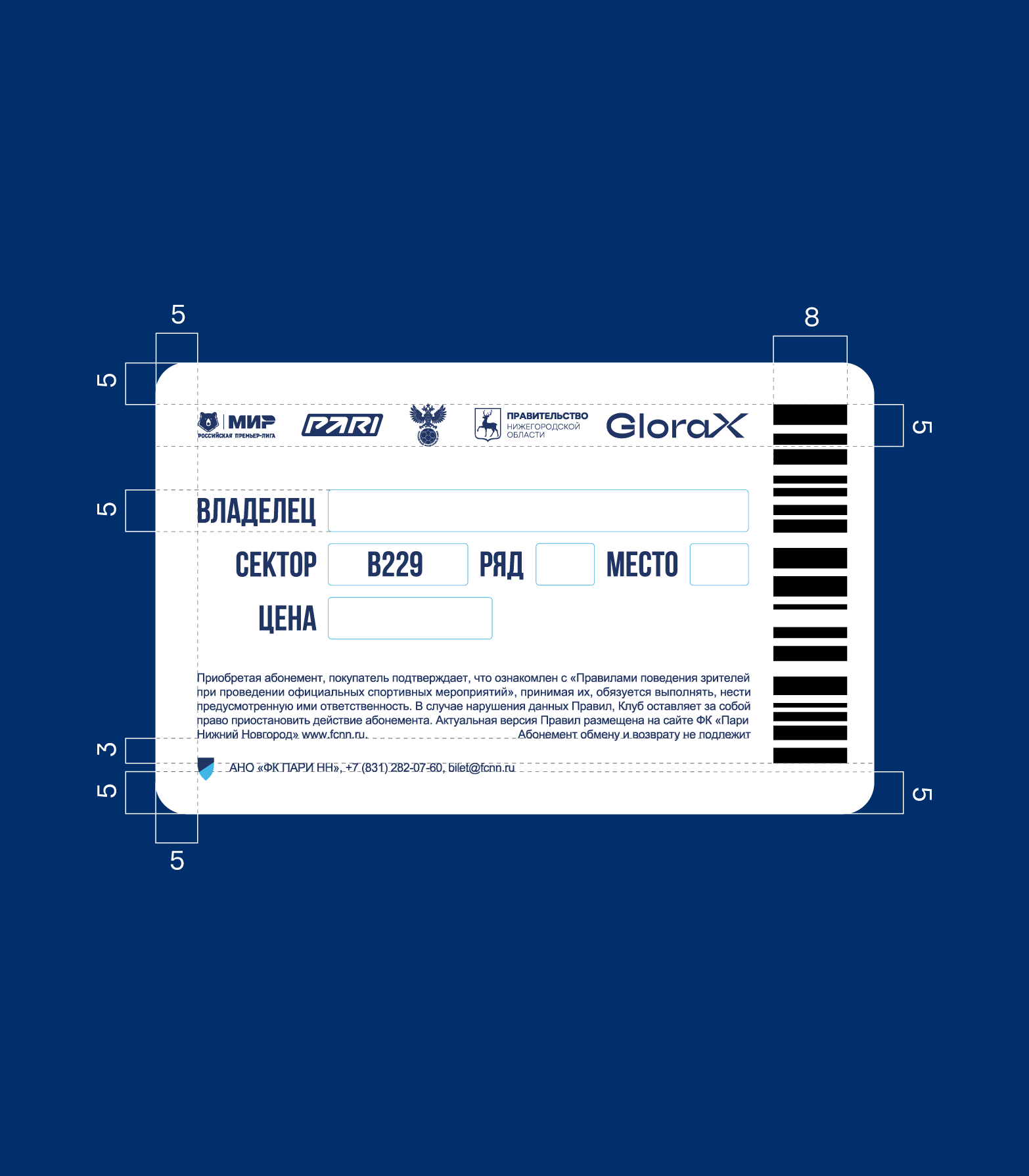
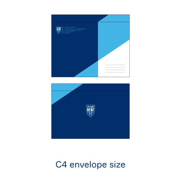
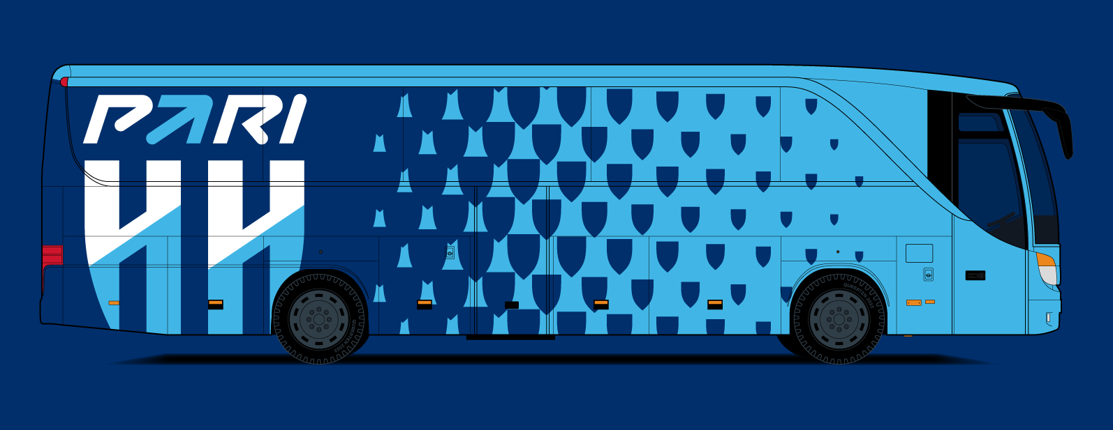
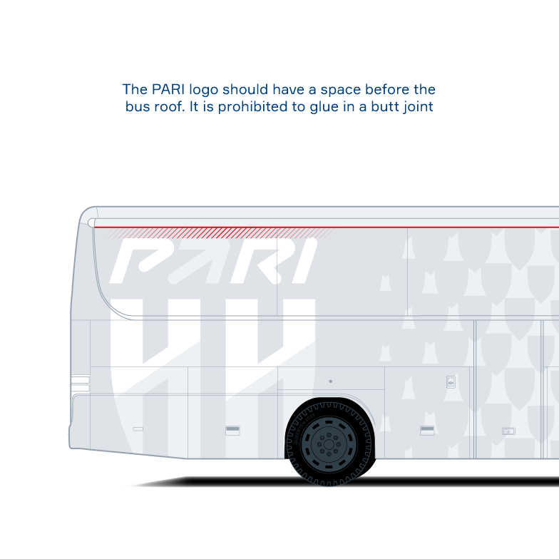
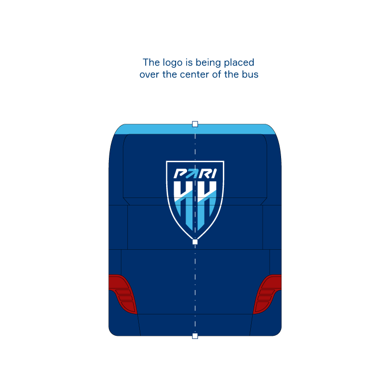
Outdoor carriers
Текст:
The design layouts for the club bus, home match posters and printing are also based on the geometry of the identity.
Медиа:
Медиа:

Медиа:
Медиа:
Медиа:

Медиа:
Заголовок:
Merchandise labels
Текст:
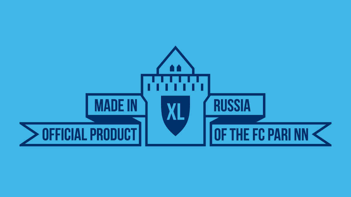
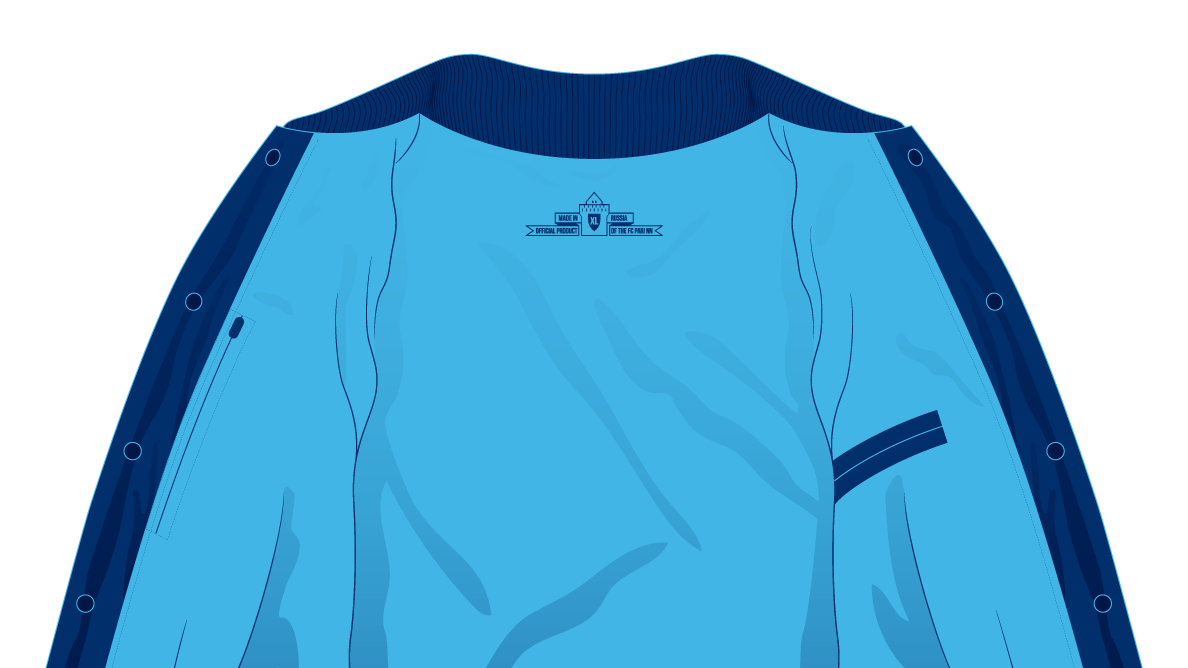
The shield can be used for both size marking and barcoding. One of the options for its placement is inside the tower of the Nizhny Novgorod Kremlin, a significant symbol of the city.
Медиа:
Медиа:
Медиа:
Медиа: