HC Norilsk. A Club That Embodies the Arctic Spirit
Everytime you hear the name Norilsk, coldness is probably the first thing that comes to your mind. Being one of the five northernmost cities in the world it is famous for severe frosts: Norilsk is located three hundred kilometers from the Arctic Circle. However Norilsk is more than just a place with a frigit climate — it’s also a place of hockey. Hockey has been a part of the city since 1943 when amateurs first started playing. By the end of the 50s, the sport had gained official status with the team called Zapolyarnik playing mainly in Division B. The club was disbanded and revived several times until it finally disappeared at the turn of the century. Nevertheless in the 2023/24 season, the hockey history in the «city of steelmakers» is going to continue with the new club Norilsk joining the VHL. To mark this big debut a new identity has been created for the team.
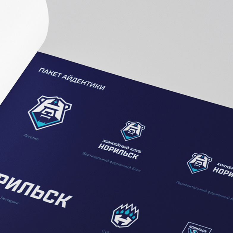
Logo
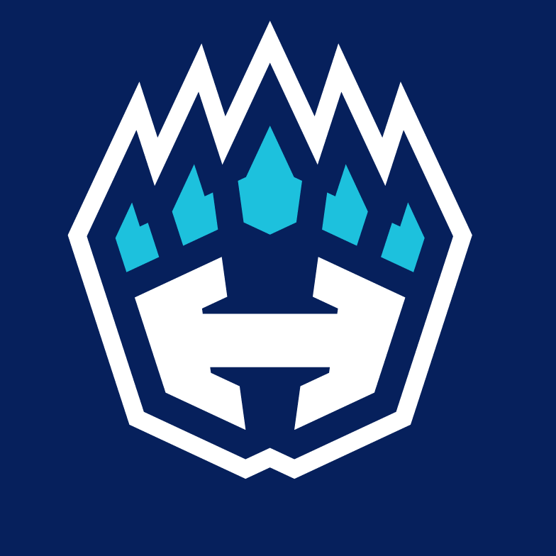
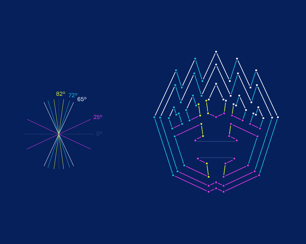
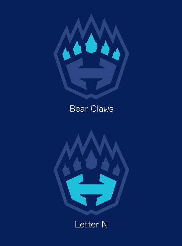
The main image of the new club is a polar bear, a symbol of the Arctic. The letter «N» (cyrillic «Н») is integrated into the logo representing the first letter of the team’s name. The logo has a futuristic look with the polar bear’s gaze hidden behind the visor of a helmet. The polar star at the top of the logo is another important symbol of the North. The design of the sign is based on the angles of 25°, 42°, 72°, and 90°.
Sublogo paw
The sublogotype is a stylized bear’s paw built on the same angles as the main logo of 25°, 72° with the addition of 65° and 82°. The claws not only reflect the region’s landscape features but also refer to the drilling tool.
Медиа:
Sublogo crest
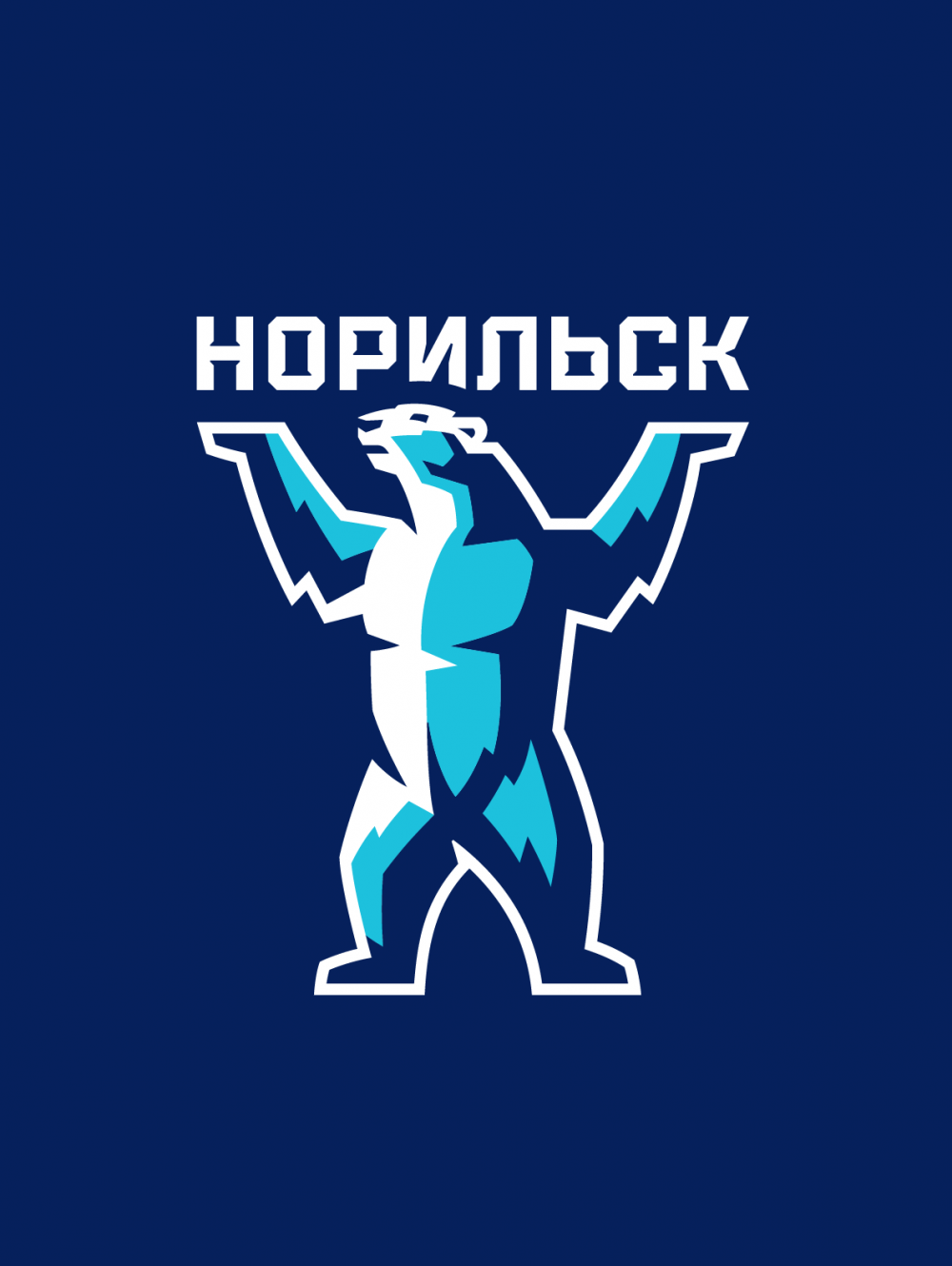
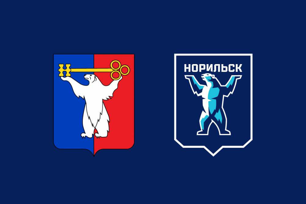
In a more sporty aesthetic on the coat of arms of the city an athletic bear holds above his head not a key, but the grand name of the city and the team.

Медиа:
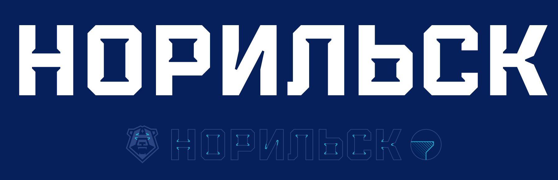
Wordmark
The branded lettering has balanced proportions and refers to the aesthetics of heavy industry. The letter «N» and other relevant letters of the name have compensators that provide even distribution of the ink, reminiscent of functional printing techniques from the past. The ink traps in the logo are identical to the construction in the inscription.
Медиа:
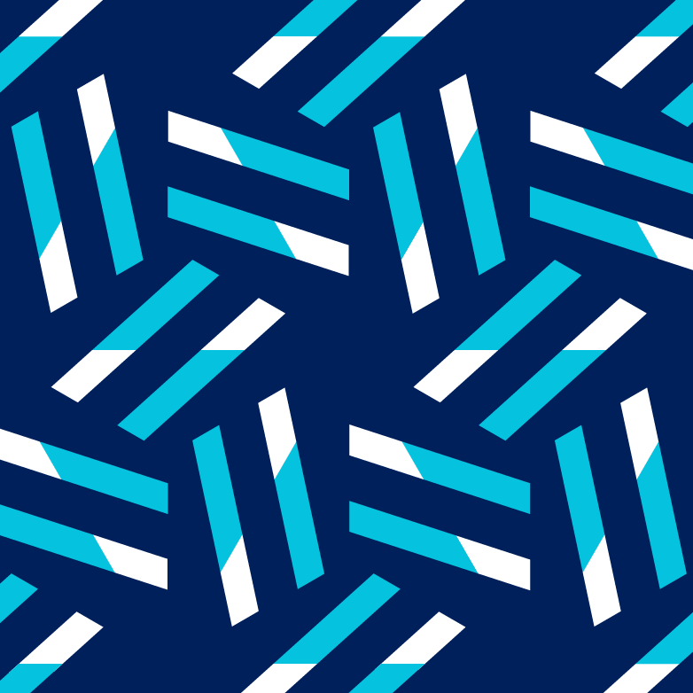
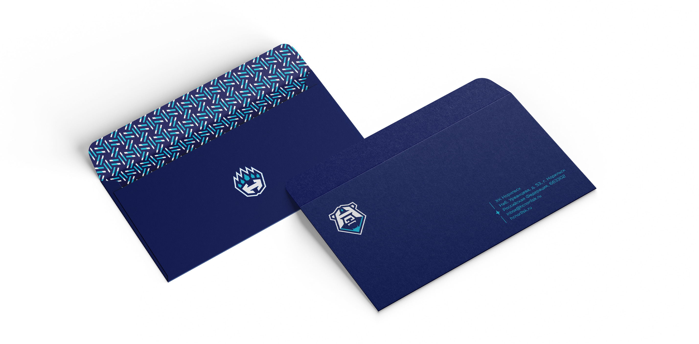
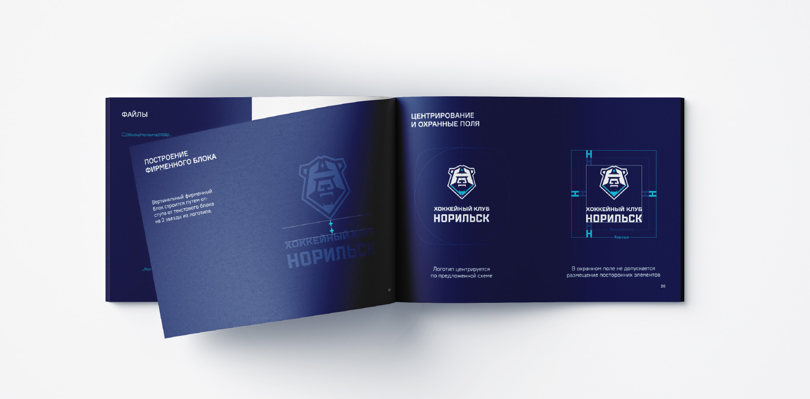
Corporate font and style
The recommended font for Norilsk is TT Octosquares Bold, a geometric grotesque with a wide range of shapes and signs, perfect for a conservative hockey style. The font was created by a friendly TypeType studio.


Медиа:
Медиа:


Медиа:
Медиа:

Медиа:
With its new identity HC Norilsk embodies the Arctic spirit and the city’s hockey traditions. Anticipating a potential new Siberian derby between Norilsk and Sokol Krasnoyarsk, hockey fans are in for an exciting season ahead.