Redesign of the logo of the VC Zenit-Kazan
LOGO • SUBLOGO • FONT WORK • PATTERNS
Zenit-Kazan are among some of the leading teams within world volleyball. For 21 years of its existence, the club from Tatarstan has accumulated an extensive collection of trophies both in Russia and abroad. The team’s logo has not changed since its foundation. The task of our studio was to concentrate the identity of the club in the simplest possible form, while maintaining continuity.

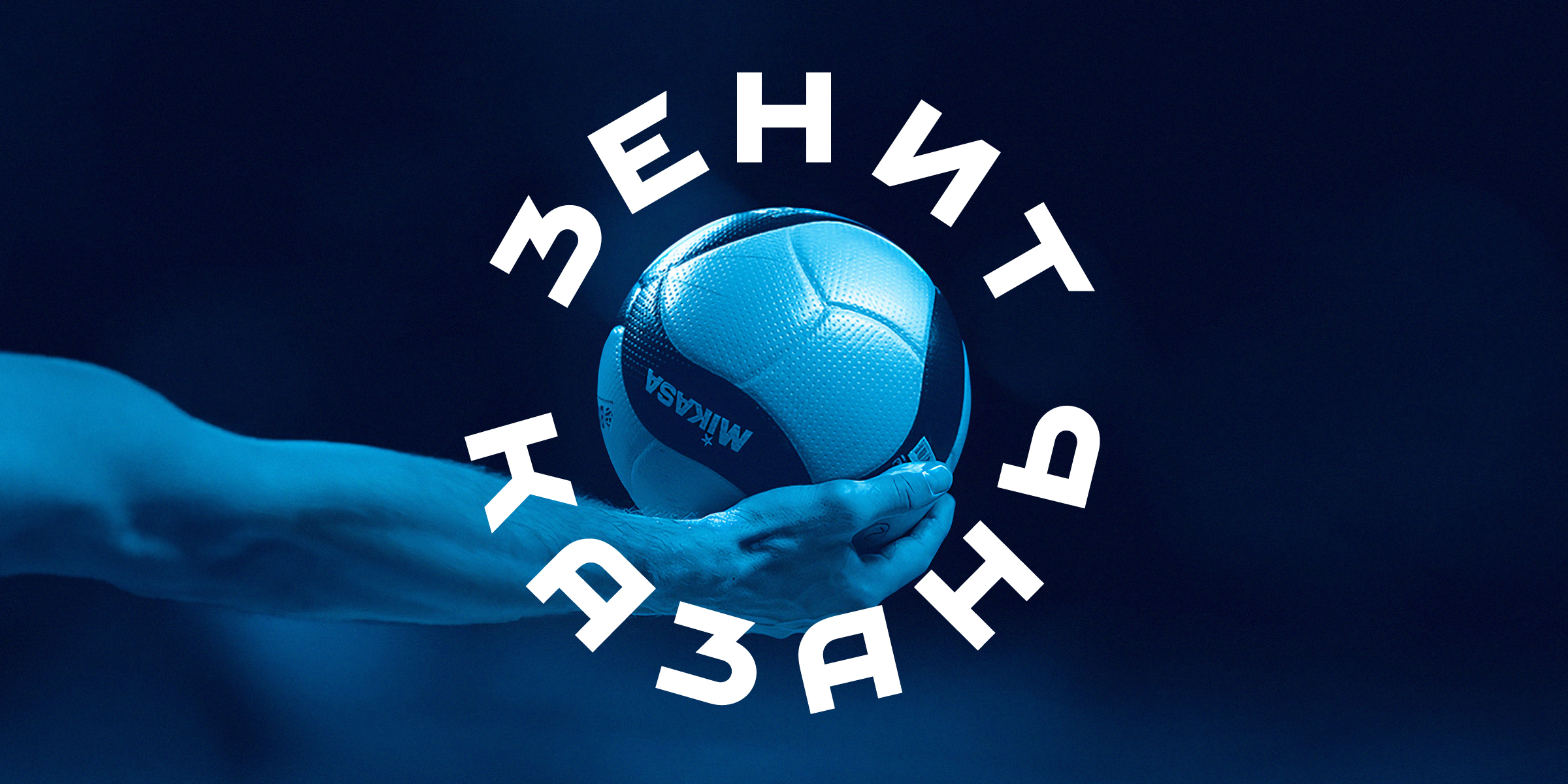
Z is Zenit
The new logo is technically thought out and aesthetically pleasing. At any scale, it conveys a message that lies in the name and geographical affiliation of the team. On a digital platform, in which a modern audience will regularly encounter the logo, it looks natural.


Geometry of volleyball
The design of the logo is an homage to the collective image of a volleyball ball. If you expand the ’Z’ by ninety degrees and put it on top, we get an exact repetition of the geometry of the legendary mva-200. The proportions of the new logo are close in terms of the ratio of elements to the current model — v200w.
At the same time, the idea of the logo has a sentimental value, and will allow it to keep looking fresh with the development within ball design.


The game scene which was laid down in the previous logo was developed in a new logo: the upper part symbolizes the attacking player’s hand on the ball, and the lower half: the player’s palm before serving. The Z dictates the game.
The logo has retained the circular dynamics and the branded diagonal of 30 degrees. An elementary sign demonstrates its identity even without using a name. Z is for Zenit; nice and simple.
The lettering construction preserves the principle that a straight line and a circle exist in a single system. The firm handwriting of the club can be read in a confident broad outline, even without using the logo.


Branded frame as an element of identity
The sub-element, in which the inscription feels confident even without a volleyball ball, emphasizes the idea that Zenit-Kazan is not just a team for the city, but an essential component of daily life of any supporter, it’s part of the city’s identity.
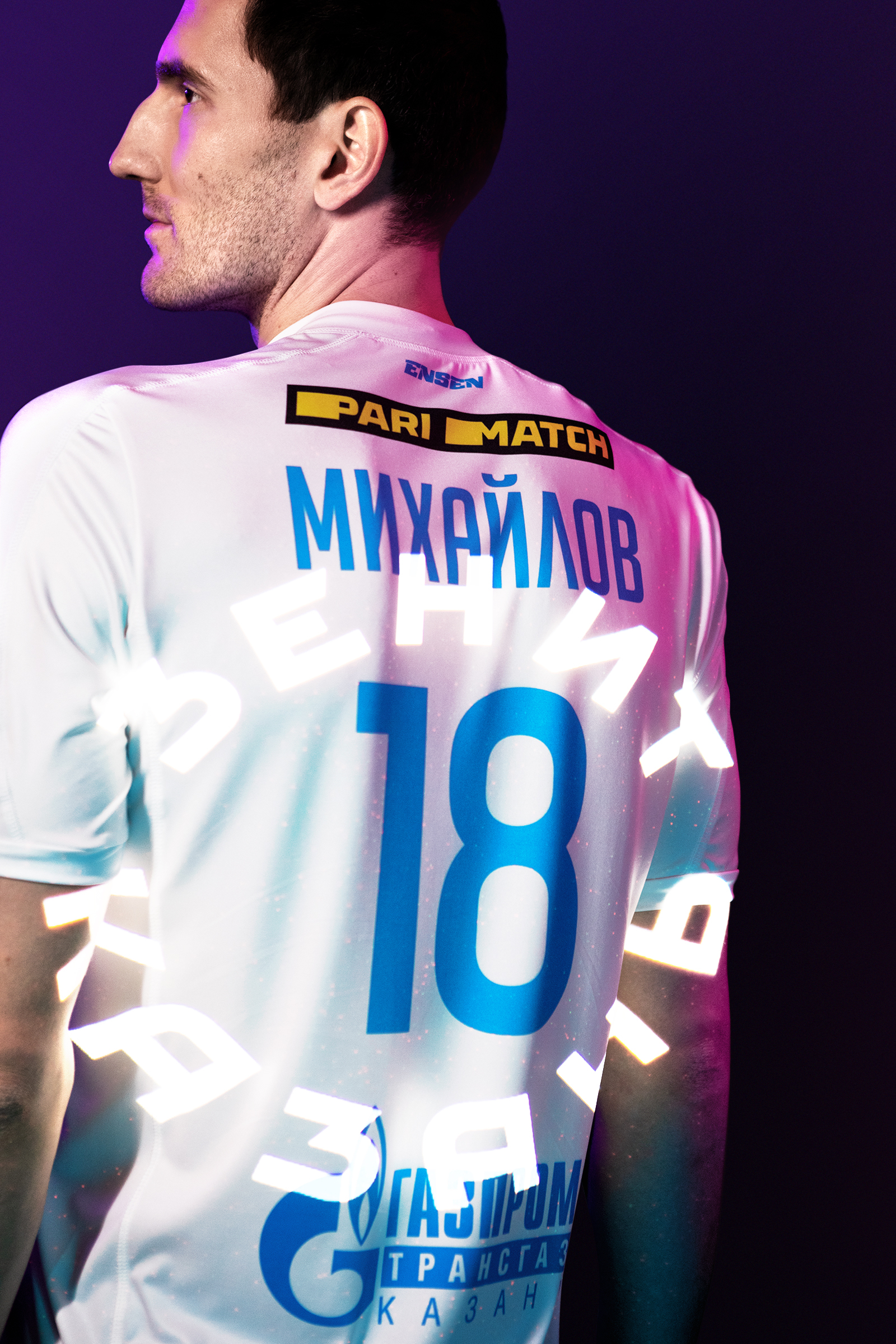
Interacting with the content inside itself, the frame embeds events from the life of the club into the proprietary graphic system: starting from game numbers, ending with the silhouettes of the won cups. So the inscription on clothes, notebooks, badges and other souvenirs equally preserves the style of the owner and his attitude to the team.

The solution with a frame is also universal for creating a set of alternative shapes with the player’s number inside the outline of the branded ring. Given the large number of close-ups in modern sports TV broadcasts, such a move will attract more attention.

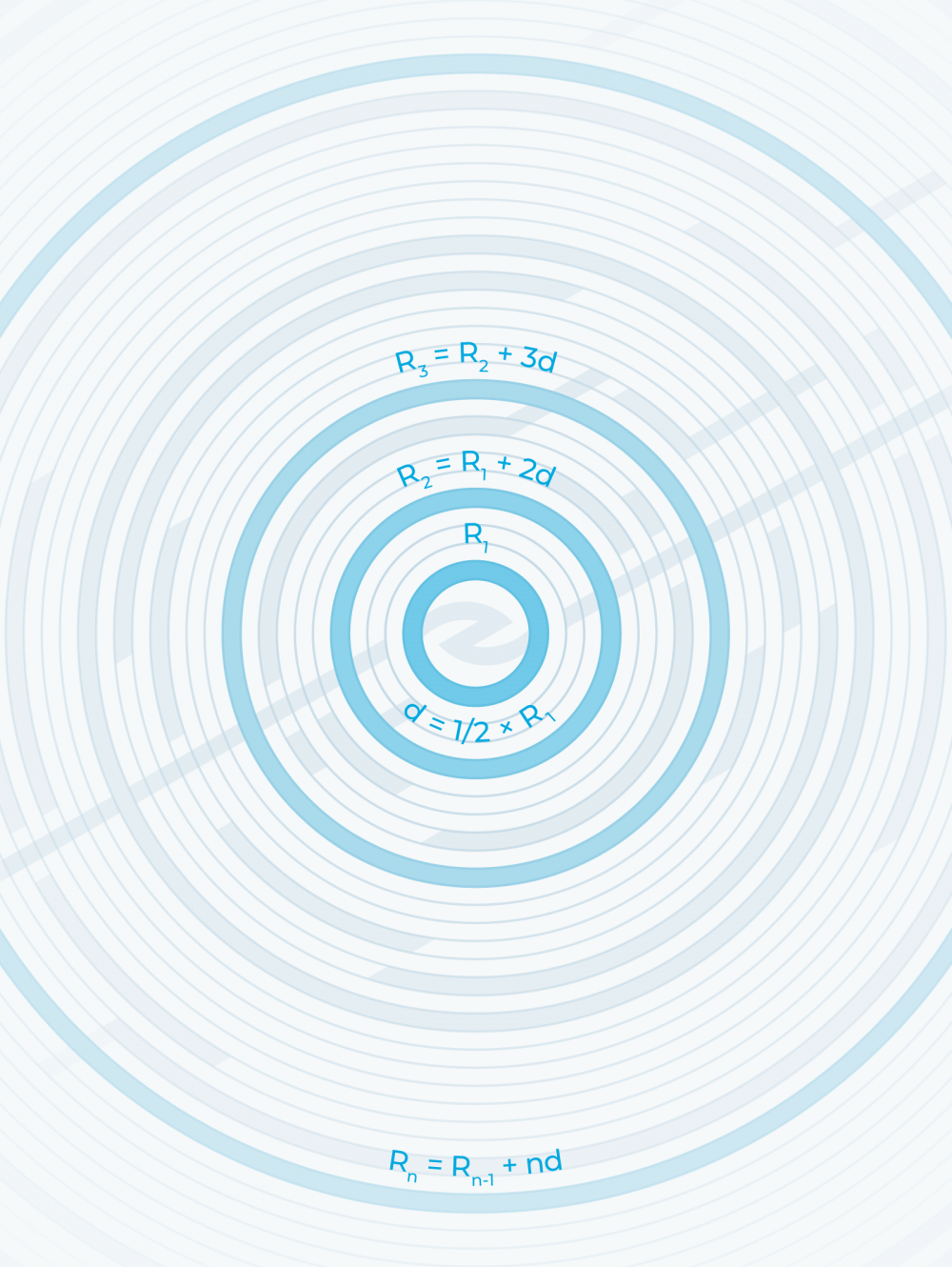
Game dynamics in the pattern
The ring graphics metaphorically concentrate on the logo: exactly as players concentrate on the ball in an effort to pass it as efficiently as possible.
The combination of concentric and diagonal dynamics outshines volleyball game patterns and is a powerful tool within motion graphics.


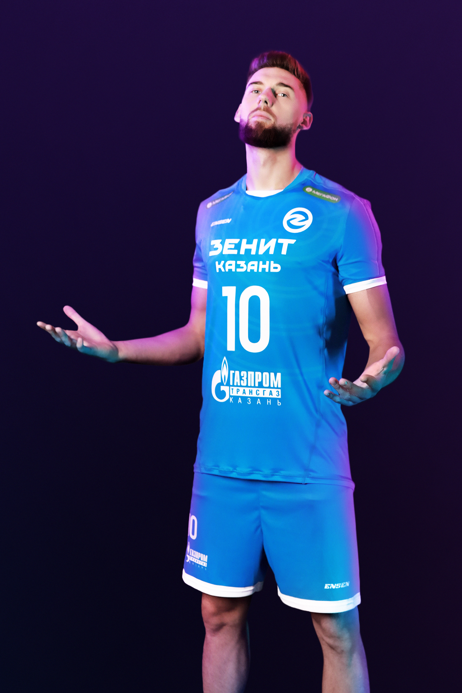
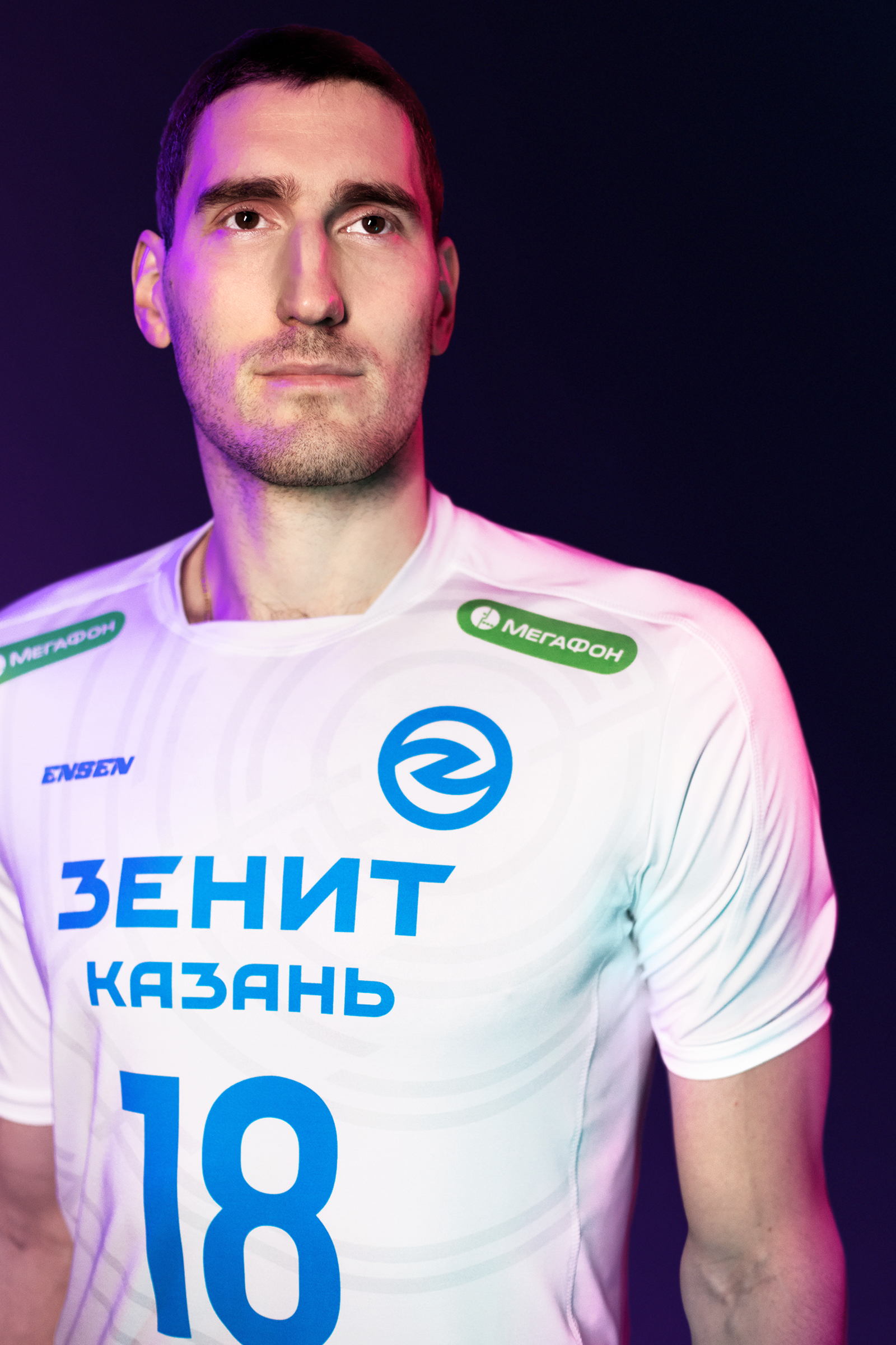
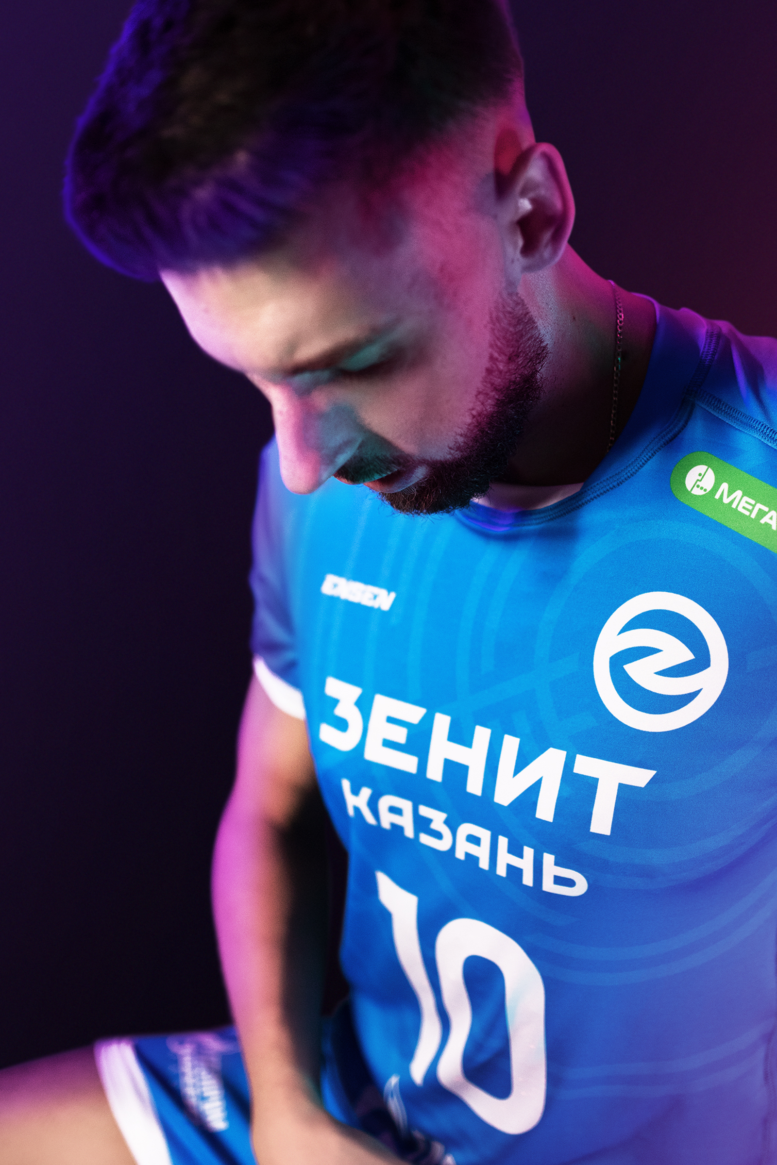
Unified system for merchandise
Thanks to the integral identity system of well-thought-out basic elements, frame and patterns, the merchandise unit, which is important for the club’s marketing, acquires a single tool that replaces a set of diverse solutions.
The logo will look great with the use of AR technology and will allow you to reveal more additional meaning. Turning an image into a three-dimensional ball can become viral in social networks and provoke fans to be imaginative in creating content.