HC Avangard's anniversary kits
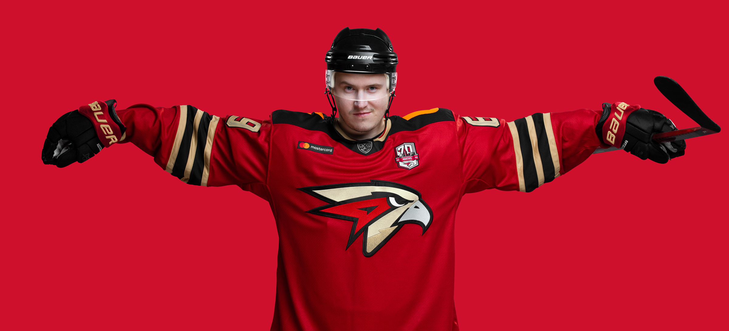
Quberten and Avangard are together for the first time — and immediately there's a good reason for these updates. This year, the club turns 70 years old, so the solemn reference to the rich club history will be displayed on the uniform. And we haven't just stopped there: Avangard will get fresh graphics, a unified style of the corporate letterings (‘OMSK’ and ‘Avangard’) and — for the first time in the KHL — two special typefaces of the game numbers.

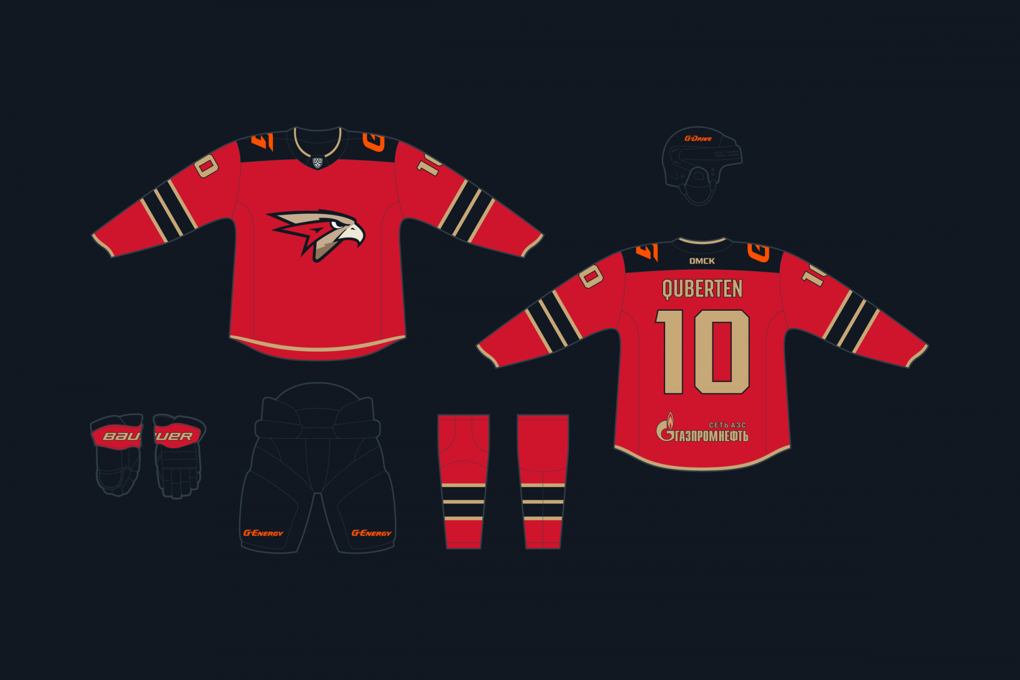
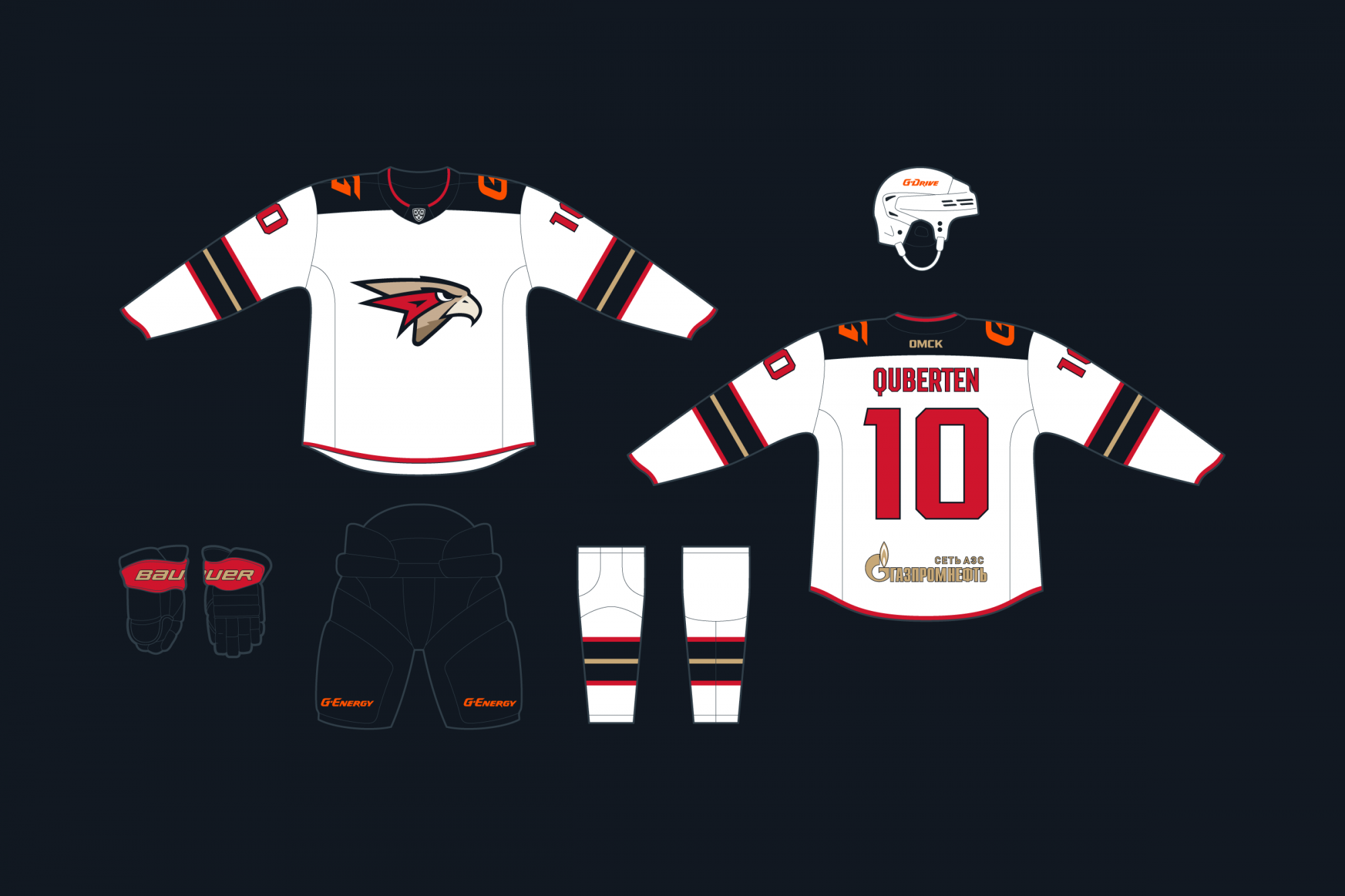
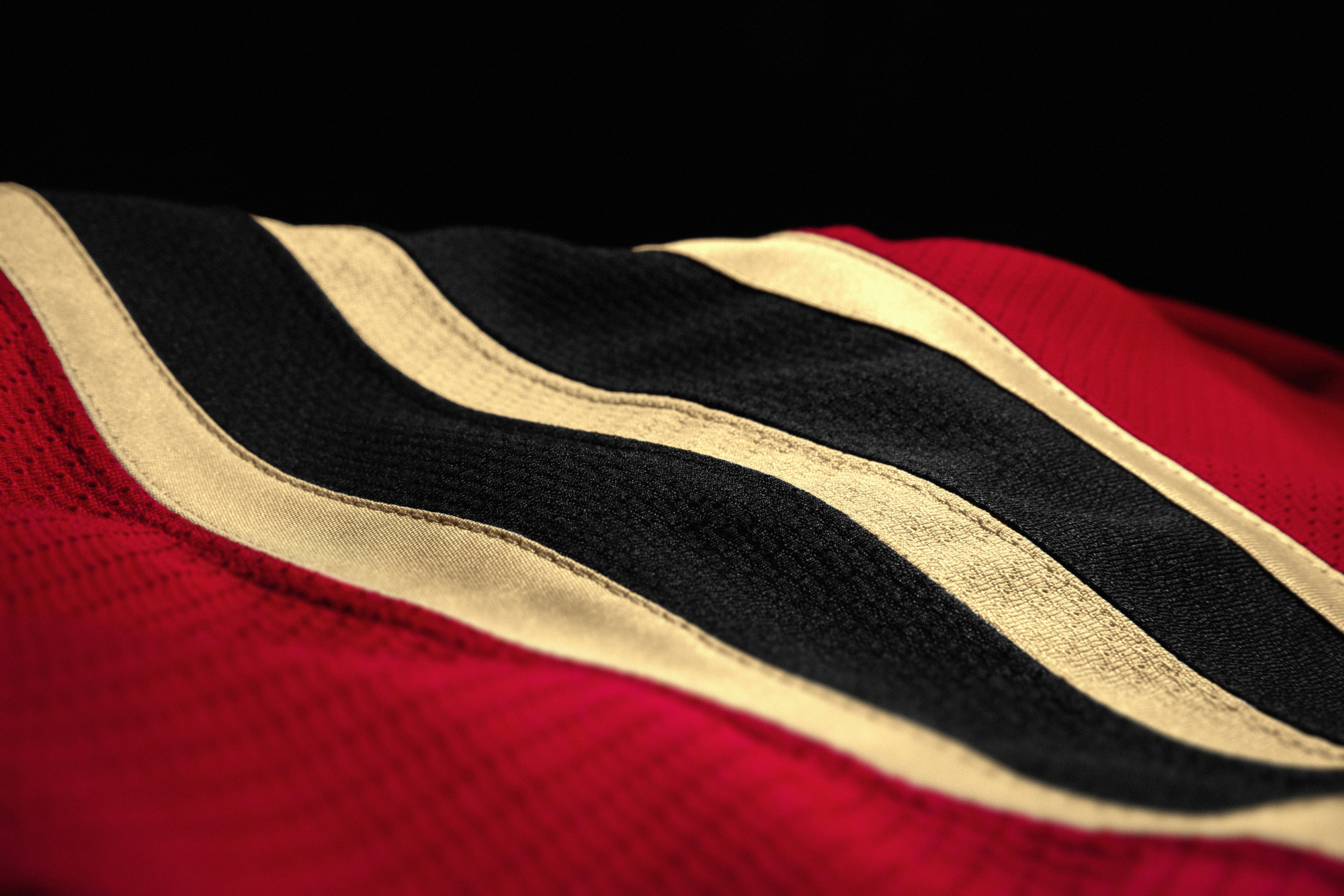
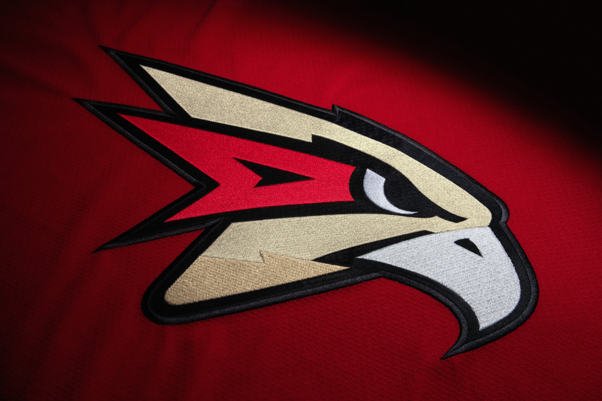
Each viewer will be reminded of the 70th anniversary of Avangard by the golden colour that has been added to kit and also on the hawk in the main logo. The third colour is more in the red home kit as it contrasts more with the red-black. Accents are set with a splash of red on the white away uniform. Accents are set with a splash of red on the white away uniformNew graphics make the design more plain and brief: there are three rhyming stripes of the same width on the sleeves and leggings now.
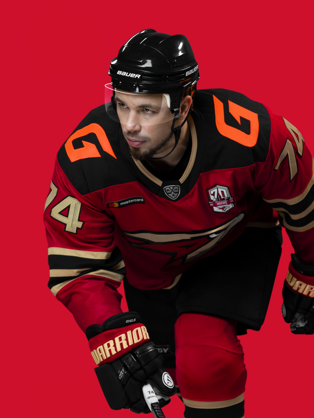

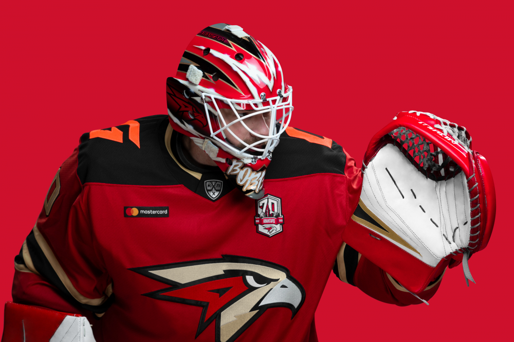
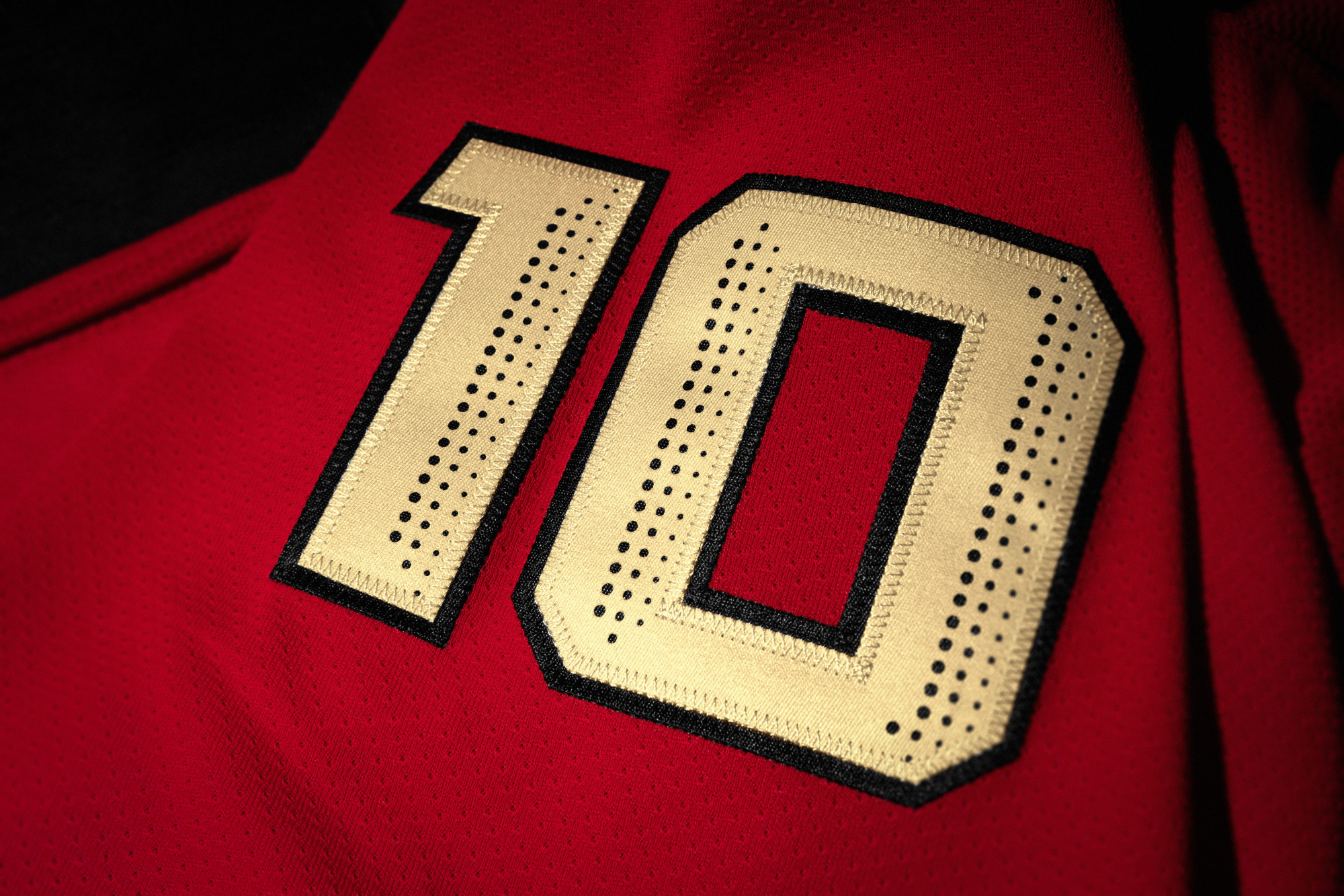
Two types of game numbers are a brand-new solution in the KHL
The players' numbers are presented in two outlines. The main ones on the back are elongated. Duplicate numbers on the sleeves are wide. However, the numbers represent just one set font and stress all the typographic elements of the kit. Such a technique has never been used in the KHL before and may become a distinctive feature of Avangard in the upcoming season.


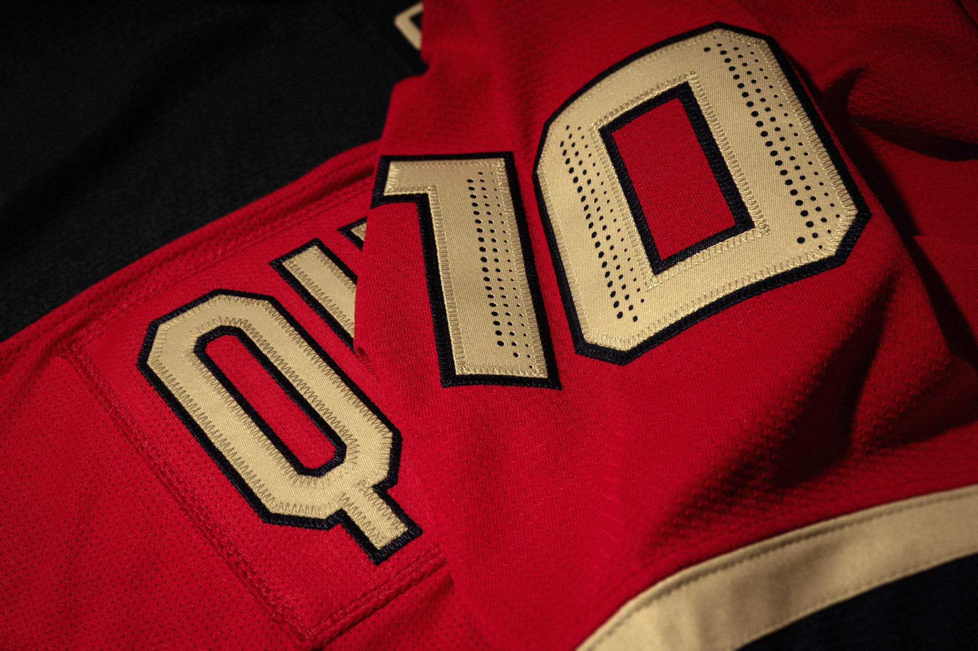
The numbers also stand out to a new type of perforation, which works not only as a functional technique but also as an element of decor. The perforation, called ‘Edges’, creates the effect of volume. Moreover, not only the main numbers are perforated but also the duplicates on the sleeves. This maintains the integrity of the whole look.

New lettering and patch Omsk
Along with graphics, we've also rethought typography. All the elements of the uniform have formed a visual system: the Avangard inscription on the inside of the collar, the lettering on the captain's kit, player's surnames, the font of numbers, the traditional patch ‘Omsk’ placed under the collar on the back — are made in the same style. Such a combination, when not one element is removed but interacts with another, favourably stands out Avangard among many KHL clubs.
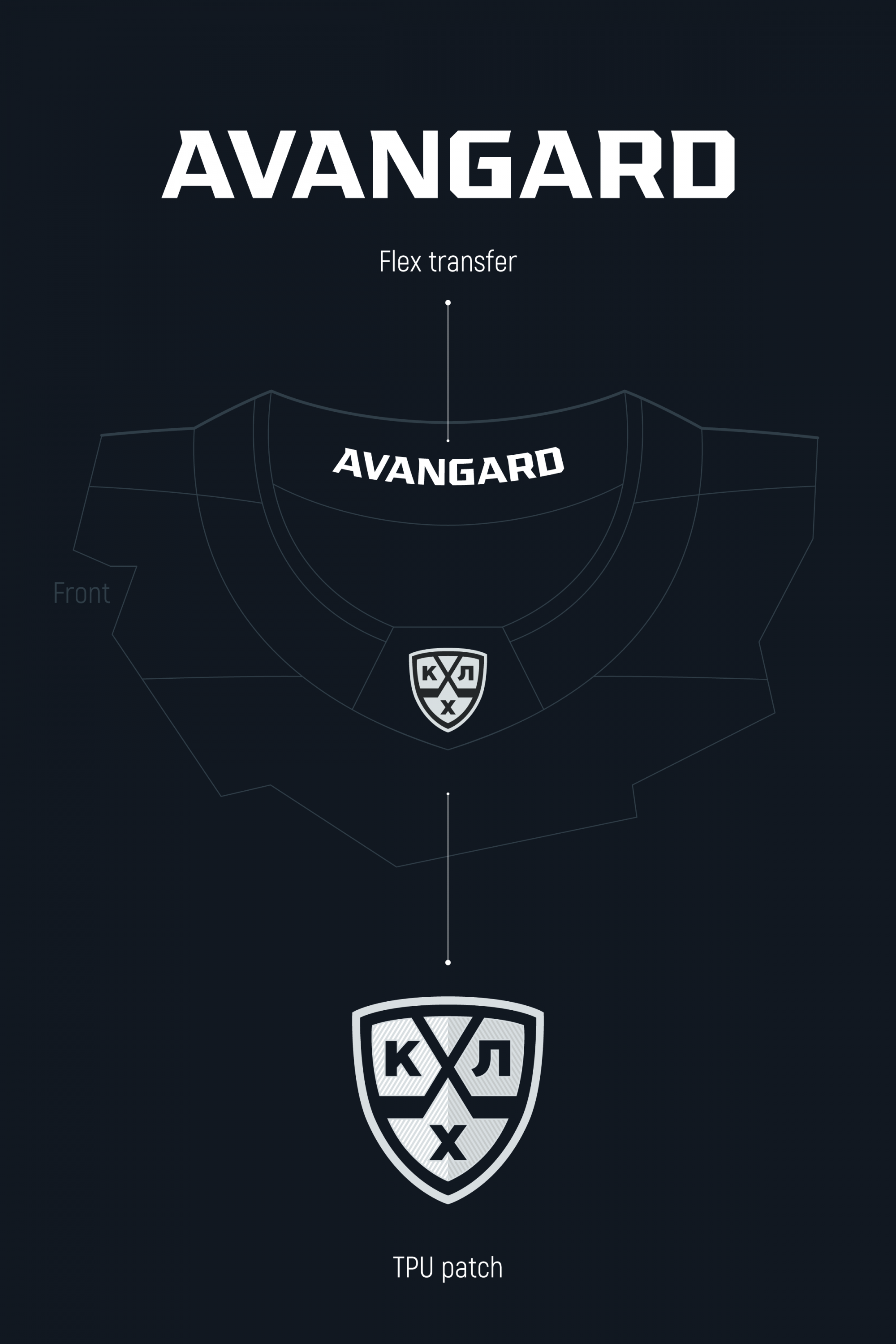

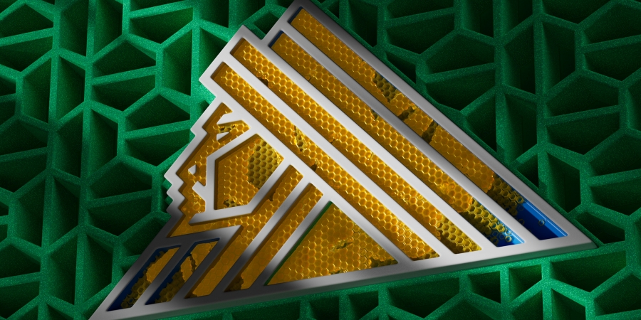
KHL technological patch
KHL logo patches are usually embroidered, but their appearance is always far from perfect due to production problems. We've gone for a more modern solution: a patch made from thermoplastic polyurethane. It's more reliable and much more beautiful.

