Virtus.pro Logo
LOGO • SUBLOGO • FONTS WORK • UNIFORM • PATTERNS • GUIDES
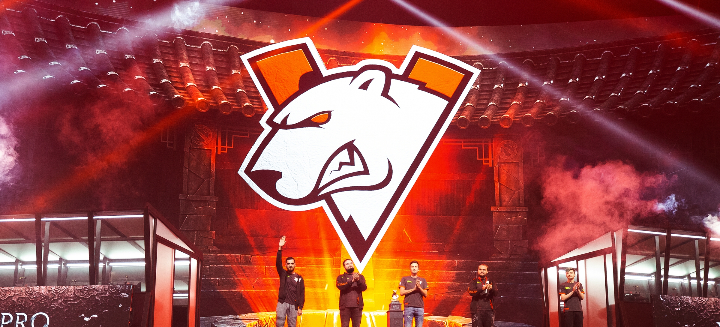
Virtus.pro is a very recognizable brand within esports, but graphically it has gone into a state of decay. Just by looking at it, it’s immediately obvious that it was made in the 2000s. The graphic and logical problems of the sign are clear to see: the chaotic lines, a dull orange colour, an outdated Europe font. Quberten studio has restyled the identity, having worked carefully on every single component.

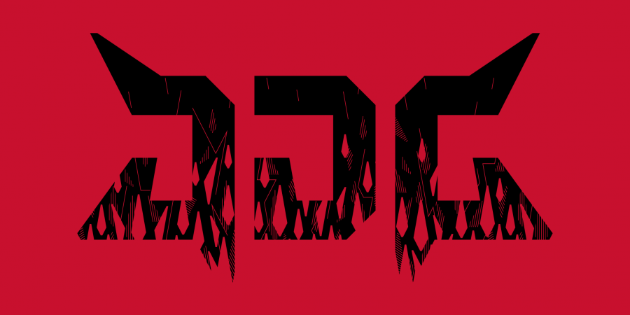
The bear with the logo has come to life, and a style-forming letter V appeared
The update maintenance consistency: the shape of the emblem remained the same, keeping the bear as the symbol and its characteristic grin was also preserved. But the bear has become more graphic and now looks more real. The massive text block has gone, as the brand is perfectly recognisable without the inscription, and the triangular shield has acquired a new shape and meaning: we carefully introduced the letter V, serving as a victory sign.


A modern identity needs to look harmonious on all media platforms from large banners to a favicon in a browser tab.
Not all surfaces allow you to draw details of the main logo in detail, so for small diagonals (from icons on streams to avatars), a simplified sign has been created: there’s no bear on this one, but instead a recognizable letter V with characteristic bear scratch marks. For every small scale, an elementary version is provided that doesn’t look too garish.


Bear scratches are a way to attract additional attention
It wasn’t for nothing that we wrote that the letter V brought an additional semantic load to the logo; a whole set of characteristic elements really make the identity its own.
The letter is strictly geometric, the angles of its construction form a variety of branded patterns. They convey a strong sense of feeling and delicately sub-brand different surfaces, as they are firmly connected with the logo.


The active patterns used around the bear scratches work week. They become an additional element to help identify the brand; with its aggressiveness, they quickly catch the eye.