Rebranding of HC Amur
LOGO • UNIFORM • GUIDES • FONTS
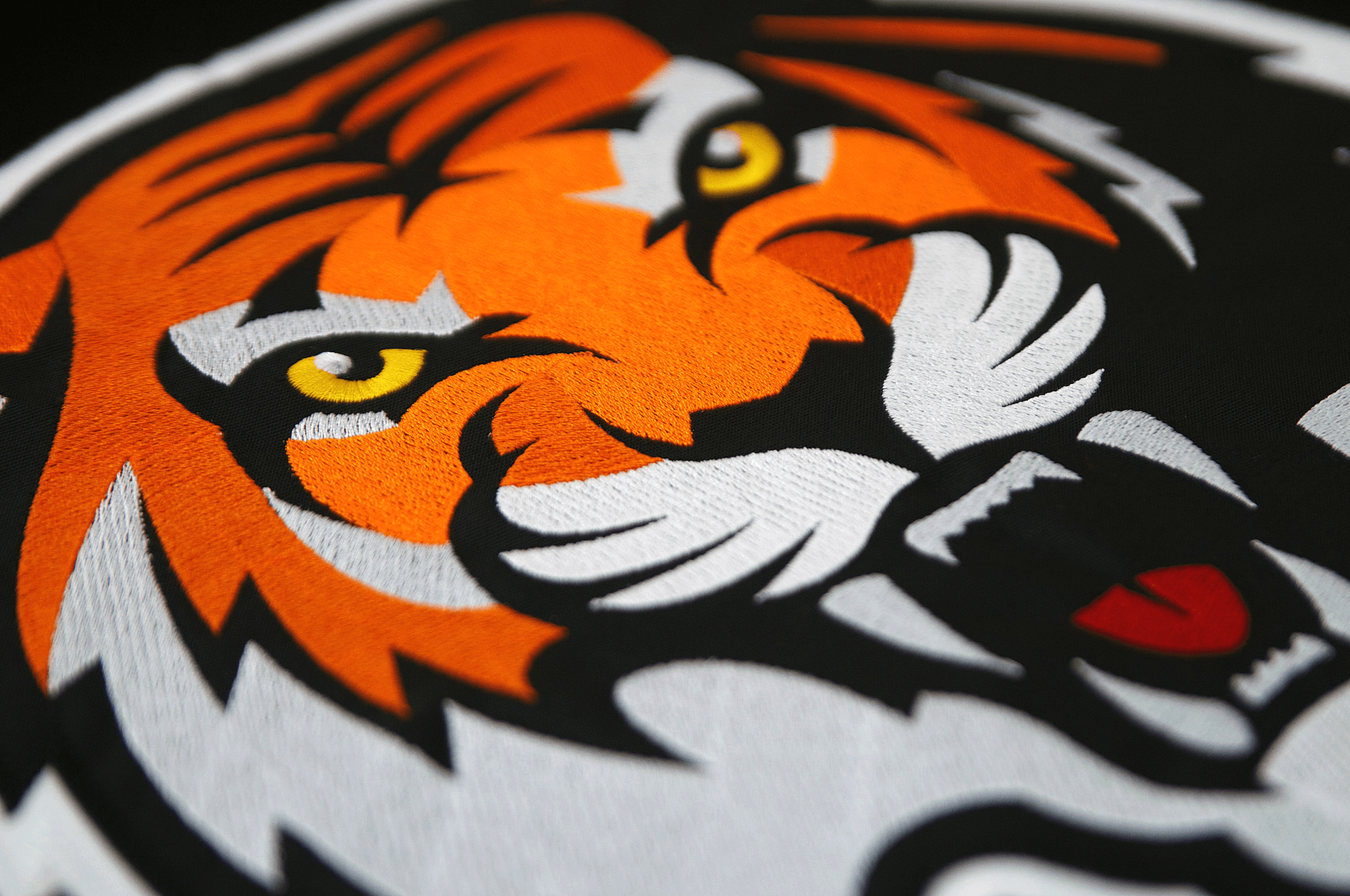
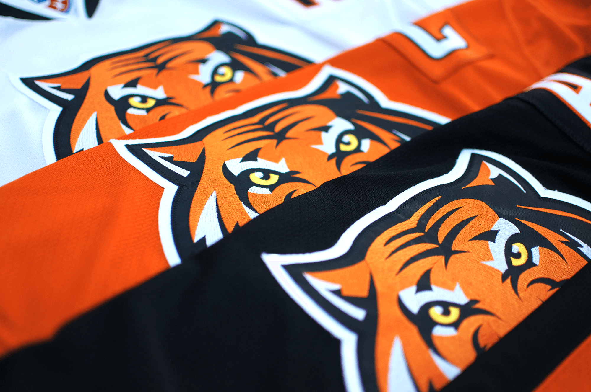
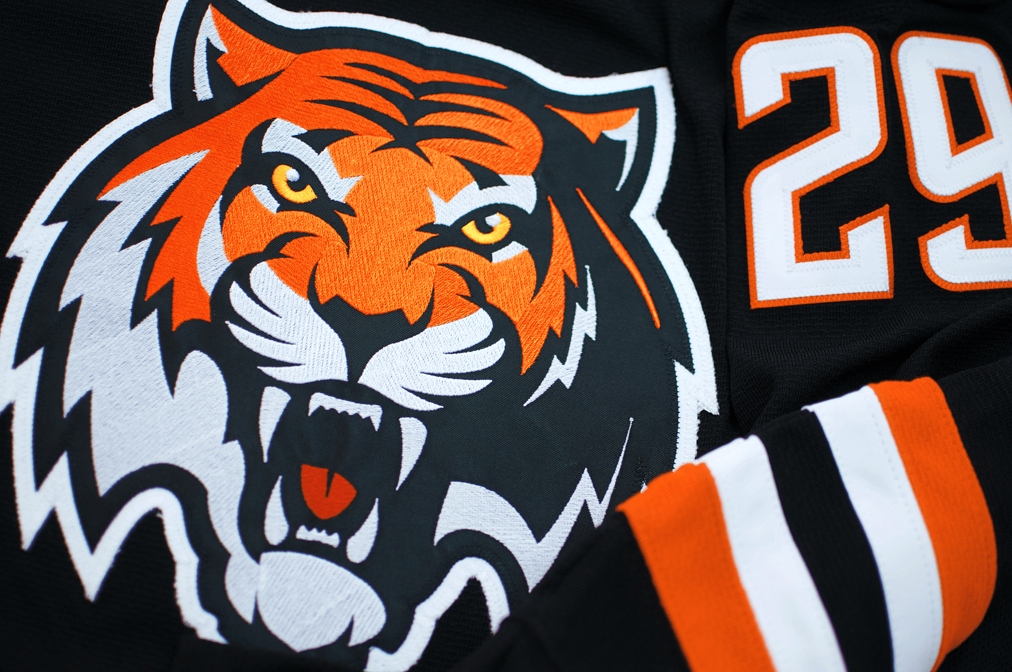
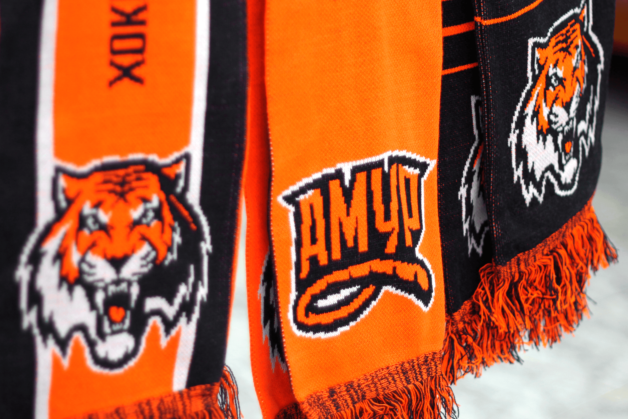
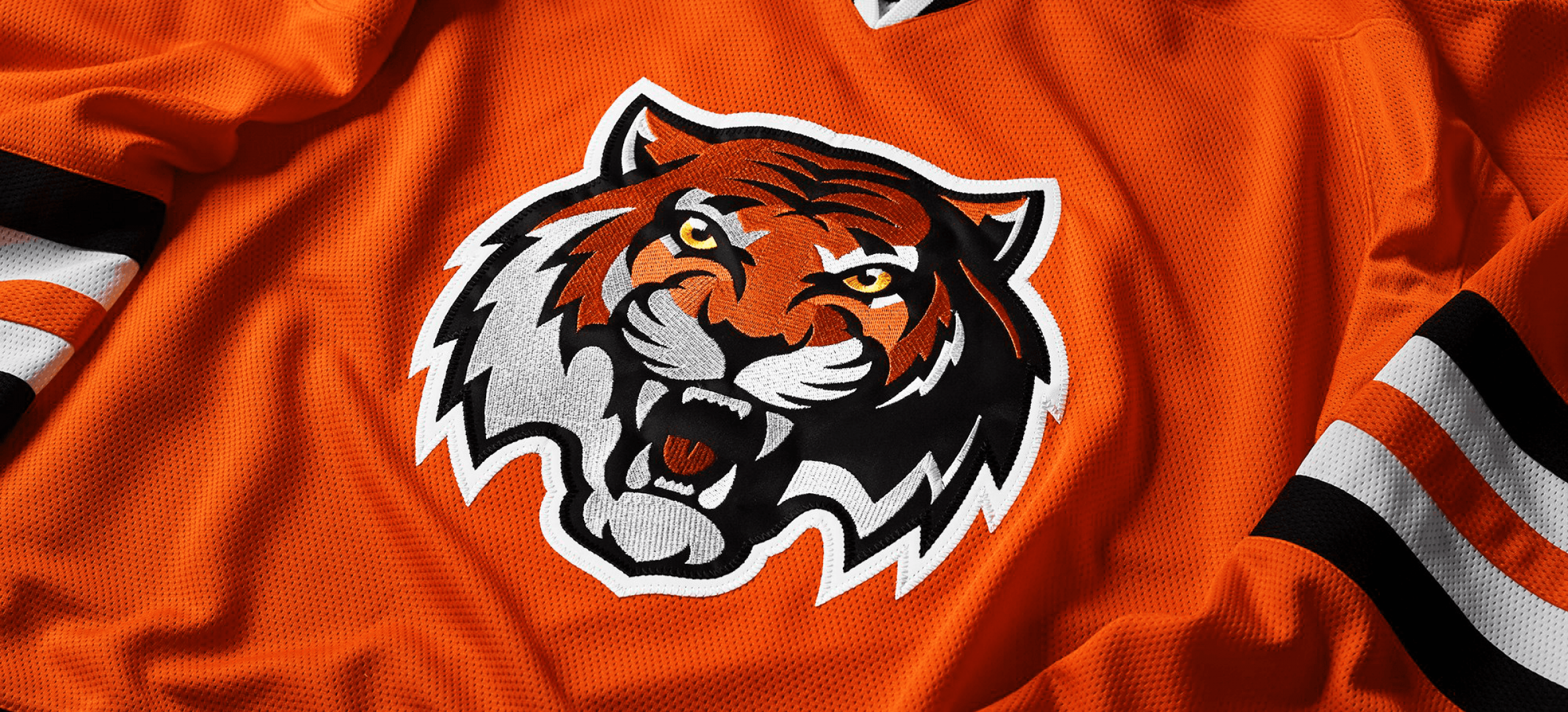
May 2013 was the beginning of a long, challenging, but interesting story of rebranding HC Amur. The whole package of brand ID was designed for the club: logos and letterings, each of them having a special purpose. The main logo contains the face of the Amur tiger, northern beast with thick fur and luxuriant mane. The lettering combined two techniques: graphics and calligraphy. An additional logotype with lettering was created for club symbols and other special purposes. The tigers got their unique wild style of the numbers, with slanted serifs that added an aggressive feel to the font.
The process of creating the uniform for the Khabarovsk team deserves special attention. With great difficulty we persuaded the management to accept the unique for KHL orange and black colors. Thanks to the colors HC Amur games have been broadcast on TV more often.
A popular American website sportslogos.net specializing in sport branding named Amur logo the best sport logotype of the year. This is the first time when a non-American logotype is recognized as the best by the authoritative North American source.