HC Spartak kits 2020/21
UNIFORM • FONTS • GUIDES
With a love for the rhomb, strip and letter C
Spartak probably has the most recognizable identity in Russian sport: all the elements of the logo: the rhombus, the white stripe and the letter C, have long since become independent brands. That’s why it’s more interesting to use symbols with a rich history to create something new. Quberten studio has already made a Spartak’s brand book, which includes the basic line of merchandise, and now it is time for a big sports project: the kit designs for the 2020/21 season.

Three kits: the strip is back and takes centre stage
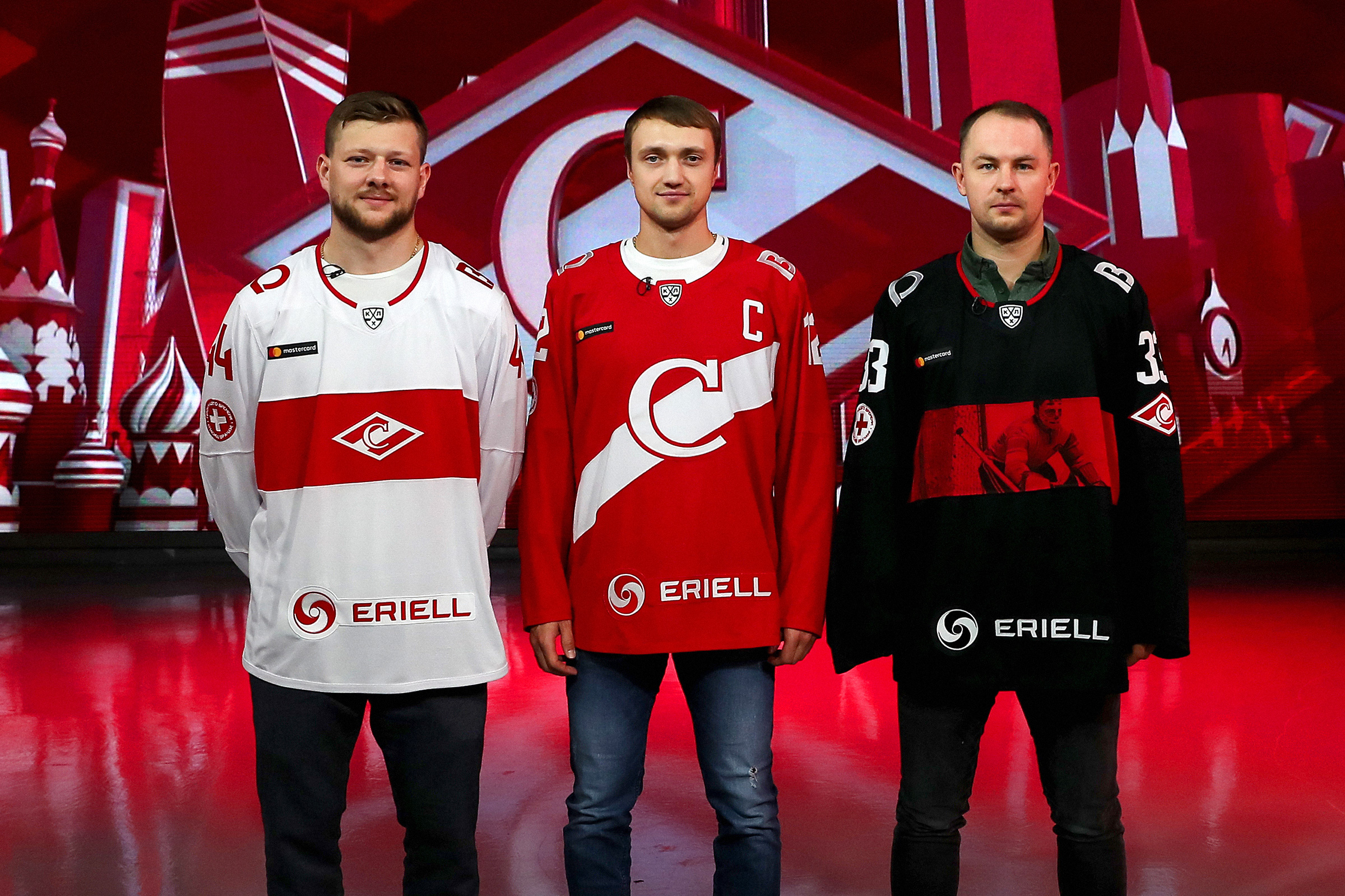
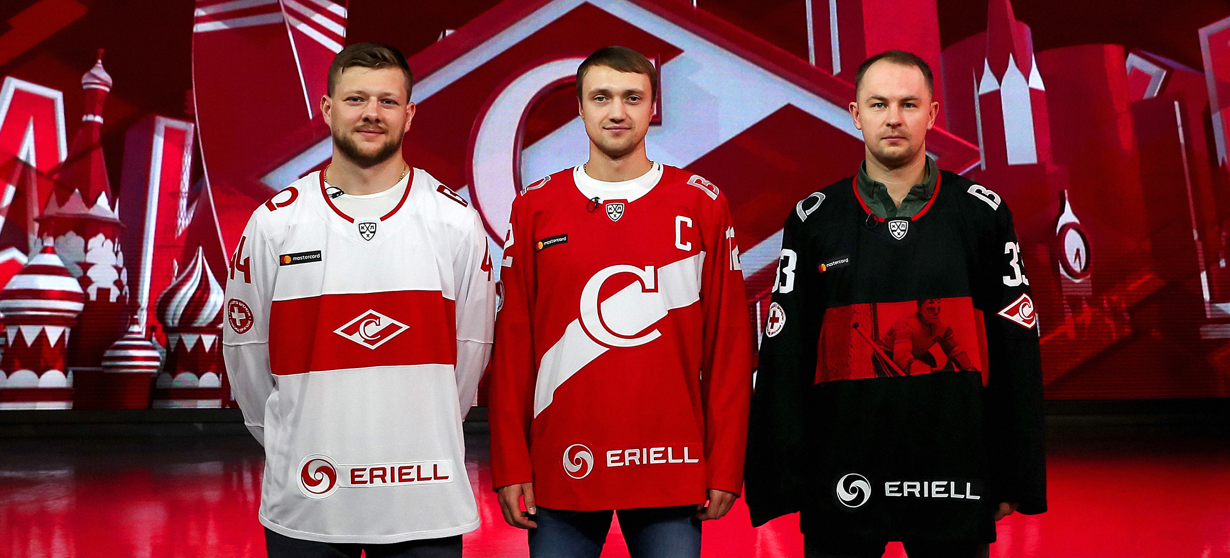
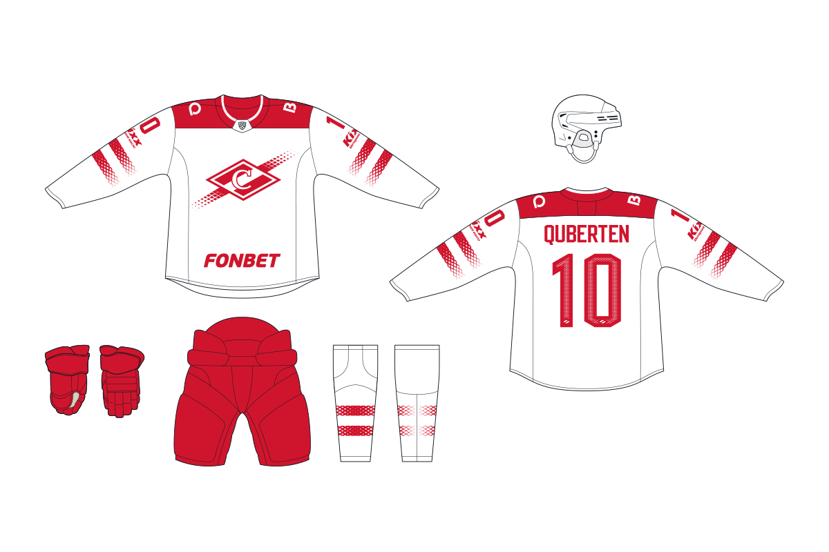
Spartak didn’t limit itself to two standard home and away kits. Nowadays the team will change the home kit depending on the game day: on weekdays there will be one design, and another for the weekends. Yet the main Spartak symbol will always stay in place.
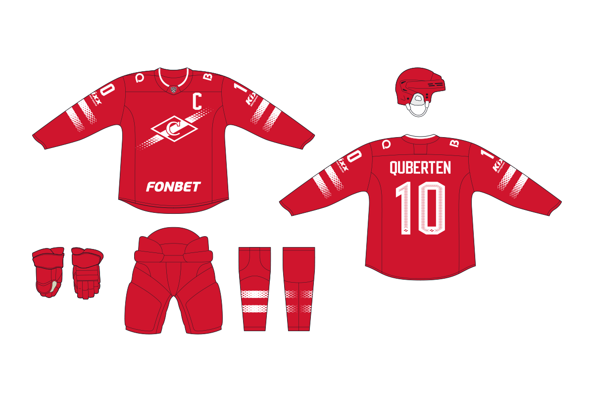
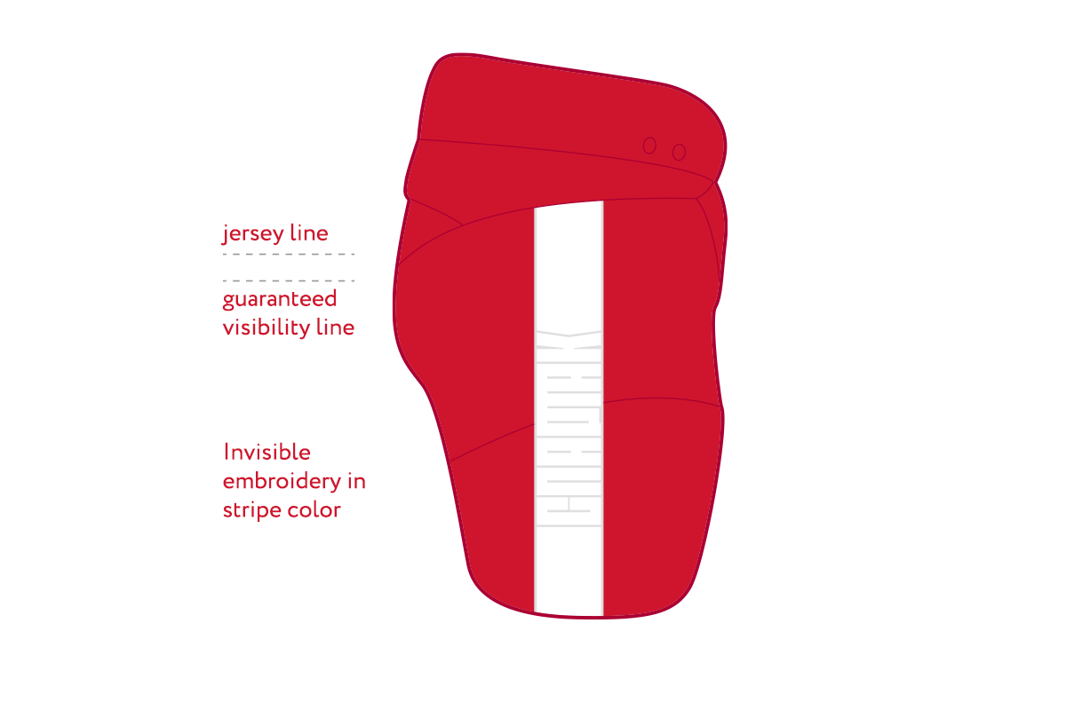
The away kit brings back the wide red stripe. It doesn’t extend to the sleeves, as in the 2011-16 seasons, so it looks more contrasting. Overall, the stripe plays an important role in each kit and always works in harmony: the rings are half as narrow on the socks than on the chest.
The first home uniform for working days is subordinated to the large letter C — the centre and the heart of Spartak’s emblem. If you look at the uniform from a distance, it becomes clear that the kit itself is the club’s logo.
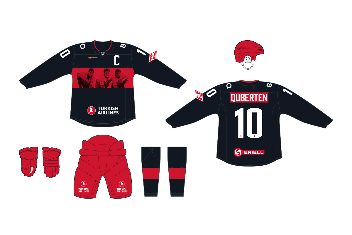
The second home kit is the special version for weekends and public holidays. Instead of a stripe, rhombus and the letter C on the chest, the print will use with photos from the history of Spartak. It will be made using serigraphic and will undoubtedly become one of the most memorable elements of Spartak’s season.

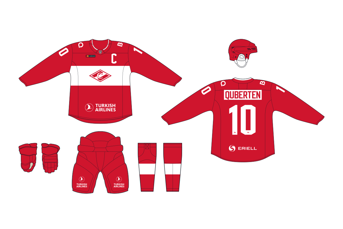
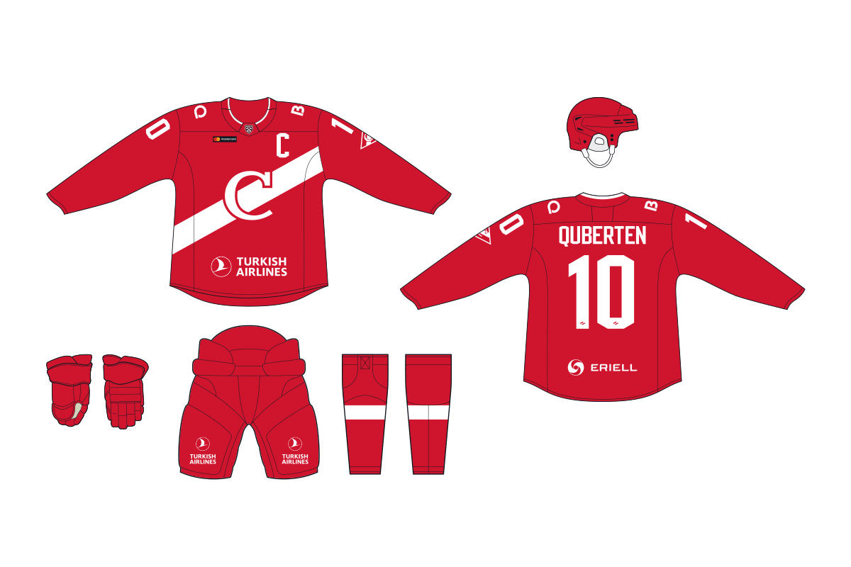
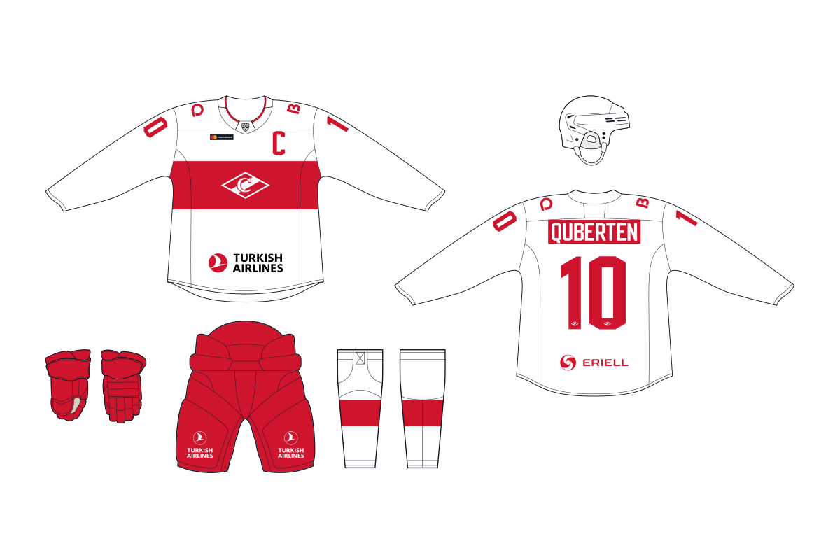
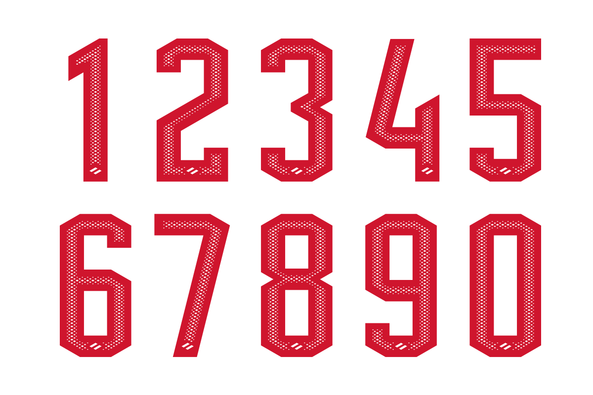
Fonts of numbers and surnames
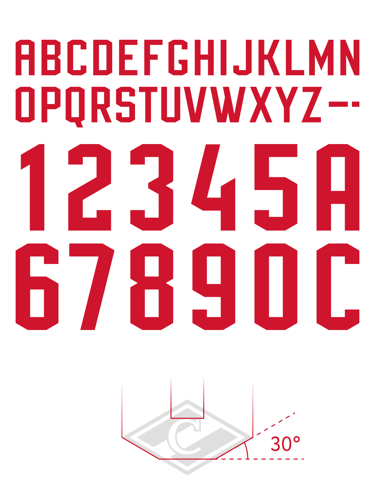
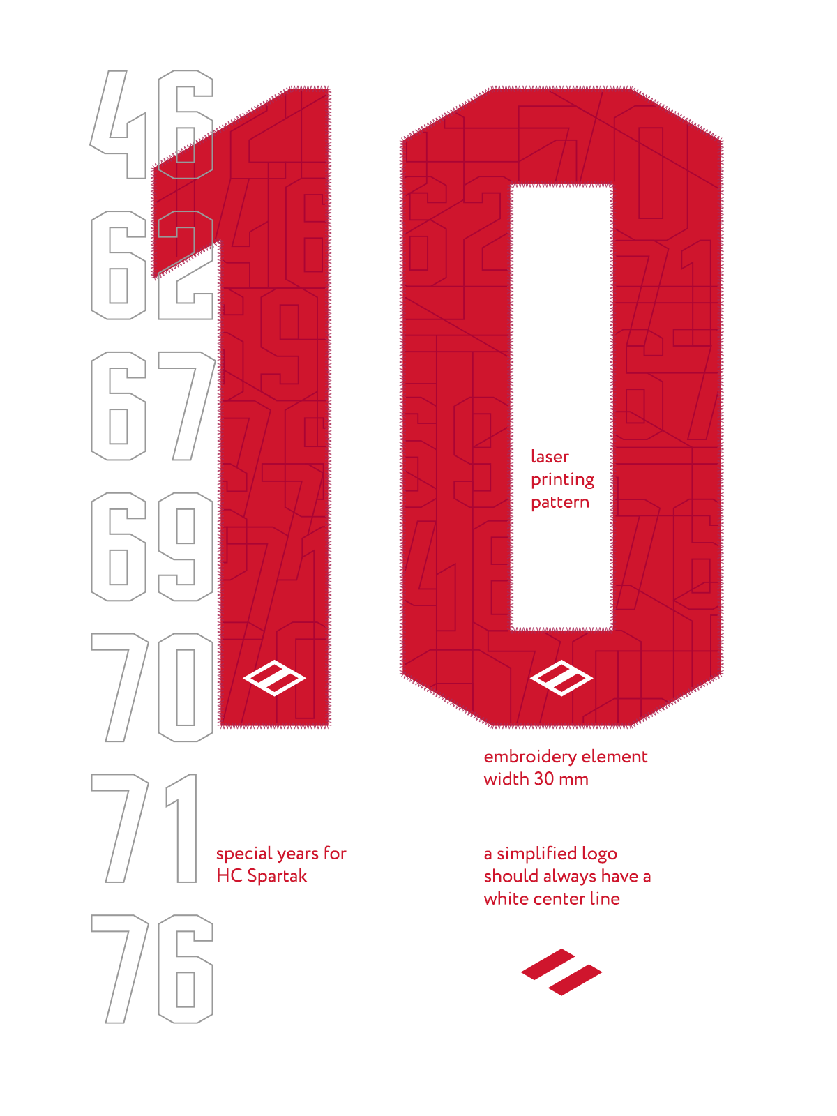
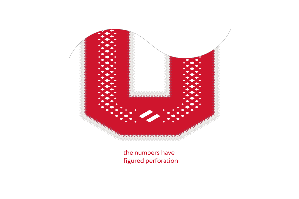
The font of the numbers is imbued with Spartak aesthetics: it echoes the classic sets of the times of the USSR, the geometry of the numbers is based on the corners of the rhombus. The same principle is used in typeface for surnames.
And the new Spartak look doesn’t end there. The club’s most important dates are integrated into the numbers — from the date of foundation to championship titles and victories in the USSR Cup. The solid digital pattern is laser-printed and serves not only as a decorative function, but also takes fans back to the glory days. This idea of using an encrypted pattern has never been used in the KHL before.
A simplified logo is placed at the bottom of the numbers: a rhombus with a white middle line.

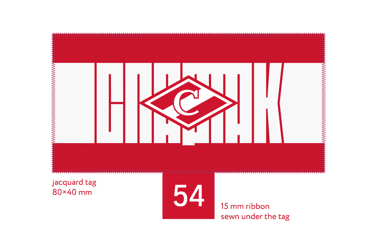
Patches as part of branding
On all sets of the season, a jacquard label has appeared on the inside of the collar, which combines a stripe, logo and lettering. On the outside, there are motivating inscriptions. They will vary depending on the circumstances. The red kit includes a patch with the traditional slogan ‘Strength and Honour’, and the white one reads ‘Moscow’.
On the front of the collar, there is a thermoplastic polyurethane KHL badge — it’s clearer and more reliable than the embroidered ones which still dominate the league.