Game uniform for hockey club Ak Bars
SUBLOGOS • KIT • TYPEFACE DESIGN
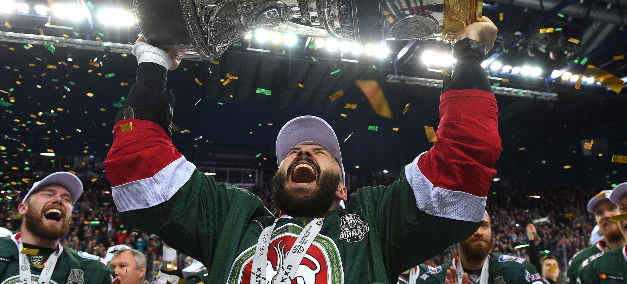
Champions kit in the Quberten portfolio! In the 2017/18 season, Ak Bars Kazan reclaimed the Gagarin Cup after 8 years of waiting, and the entire play-offs were played in the kit created by our studio. And a further two new sets were presented at the end of the season.

No to loud graphics, and yes to clear colours, large stripes and contrasts
The new Ak Bars uniform got rid of small elements that are barely distinguishable on the general broadcast plans and even inside the arena: first of all, this concerns the sleeves and sides, where small white and red lines did not create the necessary contrast.
More modern sports design moves away from spontaneous graphics and lines. Clear colour solutions, individual typography and recognizable decorative elements associated with corporate identity are in demand. The new set of Ak Bars incorporates all of these.
We have adjusted the green colour of the jersey, and also introduced large white and red stripes, which were previously placed on the trousers. Due to the colour and structural rhyming, the kit looks more solid.
The actual design of the kit is dictated by the cut of the sweater. Only embroidery and stitched graphics are used in its production, which also makes the kit more meaningful and visually pleasing.


Own typography and a new element at the intersection of hockey and national culture
The former lettering of Ak Bars did not echo the main identity. Because of this, it was stylistically knocked out on the kit and did not increase the recognition of the team. Working on the new kit, we have rethought the entire typography: the inscriptions and numbers are now geometrically uniform and do not conflict with the sponsor logo of Tatneft and the coat of arms of Tatarstan on the chest.
We also created an additional logo for Kazan: it combines the values of Ak Bars and the rich culture of Tatarstan. The emblem was born when a new lettering and a decorative element combining a tulip and a snow leopard paw print merged.
With the snow leopard, hockey fans already understand everything, and the tulip is taken from the coat of arms of Tatarstan; there the flower is used as a symbol of the awakening and renewal of the republic. And because of the communication strategy of Ak Bars, which during the 2017/18 season many times referred to the culture of Tatarstan, this was taken into account for this design too.
The tulip and the snow leopard’s paw can also work as an independent decorating element — for example, it is located at the base of all numbers.