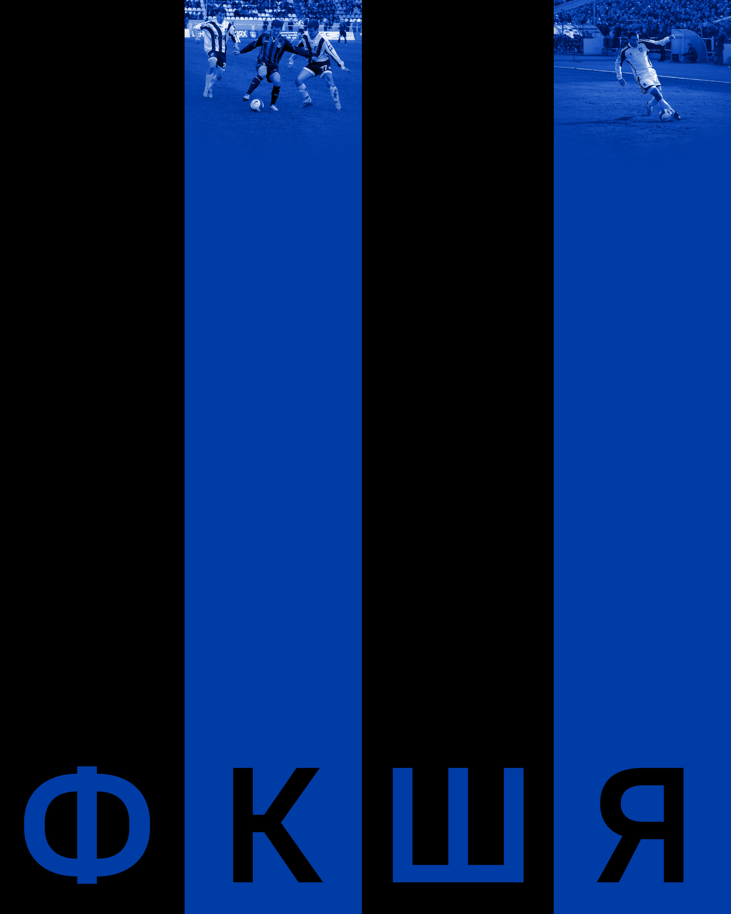
FC Shinnik restyling concept
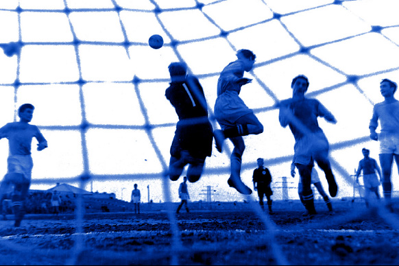
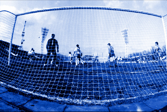
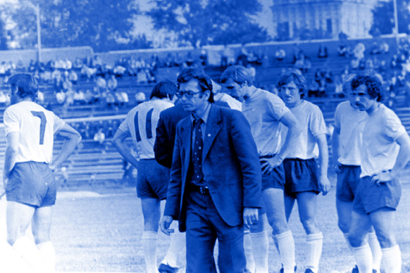
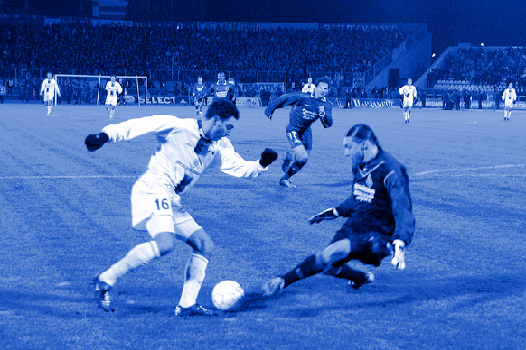
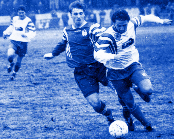
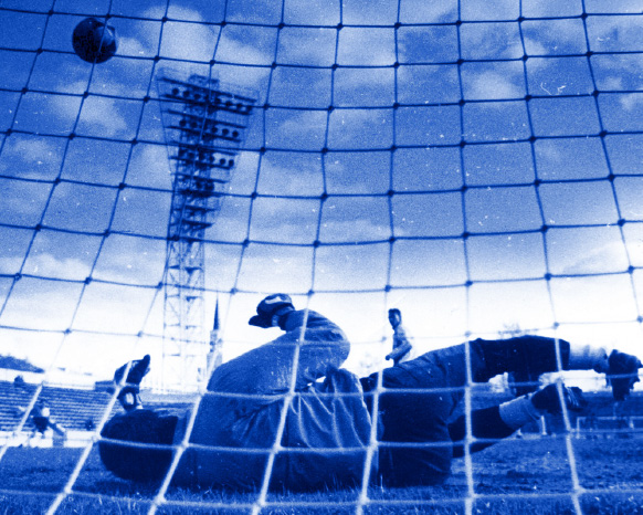
Football club Shinnik is one of the main sports brands of Yaroslavl. Founded in 1957, the team twice played in European Cups and many times gave battle to the flagships of national football. Its history is an important part of the regional sports heritage.
In the summer of 2022 Quberten studio proposed the idea to simplify the club logo. The project was not implemented, but it deserves to be presented. It was done out of love for the sport and respect for the club’s achievements from one of the oldest Russian cities.
Original logo
The bear’s axe, touching the outline of the coat of arms, tiny claws and fur, an asymmetrical ball: all these are details that are crucial for the digital use along with an excessively tight kerning.
Concept
The conservative elements (foundation date, thin outlines and ball streaks) have disappeared. To make the image more readable the bear was transformed into a pictogram. The copyrights were kindly provided by the designer of icons and pictograms Sergey Chikin. The bear is one of the key elements of the logo. In the new version the system of angles makes it possible to execute it in the geometry of the sign. The correction of the ball-wheel helped to correspond the sign symmetry perfection. Extra strokes have been removed, and the text has become more sparse. All the angles of the logo geometric construction have a pitch of 18° while the straight angles solve the problem of an adequate digital representation of the sign. The difference will be best seen in microformats — on the screens of mobile devices, which broadcast a significant part of all information in the XXI century.
Медиа:

Further transformation
The evolution of the logo can be continued: the radial text transcription and name can be simplified or hidden inside the ring which contributes to a greater emphasis on the message the sign carries.

Traditionally, the result of redesigning an existing identity is a package of logos that will then be used for different scales. The alternative logo in this lineup is a homage to a sign from 1961.
Медиа:
The design of the Shinnik logo has consistently evolved from a simple «wheel» to an emblem with the region’s coat of arms. Following the logical line, restyling implied simplification of sign construction, bringing Shinnik logo to clear geometry, enlargement of graphics, unified thickness and scale of elements.

Медиа:
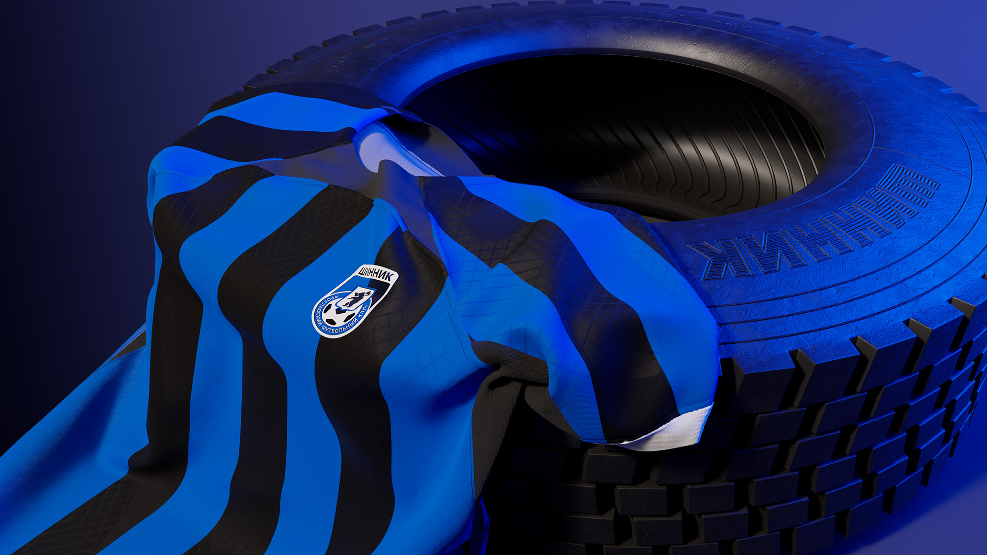
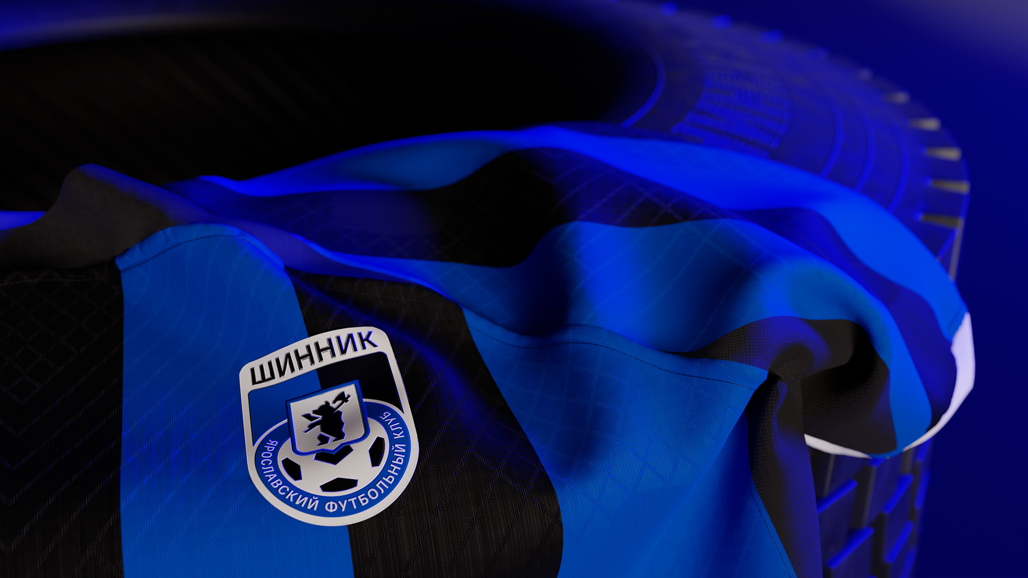
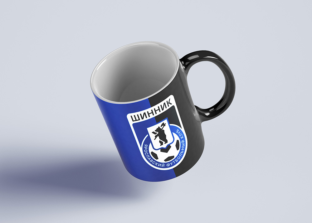
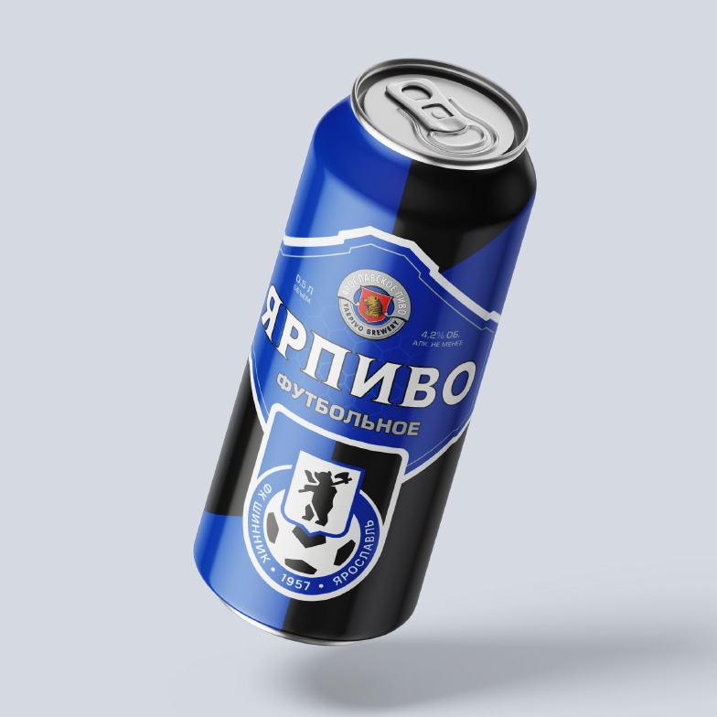
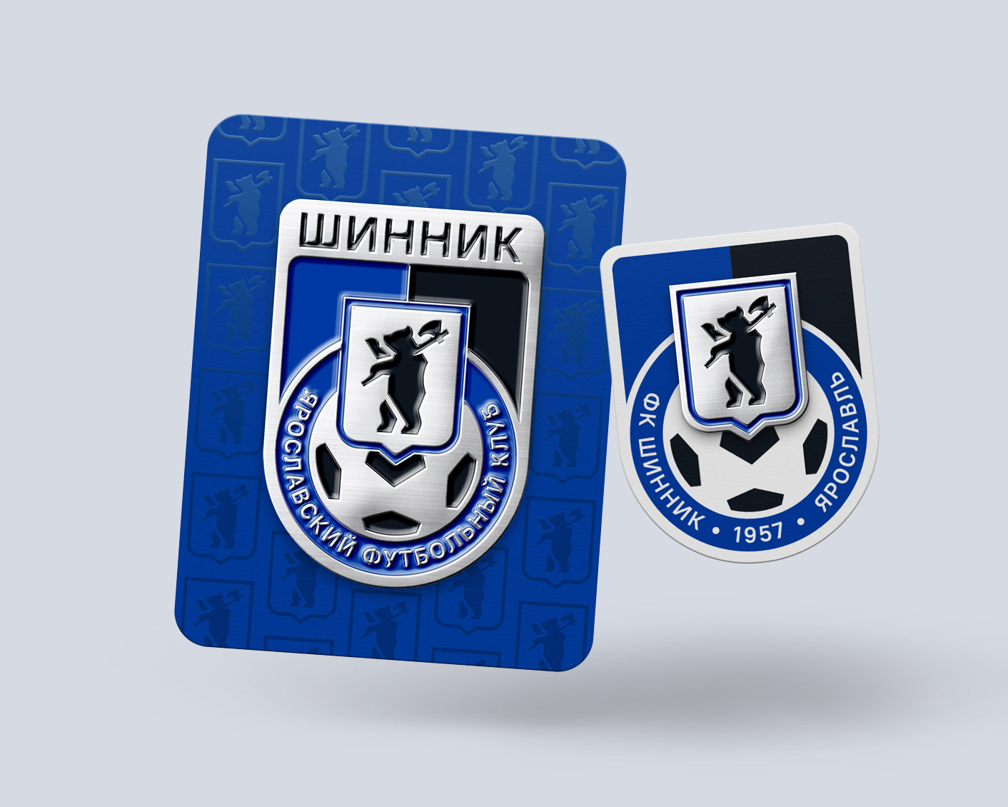
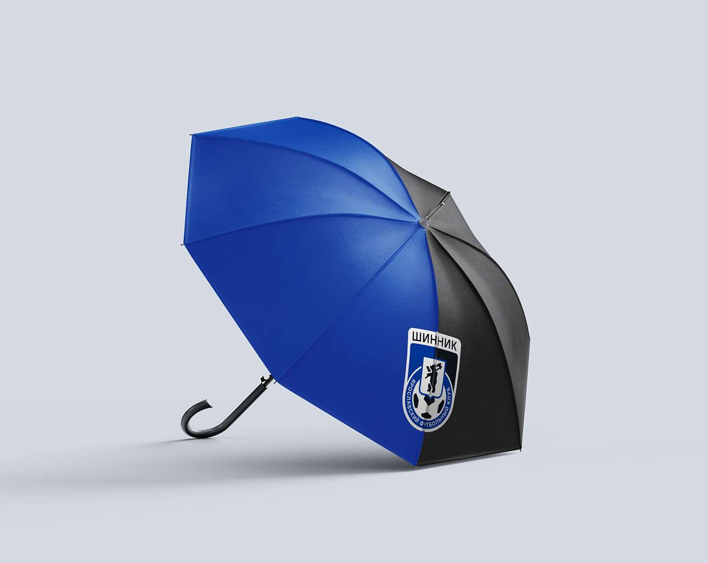
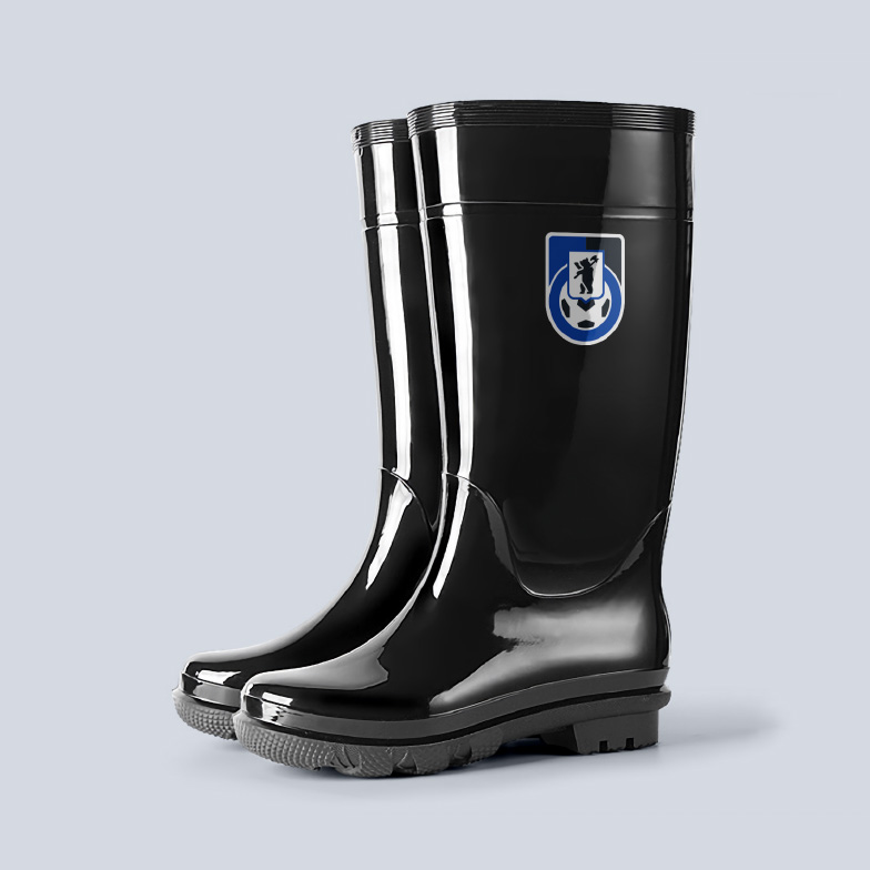
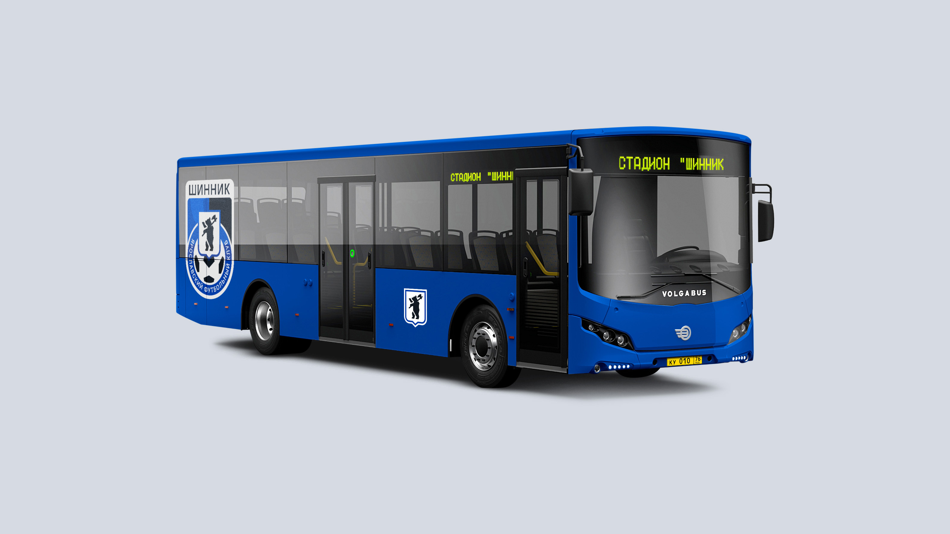
Shinnik logo design gives a wide space to work with souvenir products and merchendise. In addition, the sign can be successfully implemented in the environment — buses of city routes and household items necessary for attending the games in unpredictable Yaroslavl weather.
Медиа:
Медиа:
Медиа:
Медиа:
Медиа:
Медиа:
Медиа: